Unbiased iPhone SE vs 11 vs XR Camera Comparison! By Max Tech
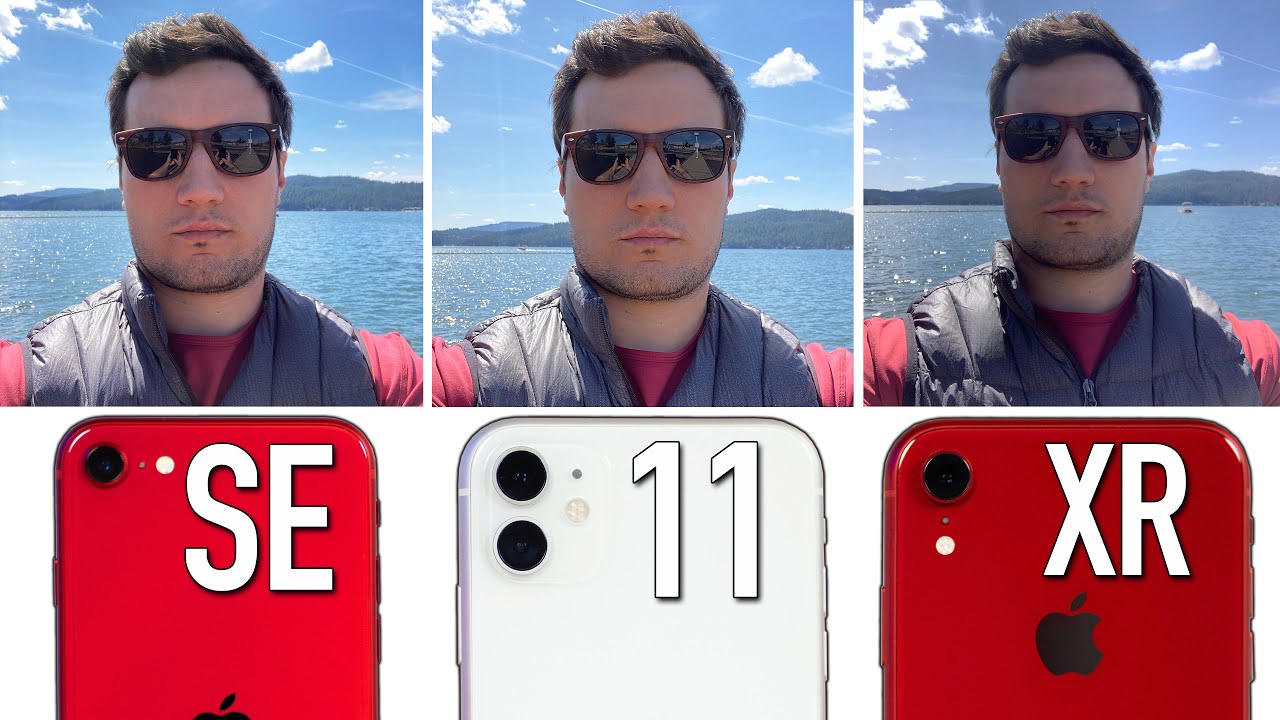
Hey guys its max and Vadim, and today we are doing another blind camera comparison that you guys love we're, taking a look at the new iPhone SE, and we're comparing it to the 10r in the 11. In keep in mind, the XR has the same camera as the XS and 11 has the same camera as my $1100 iPhone 11 Pro max yep, and the cool thing about this video is that we're actually both doing this unbiased test, because we had Angelica put these photos together, so neither of us know which ones which now yeah we both have our tally sheets, and we recommend you guys grab one of these and do this test along with us. Let's go ahead and find out if we can tell the difference between the spore hundred-dollar phone with iPhone 8 sensors inside and these higher end more expensive phones. Here is the first image here, which one do you think looks the best to you. So I was actually looking at this a little because it's the first photo and to me, it's the one on the left, the one in the center. It's just kind of like the dynamic range just isn't there, especially in that shed and between the left and the right I like how the inside I guess is brighter than the one on the right.
So I'm, going with the left and I actually have to vote differently. These two are almost identical. We could see that the middle one definitely has less dynamic range. It's all blown out, I just liked a little extra. The saturation all right and I have no idea.
Oh, oh! No way what wait a minute! Yes, my Elevens justified, I chose the SE. The XR. It was that much worse, yeah I was not expecting this and the XR has larger sensors that are no worse. The actual cameras are better what it's the a13, that's in the SD that is doing this now on to the next scene, I think I'm between the center and the right, I think I'm, seeing more detail on the one on the right and for me these are so close. Obviously the duck moved here, but I could tell that.
There's a color difference here. To me, these look more similar and with the with white balance. Compared to this one, I'm going to choose the iPhone 11 again, and I think this is the iPhone 11 it's a little sharper. Yes, all right! So what I'm seeing in this one is that it's just crazy how similar these are, especially the one on the left and in the center they're like almost indistinguishable and the one on the right. You can tell that it's, maybe not as saturated, or it's a little cooler on the white balance.
I think I actually prefer the one on the right. It just looks more clean to me. I do as well I like that. The white looks a little more white yeah, and it looks like it's slightly more detailed yeah 10 are perfect, did not expect that I want to point out. I did take another shot.
The 11 is the only one. I could do portrait mode, a bunch of objects, and it doesn't look that great here, but it can do it. It could do it in some cases, it's nice. So this is a portrait mode shot with all of them. Alright, so between this I think I'm going for the center, because the one on the right looks to have some sort of kind of haze from the Sun and the one on the left just looks like it has a little of noise, so I'm going to go with the center I'm going to go with the one on the left.
Are you okay? Yes, I'm scoring good I deserve my eleven, so these two looks so similar to me. The white balance looks the same. This. Actually a tough dynamic range shot. It was really dark here.
The one on the left looks: lets looks cooler. I think this looks more realistic, but I think I like that one, the best DUI honestly I'm going to go with the one on the very right. I, don't know for some reason: I just it looks more crisp. It looks sharper yeah you're right can I change my mind. I, don't know you I, don't know about you, but I'm, going with I'm changing my mind.
You'm going on there right. So this one is a macro shot because all of them are blurred out in the background in I instantly notice that the one on the Left doesn't look as good, it's just not as sharp, but between the center and the right I'm, seeing more detail in a more crisp looking image, and I'm, seeing more dynamic range in the fibers of that, whatever that hair a little flower yeah, it's a little blown out over here, where this maintains all the detail, I'm voting for this one as well. It's also it can get closer than this other two. What Wow? That's my first SE point what how it does it get closer? Maybe just the sensor is smaller, and it allows it to get closer I, don't know but like for $400 man, it's clearly the best one there. To be honest, it is hard to tell a difference here.
I'm voting for the middle, just because I haven't voted for the middle for a while. Okay, that one looks a little darker, though I don't know how the white balance was in real life, but the one on the right just looks too cool, but the one on the left. It looks like everything kind of blends together, like the color of the water and the landscape right here, just kind of blends in, so I'm also going for the center Apple. This is madness. We thought we got upgrades over the years here.
This one is too cool this one's too warm I, like the extra contrast and looks like it might be a little sharper I'm voting for the right one, yeah I do see more detail in the trees and all the texture everywhere on the right I'm going with that 1 to 10 are what guys we did not expect this for this one I'm going for the center I already know what it is: I like the wider shot, but not only that look at my face is nice and bright. Everything's exposed well here we're blowing out more of the clouds, and this is all darker- and this was this actually looks very similar. This shot. Just you, even, even though it's a wider shot, you still get more detail on your vest. Yeah, then, on the other, ? yeah, 11, I, see yeah surprising.
So here with the dynamic range, the front camera, it definitely looks worse than the SE. Now this shot here is a zoom shot, so the 10 are in the 11. They don't have telephoto lenses 5 times zoom I'm going to have to vote for the one on the left. It just looks more detailed. These look kind of similar this one kind of stands out to me yeah, so the one in the center is lacking.
Detail looks slightly blurry and the one on the right looks like it has over sharpening I. Don't know why compared to the laughs, this one looks more natural left as well Meet. We actually have some daylight coming in from the left hand, side and warm light from the top yeah I would say this. One is the sharpest. This one looks perfect too really close.
It's just not as close of a shot. This one looks the worst yeah, the one on the right, I see more detail, and especially if I look at this place, man or whatever right there so right as well I see wow what, in the eleven, also very detailed this one just looks the were specially over there. This is a selfie shot of me. I have to go for the middle I, like it dynamic range hear hear, my face just glitz kind of darker, and I'm, seeing a little more detail here so- and this is weird right here- everything just smeared all this color- you lose color detail, I'm, actually, going to go with the left, so I see more detail in your shirt and the fibers of your shirts, but not the face. I think your beard has more detail to s/e, and I chose 11.
The X are definitely for the yes, like the selfie camera on the 10. Are it's not worse? Okay, so for this one we are not going to vote, because there is obviously a difference here. The 11 has that ultra-wide. So we had this really cool. Looking shot.
You see the hotel of the building. Instead of this kind of shot, where I can go back any more here, so we're not voting on it, but the 11 definitely has that advantage, and this is a lower light shot, not super low light, but kind of medium low light, so, so easy that one yeah so without more detail is that this is deep fusion. It has to be diffusion. This is what I was trying to test if diffusion worked. Obviously this really stands out: exposure sharpness, yeah! Well now that texture and the lines of the yep okay.
Now what about between these two that's kind of tough man. This is kind of tough I, think the one in the center. If you look at the texture of the yeah, a NATO and the text right here, we have more detailed, okay, so obviously we're voting for this elaborate 11, but that S II does look more detailed than the X are now. This is another low-light scenario, not super dark, but it is dark. This one definitely looks the best to me.
This one looks the worst I just see more detail, more color, less noise, less compression artifacts here yeah. It's easy to tell that the one in the center is just so much worse than the others, but between the left and the right. It's really tough, like in this panel right here of the wood I, see more detail, but then their faces and everything else looks better on the right, but I'm yeah I'm, going to the right Wow very interesting 10r doesn't have diffusion I like the color, the pop more and I, like the skin tones more. The 11 does have more detail here and here, but that's not what you care about an image like this. You care about the people.
Look yeah, I, don't know why you know you could tell now that I think about it. You could tell that deep fusion is working, you're, getting more detailed, but I think the reason I chose the right. One was because you are getting some noise up here, yeah! That's what I noticed, because you don't really get that noise I just liked how my kids look better in the photo s. e. It's crazy in this little light situation.
It's better ban I, don't know if it's smeared a little or what definitely the worst. Now this shot is a front-facing portrait mode shot super dark outside I did use the flash as well and, as you guys, can see the center one I tested it many times the portrait mode just wouldn't work, even though it was enabled it wouldn't work so which one are you choosing I'm choosing the one on the right I mean if I was choosing an image that I would keep, it would be the center still so 11 on the right X, our portrait doesn't work, but it does not look. We agree that doesn't look good. Se looks nice and sharp a portrait just didn't work, yeah and I think this is the last shot here. If you know phones, you probably know.
What's going on this, one has night mode in the middle yeah. You could see the difference here, yeah Center. Of course, it's got night mode. Okay, 11 obviously has that and the SE looks better than the 10r with the worst sensor. Yeah, I think that is the last image.
So what did you get? Median, so I got five for the SE. I have seven for the 10r, and only four for the iPhone 11 Wow I, don't know how that happened, but, like honestly I should move back to that. I'm not going to I have two for the se6 for the XR and I have eight for the eleven now. This doesn't really tell the whole story in a couple of ways. First, off and a lot of cases, the SE beat out the 10r I think a different one.
I gave ratings when I knew which ones were which and that helped kind of even it out. In a lot of cases, the SE beat the XR, but in some cases ten are slightly beat out the eleven, and we were surprised and then, of course the eleven does have the extra ultra-wide lens, and it has a night mode. So it definitely takes the lead there. But overall I was really surprised. I was surprised how the S II yeah beat out.
The ten are in a lot of cases, and I was also surprised out. The ten are beat out the eleven in some cases, yeah I think the ten are does a perfect job for bright environments. Maybe it's the larger sensor that does that and I. Don't know how it was beating out the iPhone 11 in those situations, but for me yeah, but then, when there's dynamic range or lower light, you dynamic range, the other two in lower light, the other two when so, overall, the SE for 400 bucks, is doing a dang good job. Unless you're in that medium lighting, cousin super low light, it does better, but that medium low light to suffer is a little other than that it does a great job.
So give us your thoughts and your opinions down in the comment section below you guys want to see how the SE compares to the Pixel 3a, we'll have a video over there on that side and make sure you guys click that circle above to subscribe. This man max and Vadim, and we'll see you in the next video.
Source : Max Tech



![[CLOSED] Nokia 1.4 Giveaway [CLOSED]](https://img.youtube.com/vi/XMp0lK0M7oY/maxresdefault.jpg )


