Realme UI 2.0 ft. Android 11 - Realme UI 1.0 comparison | 3rd Party Icon Pack, System Cloner & more By Mr. Phone
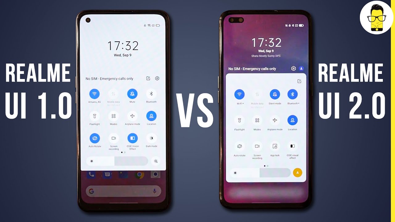
So, Google has finally released the final version of android 11, and it looks like this year. Around manufacturers are really fast on the ball, and you know Realme already has its Realme UI 2.0 update based on android 11. So right now I have the Realme x50 pro, which is the only phone that has real me. UI 2.0 beta available note that this is just a beta variant and of course I have the new Realme 7 pro, which is running Realme UI 1.0. So what I'm going to be doing in this video is of course show you all. The new features on real me, UI 2.0, in comparison with real mini 1.0. Don't think of this as a review or a full-fledged comparison review, primarily because there are few factors that I haven't tested.
For example, I haven't still checked. You know how the update uh, you know, affects battery life, or you know, camera performance, both of which should be quite unstable, and since this is a beta build, there will be some bugs as well. So this is not the right time to do a review, but what I can show you are the new features and uh. You know all the changes that Realme has done to real me: UI 2.0, all right, so my name is Assad you're watching Mr phone. Let's get this video started, but before we move on, don't forget to hit that red subscribe button and the bell icon right next to it to get notified.
Whenever Mr phone puts out an awesome new tech video for the very first thing, what I'm going to be doing is jumping into setting and showing you guys that these phones are actually indeed running on android 10 and android 11, respectively uh. So let me just get into the about phone page and- and you can tell clearly that this is running on real me, UI 2.0. This is running on real me, 1.0 and android 10 and android 11. , and the security patch on real me. UI 2.0 is on september 1, 2020, and this is on September 5th 2020. So you can see that this is what android 11's new uh.
You know. Easter egg looks like this is really cool all right. So, let's move on so first thing that I did when I actually started real me. UI 2.0 is take a look at the notification shade, and you can see that it's still half steps, so there's one half step which shows like the quick notifications panel and, of course there is the brightness slider as well, which hasn't actually changed, but then, when you actually slide it down, you see that now there is a transparent panel instead of one UI like you know completely opaque panel. So that's what the difference in the notification shade looks like right now.
The most important update that Realme has made to real ma 2.0 is the customization options. I really like now over here. You'll see that in fact the customization bar actually has an opaque panel, and I quite like it. It's very well organized, and it looks pretty damn good, a couple of the extra settings, for example the icons and, of course the layout. Both of this are actually pulled out of the main settings menu, which is on the Realme UI 1.0. So if you take a look at it, you can actually change the icon pack right now to a third-party one.
So right now I'm running the pixel queue icon out here, and you know you can get any icon pack of your choice earlier. That was not available on real me, UI 1.0. Now it is available on real mini 2.0, which is very, very good. Now one of the very cool features of realm UI has to be the smart sidebar feature, of course, and you can see that there is a bit of a bug, and it takes a little while to load on the Realme UI 2.0, but it looks very similar right now, but another thing you can notice right now is that Realme has reorganized a few things around, so you can see the tools is in one page and then, if you want to check for the apps, the apps goes into other page, and it looks damn nice. If you ask me- and I think this is a better way to organize stuff around- I think this is really nice now with real me, UI 1.0. You, of course, did get a dark mode uh and that can be toggled directly, so that's obviously nice and in dark mode.
You have a few other settings that is available. For example, you can schedule time and stuff like that, but over here the dark mode has been improved by leaps and bounds. So if you take a look at the dark mode settings right now, if you head into it, you will see that you have three different options for dark mode. So basically, if you're someone who doesn't prefer extreme dark black, you can go for something like medium or gentle as well. So that's really nicely done, so you have three different options: one! You can pick one that absolutely suits your purpose now.
One other thing that I noticed is that you can now reduce the contrast in low light conditions. So that's perfect as well, so let's actually go back to light mode and I actually sort of prefer that so yeah. So that's that's what it looks like without the dark mode. Now one really cool new addition is in the battery settings page and uh. You can see that there is one option that is actually missing.
So if you go into more battery settings, you can see something called optimized night charging. What this means is actually let me just read it out to you. It's very crystal clear and written out very nicely out here. It says to reduce battery aging. Your phone learns from your daily charging routine, so it can control the charging speed at night.
So if you keep it overnight for charging, and it doesn't end up over charging your phone, and therefore you get a better, you know longer battery uh longevity and life cycle as well. So that's perfect. Now, one of the things that apparently Realme has improved is actually optimize. The auto brightness feature to be entirely honest. That is something that I'll have to test and find out if that actually works better, but I'd never had like an auto brightness problem with uh real mew 1.0 either. So I don't know what exactly real me: UI 2.0 improves so anyway. That is something that I'll definitely check out for my full review.
All right. One of the improvements that realm has said in its change log that it has done is apparently improved the animations on the weather app now to be entirely honest, I don't see much of a difference. It seems very similar out here. If you guys find out anything uh, you know very different. Just let me know I mean I don't see any difference out here now.
One really cool new addition is something that I absolutely love is the fact that you can actually add a folder into a folder earlier in real me, UI 1.0. You couldn't do that so essentially, when you would do something like this, when you pick the folder and drop it on top of another folder, it will just slide out now with real mini 2.0. If you pick a folder and drop it into another folder, the apps from the first folder go into the second one. How cool is that that's really well done. I think that is a really cool option to have now with real menu 1.0. We of course, got an app drawer, which is really nice, but the only way to look at the apps is through an alphabetical order, but now you can actually manage the sorting, and you can do it in different ways.
So, if you hit the manage button, you'll see that the sorting can be done in different ways. Now you can sort the apps by the most used ones or by name or even by install time, which is pretty cool. The latest apps that I installed were, of course, a couple of icon packs on the Realme x50 pro and twitter, of course, uh, because I actually shared a tweet out about the real max 50 pro with a real mini 2.0. So that is why so. These are the only three apps on the real max 50 pro, and these are the ones that I downloaded recently.
So that shows you clearly that you know it has done sorting according to install time um and of course you can go back to name based sorting as well. Now this one is exclusive to RMU 2.0, and I cannot really show it on real mini 1.0, and that is something called a system cloner. So this is a new privacy feature where you can clone the entire system to create a completely new system as well, which means that if you want to keep your main system hidden away from somebody, then you can do that as well. So you've set uh that was a pre older password, so I'm going to be setting a new password for the system cloner over here. If you can take a look at it, so I can also actually enroll an entirely new fingerprint for the cloned system, so that's also really cool.
So both of these will have different fingerprints uh, and will you know unlock accordingly, so system clone has now been created? Let me quickly enter into the system clone. Of course there are some bugs right now, and it's not really very seamless, so it doesn't happen very fast. So now, if I have to unlock this uh for the first time I'll have to use uh the system clone password, but for the next time onwards I can use the fingerprint scanner. So basically, what you see right now is it's working really slow, all right, so finally we're into the cloned system. So, yes, it's damn slow right now, so I'm guessing that will become better over a period of time, but this is definitely a great feature to have and of course, directly from the quick settings panel, you can go back to the main system.
So that's what I'm going to be doing right now and there you go we're back into the main system. So what do you guys think of system cloner? Do? Let me know in the comment section below now in the quick settings feature uh. One of the things that has been added is the app lock, so app lock has now been added to quick settings directly, so you can invoke app log directly from the quick settings itself. Now, of course, no update will be over unless realm makes improvements to game space and, as you can tell, there are far too many features that have been added, which are newer. Of course, you get a low power mode.
You get a competition mode. You can automatically adjust the resolution. Furthermore, you can do a brightness log. Furthermore, you can quickly start up a game uh just so many things more uh and of course there is one cool feature where you can also head into an immersive mode in game mode. So that's really cool.
So another tiny new addition that realm has made to real mini 2.0 is, of course, the fact that you know you can actually share a qr code to share your personal hotspot. So let me quickly go into the qr code, setting for both the phones, uh, which is basically real. My 1.0 and 2.0 uh, sorry personal hotspot settings- and you can see that the moment I hit personal hotspot on real me, UI 2.0. You see that the qr codes option has popped up and which doesn't on the Realme UI 1.0. So when I once I hit that and of course verify my identity, which of course I didn't do properly and now that I've done that, you can see that I can share a Wi-Fi, qr code, making it easier for me to share my Wi-Fi password now.
Realm has also added a few new camera features, which is pretty cool. Now, if you take a look at it over here, you see this crosshair. Basically, that lets you and, of course, these grids as well. Basically that lets you actually frame better when you are actually shooting something top down, so it can create a proper level for you. So if you take a look at it, if you get into the settings out here, you won't see the option for something called composition.
So that's perfect. So if you take a look at composition, you'll see that uh you've got great diagonal lines, gold spiral and, of course, uh. You can also level when you're taking a top-down shot, so that makes it easier for you to shoot pictures as well. Now the other uh you know very, very good feature is of course, the fact that directly from this tiny little gallery icon, which is very similar to what is available on oxygen OS right now, so once you've taken a picture. If you quickly hit this button, you can see that you can share, or you know directly go into the edit page, uh, so yeah, so that's pretty useful as well.
Let me just quickly show you a better way to do that, so all right, so we'll take a picture of the Realme seven pro, so now you can see that I can actually frame it uh using that uh. You know leveling tool so which is easier. So all I need to do is ensure that it becomes yellow. So I know that I've leveled it perfectly and once I've done that I can just quickly hit this and hit the edit tool uh and make all the changes that I like now. Another new addition that I really like on real mini 2.0 is that you get a lot of new photo editing features, including a new set of markup features, which of course, is useful for a lot of folks who, like to markup stuff when they're editing their photos now. Finally, I saved the best for last, and this one is actually inspired by.
You know: oxygen OS. If you ask me, so I'm on real me, UI 2.0 out here, and you can see that there is a new option called personalizations. So basically, what Realme UI is doing right now over here is actually uh, consolidating all the customization options that are available, for example, teams, wallpapers, always on displays all of those things in one easy to access page. So that's absolutely well done. For example, you can change the fingerprint style to one that you like uh.
You can even now change the notification drawer. I can uh style as well. So I like the circle one only so I'll. Stick to that, but you know you can change it to your preference. You can change the edge lighting.
Of course, you can change the font display and size now. One thing that is obviously not available on this is, of course, the accent color, which would have been nice edition. But there are a few extra always on display features, so that could be useful for you as well so yeah. So these are all the options that are available in the personalization speech. Finally, let's go back to our about phone page to show you that we are on realm UI 2.0, and I hope that you guys liked the update over Realme UI 1.0 or, if you didn't do. Let me know in the comment section below because of course everybody has an opinion, and you can share that as well.
So now real UI 2.0 is available in beta only for the x50 pro. So if you are a x50 pro user, then consider yourself lucky, but I really hope that real me, UI 2.0 starts rolling out to other Realme phones, including the latest Realme 7 pro, and it of course hits a lot of other phones as well, but uh. We all know very well that real me's update cycle hasn't been very good, and it's not the fastest one out there, but it looks like uh with android 11. A lot of manufacturers are actually changing that going uh forward, so I hope that all the brands actually fix uh the update cycle. Obviously we can't expect it to be closer to apple's iOS, but even if the fragmentation reduces by a good number, then you know.
That is something that we can absolutely uh appreciate so yeah. So what did you guys think of real me, UI 2.0, compared to real my 1.0? Do let me know in the comment section below until next time this is ashlar from Mr phone signing off goodbye and godspeed. My friends, you.
Source : Mr. Phone
