Pixel 3 XL vs Pixel 2 XL - Comparison and Conclusion By sakitech
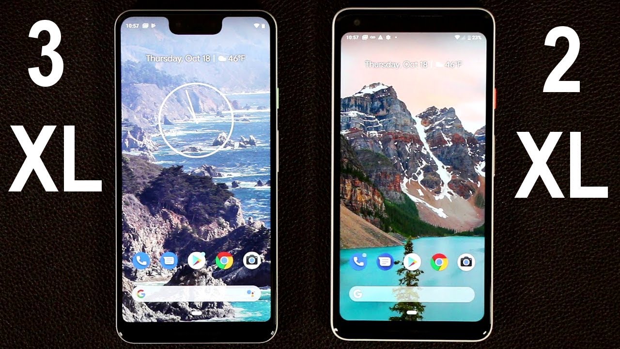
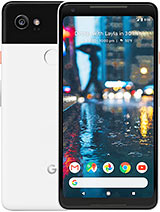
Hey guys Saki here from sake taken in today's video I'm gonna, do a side-by-side look at the pixel 3 XL and the pixel 2 XL from last year. I am going to go over the design dimensions, the software, the camera and basically everything to see if this is a big upgrade and especially if a pixel, 2 XL owners should go ahead and move up a notch to the pixel 3 XL. So, let's dive in now. The first thing I want you guys to notice is the size of these devices. They actually have almost identical specs when it comes to dimensions, they're, equally, thick, equally tall and wide, and also the almost weigh the same. So the pixel three XL weighs a couple more grams than the actual pixel 2 XL, probably because of the glass back, but the overall dimensions, as you can see side-by-side, are exactly the same and of course, if you were to go into the actual software and just take a look around you'll see that the software experience is almost identical.
Now. One thing with the pixel 2 XL is that it has a 6-inch screen, while the pixel 3 XL has a 6.3-inch screen. But of course it's got this notch over here, and also it's got an extra wide angle, front-facing camera, as opposed to the pixel 2 XL. That only has one single, regular angle, camera, but again, as far as actual software functionality is concerned, there really almost identical with the exact same features and tactics built into it. So I can swipe up.
Of course, that's because they're writing the same exact, Android 9.0 operating system. Let me go back to the settings really quick over here. Setting settings go all the way down, go to system, go to system and then tap on about and about, and as you can see, both of these phones are in fact running. Android version 9.0. So from a software perspective, you're not going to see anything different on these phones.
In fact, let's just go into a couple of minutes over here. So let me just go to the display over here right here display again you get all the same settings on the display side. Same exact thing or right, if I go back out and if I go to the system and just go to gestures, those are the building gestures for these smartphones. You have the exact same options now. One extra option I see over here is the swipe up on home button option that allows you to go into the app drawer that can be actually disabled.
I can do the same thing here: okay, just like that same interface. Obviously, but with this one over here, you actually have an option to turn that off. If you don't want it and if you do turn it off, you get the old-school three buttons over here where you can tap the recent button home button and the back button. Okay, not a bad feature to have so, let's just enable this door, so they look exactly the same, and there is one more thing you can do by the way they both have the active edge option where you squeeze the phone to bring up the Google Assistant and do other things such as squeeze the phone to silence notifications. Both of these guys have it as well, but one more thing that you do have is: if you go to the settings over here, settings and settings I'm noticing that this one here has a digital wellbeing option, whereas this one doesn't yet, of course it's going to get very soon, but as of now I haven't seen it and, of course, I did update this product just recently, as a matter of fact, I'll show that, right now, if you go to the system and if you go to the advanced over here, tap on system update and if I check for an update, I, just I'm just checking for one right now, so this is up-to-date.
So the one thing that's on this guy is the digital wellbeing options that allows you to control how much time you're spending with your smartphone. These are features we're seeing on the iPhones and other Android phones as well. But then now you have it on the Google Pixel 3xl, but not only to excel, and of course, it says we're here. This is the beta version. Okay, so this is still work in progress.
So I bet you once it's finalized here, it's going to trickle down to the pixel to XL as well. Now one observation I'm gonna make about the notch over here is nobody likes the notch? Okay, so I would have preferred the pixel 3xl to actually be just like the pixel 2xl, without the notch, with just the improvements that it came with, such as the camera and the front-facing camera and the speaker, loudness and stuff like that, there really is no way to say it, but that notch looks ugly, makes the phone look out of symmetry. If you look at them side by side, this one simply looks better. Now, interestingly enough, you can actually go into the pixel 3xl and disable the notch, so it looks exactly like the pixel 2xl. So let me show you how to get that done.
If you go to the settings over here and if you scroll all the way down, go to the system and tap on advanced there's gonna, be an option here, developer options that you have to enable now to enable this. You go to about phone scroll, all the way down and tap on the build number seven times. Okay and that's going to enable the developer options over here. So when you tap the sky, you scroll down under Erica s, drawing over here and then at the bottom of that option. You'll see the display cut out feature.
Okay! Let me just go back into this guy now. If you tap on the display cut out feature, it allows you to hide the notch. It's got a bunch of other options here that are not really usable, but the hide option here is going to hide the notch. And now, when you look at these phones side by side, you actually cannot even tell the difference from the front side. You can mistake this one for the pixel to excel and mistake this one for the pixel 3xl.
Now when the notch is hidden, no matter what you do, it's not going to show up okay, so it's not a harassed hidden notch, it's a completely hidden notch. Now this feature is not built-in. Let me just alone some absolute. You can see what I'm talking about. So when you launch apps again, that notch is going to be non-existent as if it was a pixel -.
Okay. Now the one thing with this thing is: you do have to go out of your way to enable this by going into the system and going into the developer options, which is not recommended for consumers. So, hopefully, what they're going to do very soon is they're gonna, take these options and make them mainstream. So you can actually do this. So if you tap this again, you have this tall cutout, which I don't know what that is.
You can do this one, the double cut out. You can get two notches top and bottom, and you got the corner cut out, and you got all these weird things over here, but the best one over here is gonna, be the hide one. Let's just do the diva device default for this review, but that's one option to make your pixel treat Excel looks like a normal phone, at least for now, until we don't have any work out for that notch, but I'll. Let you know that when I do disable the notch, because the screen is an all that display, the blacks are so dark that the hiding is almost realistic. So it almost feels like there's no screen here to begin with, so we'll see what happens with that now.
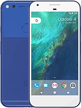
One thing word that really pleased me about the back of the pixel smartphones is the design I simply like the design of the pixel smartphones. Now, first and foremost, they will go with one camera. Okay, so that just looks better for some reason than all these dual camera setups did you have an LED flashlight over here and over here, and then the cameras are compartmentalized into a two-tone design. Now, with this, one is black and white. This is white and white, but you still have a compartmentalization.
This is more reflective over here on the top and when you transition over here, it's more matte, but this is glass. This is a glass and pixel too, of course, is aluminum all around and, of course, the glass back on the pixel 3xl enables wireless charging, while the aluminum back on the pixel to Excel does not offer wireless charging. By my opinion, this black and white combination looks better than the white and white combination and I do wish that Google actually made this in black and white color, but unfortunately, I still wanna bought this phone because of its notch design, but I may actually keep the pixel 3 regular versions- okay, not the XL, but the regular version, but I really wish they gave us this color design over here. Ok, other thing I like about this is the button that they have so with a pixel to a shell. They have an orange button with this one.
It is like, like a green, and that just gives us a little more styling. So from the backside. These phones look absolutely phenomenal. They're minimalist they're, clean, and they're, well-designed, and they're they're actually looked like they're pixelated, which makes sense now, if you are a pixel to excel order. As of now, there's no need to upgrade to the pixel 3xl unless the notch doesn't bother you.
If the notch does not bother you, it's okay to actually move on to the pixel 3xl. If you have the money for it, but it's not going to be a major upgrade. It's just a small upgrade over the pixel to excel. As I use the software of both of these smartphones, they both feel are very smooth and very snappy, as if there was no big difference now. Do you want to make a quick mention the display? The display on the pixel 3xl for now looks a little better than the display on the pixel to excel.
You may not be able to see that in the camera, but it's look, it looks cleaner, it looks crisper, and it looks brighter overall and of course, are some reviewers have actually mentioned that there were some improvements on the actual display. So even when I'm looking at these displays from an angle on the pixel to excel as I'm looking at it from this angle, here I can see a little bluing of the screen, but with this one it looks white and bright with no discoloring when looking at it from angles and like I said it just seems brighter and more vibrant, so the display certainly has been improved over the old pixel, but it's not a dramatic revolutionary change, but it's gonna, please people that were dissatisfied with the pixel to excel and of course, as we talked about, if you look around the device ignore the notch. These phones are very identical: they've got the same ports, they got the USB type-c port, no headphone jack, front-facing, dual stereo speakers top here top here bottom here and a similar design and, of course, you're going to get a camera improvement on the pixel 3 XL, with some extra features, but I doubt those features are enough to make you want to upgrade from the pixel 2 to the pixel 3, because this camera already competes directly with all the current flag. Ships such as the note 9, the iPhone, 10s and other smartphones on the market and honestly, every single shot. I take on this phone or any other flagship, is highly usable in very satisfactory.
Now this one's going to be even better with a couple extra options that just don't make it worthwhile for me to upgrade from the two to the three but anyway, let me know down below. If you have a pixel too, or you can operate to the pixel three or if you're in the market to buy one of these, which one would you buy now you do know this one is going to be $900 and this is going to be it starts at 650 now, so it's cheaper option to actually have, and it's still fast snappy. So let me know which one would you choose if you have the option to buy one or whether are you going to upgrade and just drop your comments down below and just give me any kind of comments relating to the pixel of smartphones, alright, guys make sure to subscribe to sake, Tech and give this video a thumbs up have a fantastic day on, of course, if you do use, Twitter, Instagram or Facebook, make sure to follow me on all at sake. Tech online, alright,.
Source : sakitech
![iPhone XS Max Long Term Review 3 Years Later [2021]](https://img.youtube.com/vi/ldLgR5rB780/maxresdefault.jpg )

