OPPO Reno4 Pro 5G unboxing and first impressions By Neowin
Hi everyone- this is Joe with Edwin, and today we're taking a look at the apple arena, 4 pro 5g, and I'm going to be honest with you. This might be one of my favorite unboxing yet, and it's not because the phone itself is a crazy, innovative or the most powerful thing. I've ever seen, it's not about the color in this one, but I'll just give you my own background before that. I believe this is launched in China back in the summer um earlier in the summer, like June or July, and then they announced the Indian version um and then there was only 4g. Furthermore, I reviewed it on new one. You can check that out, but then last month they announced the phones for Europe, and it's actually the 5g version this time, and it comes in, I believe the same conversation was available in China, which is very interesting, and they showed off this green color, this green glitter, and it's, let me tell you uh lime green- is my favorite color, usually or variants of that sort of tone, with the yellow and green sort of that in between yellow and green.
So when I saw this, I was just I couldn't try it, so apple sent me the green color version and the box itself is right away, just beautiful, but let's actually open it up. So we take that off. The inside of the box is also green. With that beautiful machine all around its incredible. I just love the box, it's amazing and then the little sleeve here, which has the manuals and stuff and what through information and all that it's also green, all around again, absolutely beautiful, beautiful, even the inside, I think, is green yeah.
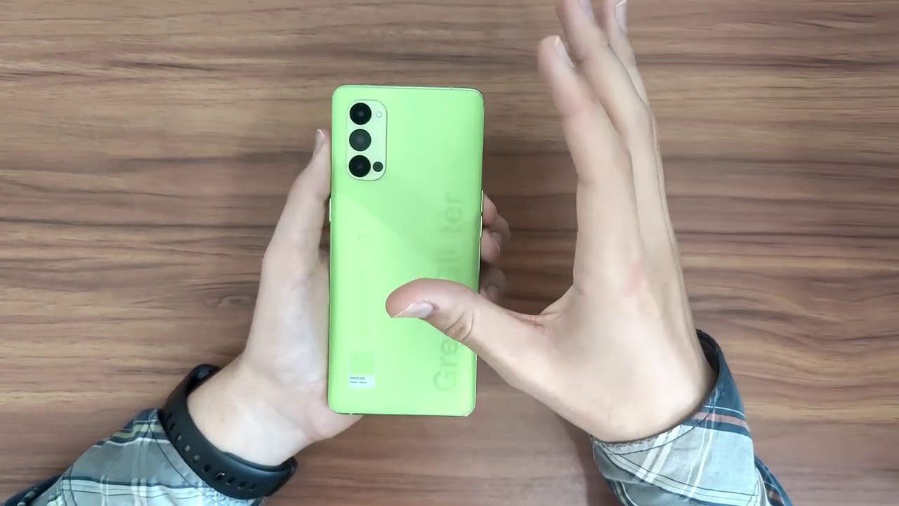
It doesn't have the same sheen on the inside, but it's still green, that's just beautiful, and then we get to the phone itself and again beautiful. This is all um green, all around the phone's there. You can also see that it's green in the frame, but don't take a look at it a little more closely in a bit. This is all green. We can lift that up.
We're not done with green, yet there's more green, and it includes this case, which I actually think is very cool. So it's green uh on the back, it's a different kind of green compared to what we see in most of the box. It has this interesting green glitter text that actually has a cool sort of effect to it and looks really nice, and it's a minimalist case in the sense that it doesn't cover the sides. It only just tries to protect the most fragile parts of the form which are the corners, and it still has a very cool identity, because cases that come in the box are usually just like transparent, there's, really not much to them, but this one looks really cool in my opinion, and it just stays in the theme of the color. So I love it um we take that off as well.
We see that the charger itself says: uh green glitter, there it's white, but the text is colored. So that's something I wonder if the USB port is also covered. Like that? Oh, no! It's just right, that's a shame! Oh, it does have a green glitter contact thing there. The earbuds, of course, also the green weather color, and here we have the cable charging cable, which is also green, but not only that this isn't even just rubber. This is a braided cable, and it looks really cool and that's actually very nice that they decided to do that.
I'm looking here, apparently, the plug is still yellow. That's the camera Oppo uses for their super VOC chargers. The 65 watt charging speeds I kind of wish they made that clear, green as well to just go with the theme but oh well, I guess you can have it all. So still. This is a lot of green, and I am a huge fan of that.
So now, we'll just set the box off to the side for a bit and take a look at the phone. So there's this plastic wrap that we have to take out and there it is. You can kind of see the green around the edges right away, and it's an it's a much more sudden green on the frame, of course, as you'd expect, but then, on the back. It's this beautiful, beautiful, green and there's a couple of interesting, interesting things about it, uh, so the most of the the backing, which I think is plastic. I can't tell for sure they use very interesting plastic.
But I think this is plastic, like the 4g version of the arena 4 pro, but that one also tricked me for a bit but yeah, it feels nice. I wouldn't immediately say it's plastic, but if I think it is, but anyways there's some cool things about the design, because it's got this matte finish um, which is very cool, it's very soft to the touch and stuff and then around the camera module. Here it's glossy just like the arena 4 pro I reviewed before, but then it has the green glitter text here on the side and that's also glossy, and it actually feels it when you go over the ladders with your fingers and even the PPO branding up here is uh classy. So that's fascinating and then the color tag here, the Pantone green glitter, color tank- is also glossy. So it's this fascinating feeling.
I think it makes it more drippy to have that glossy finish in some parts, but it for the most part. It still feels really soft and really nice. So, yes, this is a gorgeous phone simply and exclusively because of the camera I just kind of uh. I love this green, so much even the antenna bands. There are following the camera theme, so I just I love this a lot now.
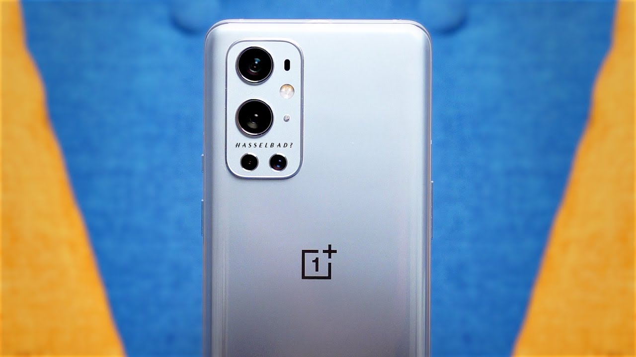
Let's take a quick look at the cameras here, so we have three cameras which is not as many as we have on the 4g version of this phone, but this is actually better. I would say so. The main camera is still 48. Megapixel Sony, mix 586 a very common sensor these days, so that's sort of the same. But then we have the wide angle camera here and in this case it's a 12 megapixel sensor instead of the 8 megapixels.
That was on the 4g version and also this combines the macro camera into the widening camera. So you don't need on the Arduino 4 pro the 4g version. You had a separate macro camera that was only 2 megapixels. Here you have everything in one camera, which is an approach. If much prefer.
I always feel like the two megapixel micro cameras are completely useless and just a dumb way to add um some sort of selling point to the spec sheet. So this I prefer a lot and also there's this ultra night, video mode. That apple is promoting for the wide manual camera. So it'll be very interesting. If you can get good wide performance for video in this wide angle, camera I think that could look really nice and then finally, we have the 13 megapixel telephoto camera, and for me this is like, like the perfect camera setup, when you have a main camera, a wide angle and then a telephoto and just the ability to go from very zoomed out shots to zooming all the way in.
I think that's really cool and that's way better than what we had on the arena.4 pro because there you had the macro camera to megapixel. Like I mentioned before, and then you had the monochrome camera, which is also 2 megapixels, and it had some interesting features in the video department. You could make this color pop sort of filter where everything would be black and white, except the comments you chose. It was interesting, it was fun, I would say it was somewhat fun, but I feel this is more useful and the cameras here seem way more high quality in terms of the resolution. So I much prefer this approach compared to what they did in the 4g version of this one.
Of course, I have to test it to know for sure, but on paper this looks more interesting, so going around the phone uh, this is pretty standard for apple. You got the power button with the little green accent which interestingly pops out a little less now, because the whole phone is green, and we got antennas on the sides. This is a 5g phone, so there may be more antenna pens than usual a couple more antenna bands up here and a microphone and the volume rocker is here and on the bottom. You have a lot of things: the bottom firing speaker USB type c, another microphone and the sim card slot um I've grown to quite like OPPO's designs. The frame is still metal.
I believe it feels pretty solid. Only the back is plastic, but this feels very nice. The frame feels very good, and I do like apple. The buttons here are pretty nice everything's very nice, I'm I'm a fan of it. So now I'm going to turn on the phone.
This is a 6.56 inch. I believe at this point full HD, plus 2400 by 1080 and ammo, add, and it has a 90hz refresh rate. So it's pretty much the same screen as the 4g version of the Renault 4 pro, not many differences there, but let's just turn this phone on and set it up, because I haven't done that yet and I will be right back, so the phone is now set up. I chose the font theme when setting it up and apparently there's this special uh green glitter theme based on the is its exclusive to this comma variant, and I hate it. So, lets uh just get that out of the way the theme they're using here.
I don't like these icons whatsoever. Obviously they have the commerce going to fall in line with the rest, but I really don't like it. You do get the option to change it out of the box. You can change it back to oppose a standard default theme here, which I much prefer, and you can also customize the icons as before. The software experience here is very much just like every other apple phone.
This is still running camera 7.2 based on android 10. So no big changes here, and I don't have a new problem becoming later in the year. So everything here is very, very familiar. The camera app has the same interface, there's the same sort of apps you've gotten used to seeing from apple the clone phone, app, uh, game space phone manager, upper relax and so loop, which is like a video editing, sort of app. So that's OPPO's, stuff and the rest just standard either.
Google stuff or just basic fun features like the calculator um, so very, very familiar the settings all the same options you used to it's all very familiar if you've used not performed before or if you've seen my previous reviews, nothing has really changed much here. I do really like apple's skin more than I thought I would when I first started testing their phones. Its everything is very smooth. The icons are pretty minimalistic. It's its nice! It's its actually quite nice.
So I like that. I, like the skin here and also this- is a 90 hertz display, so that really helps with the smoothness of everything and the transitions so just to round this out because I actually haven't mentioned the specs. Yet I was just so excited about the camera um. This has a snapdragon 765g 5g chipset, so you get 5g support like I said, there's the antenna, bands and everything to make 5g work a little better. That's not something I can test, because 5g isn't the only one in Portugal yet, but still um, there are 12 gigabytes of ram and 258 gigawatts, 256 gigabytes of storage.
So this is uh a bit of an upgrade over the 4g version, multiple ways: there's more ram, more storage, a faster chipset and 5g support, but it's also significantly more expensive, but then again the 4g version isn't officially available in Europe, so it doesn't make much of a difference there. So this is 7.99 for the galactic blue, one space pack, commerce, and this limited edition. Green water version is 8.49 euro. So it is a bit more expensive, but it's kind of in line with some other phones with the sort of specs. I believe the mg velvet problem isn't very far from that, and it has some lesser specs in some areas.
So this is a reasonable is price, um, so yeah, I'm I'm excited to use this mostly just because I want to have a green phone in my hands but of course I'll be taking a look at the rest of the phone uh. That being said, that's it for this video, and I'll see you guys next time.
Source : Neowin
