The Galaxy Tab S7+ Just Got Better! (OneUI 3.1) By Thao Huynh
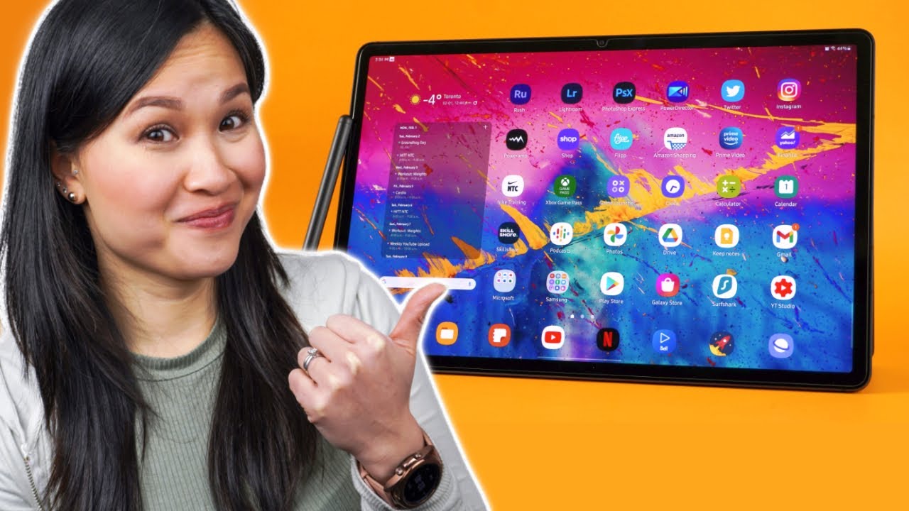
This video is sponsored by skill share hi, everyone ta here, so the Galaxy Tab, s7 plus recently got updated to one UI 3.1, if you're wondering what's actually new you're in the right place, because I'm about to show you so starting on the lock screen, the pin pad now has a different look and is finally bigger. I have no idea why they made it so small before, but it's much easier to use now. You can also move it closer to the left or right side, which makes it a little easier to reach visually. It's not a massive redesign, but they did clean things up. The software just has a more polished feel to it and lines up a little better with the look on their phones. You'll see a lot of this blurred kind of frosted background that once again kind of resembles the finish that Samsung's been using on their phones.
These days. I really like that. They've added these cute lighting effects to the notifications. What's cool is that you can customize them from the animations to the colors. You can make it as subtle or as crazy as you want.
I know it's not for everyone, but it's still a nice touch. It also feels like they put some more effort into the animations, because the tablet is definitely more fluid, I'm so glad they fixed a couple of really annoying bugs in the recent menu. The close all button was moved down, so it's actually visible. Now before this update, it was literally overlapping the bottom row of apps when you swipe away apps, they no longer jump around. It was so unpredictable before now it works like it's supposed to real quick, though I have to give a huge shout out to today's video sponsor skillshare is an online learning community with thousands of videos to help fuel your creativity and teach you practical skills.
You can find all sorts of classes on topics like photography, music, art, there's even classes on how to start a YouTube channel. So whether you want to learn something new or deepen an existing passion, you can do all that here. You'll get top-notch tips from skilled professionals and, what's great, is that you can learn at your own pace. I've taken classes on drawing filming and lately have been watching videos like personal branding from Kate areas to learn a thing or two about marketing. It's also super affordable with an annual subscription for less than ten dollars a month, but if you're on the first thousand to click, my link below you'll get a free trial of skill share premium membership, so you can explore your creativity.
One of the biggest improvements with this update has to be that multitasking sessions are now saved in the recent menu. So, for example, right now, I've got this split screen session going on right. If I swipe home, when I go to the recent menu again you'll see that the multitasking session is still there, I can click on it and get back to what I was doing without having to set everything back up. This works with two apps three apps, it doesn't matter. iPads have been doing this for a while now, so I'm glad it's.
Finally, here on the galaxy tabs. One thing I wish they would change. Is the default pop-up window size and shape every time I launch an app in a pop-up window. It opens in this weird shape and I end up having to resize it to use it comfortably. These are all essentially smartphone apps, so they work a lot better in a window like this.
So if someone from Samsung is listening, maybe pop-up windows can remember how you had them last. Anyone else wants this, or is it just me also shout out to this feature added to the alarm. There's now a toggle to have the time and name of the alarm read aloud to you as it's going off. It's a nice way to remind you what the alarm was for get to work. You lazy, bum, it's 11:58 a.
m, whether you love or hate apple, their product ecosystem and just how seamlessly everything works together is unmatched. That's why? If you just like one of the products, you'll likely own more than one down the road, I'm really starting to see the effort that Samsung is putting into building out their own ecosystem. One UI 3.1 makes the Galaxy Tab s7, plus work better with the latest galaxy phones and window PCs. So, starting with the phone, you could already respond to text messages and take calls on the tablet. But now you have app continuity.
Basically, if you're browsing the web on your phone, when you go to the recent menu on your tablet, you'll see this app suggestion tap it, and it'll launch the Samsung browser and take you right to the same website. So you can continue browsing on the tablet. Instead, this also works with Samsung notes as well. But since notes already sync, I really don't think it's as useful. Samsung, tabs and phones can also share a clipboard now copy some text on your phone, and you can actually paste it directly on the tablet.
This works with pictures too, and yes, it also works. The other way around. You can copy something on the tablet and paste it right onto the phone. They also introduce keyboard sharing where you can use the keyboard cover on the tab. Seven plus with your phone, you can pair up to three devices and a keyboard shortcut is used to switch between them.
I personally don't see myself using this, but hey it's there. If you want to give it a shot for those of you with windows, PCs, you can use the tab, s7 plus to mirror or as a second screen for your computer. The touchscreen functionality still works too, but a mouse makes more sense. To be honest, it's all done wirelessly and does work decently well, but it's not perfect mine stutters from time to time, and the resolution tends to dip. Occasionally it might just be my Wi-Fi, though still it's nice to see.
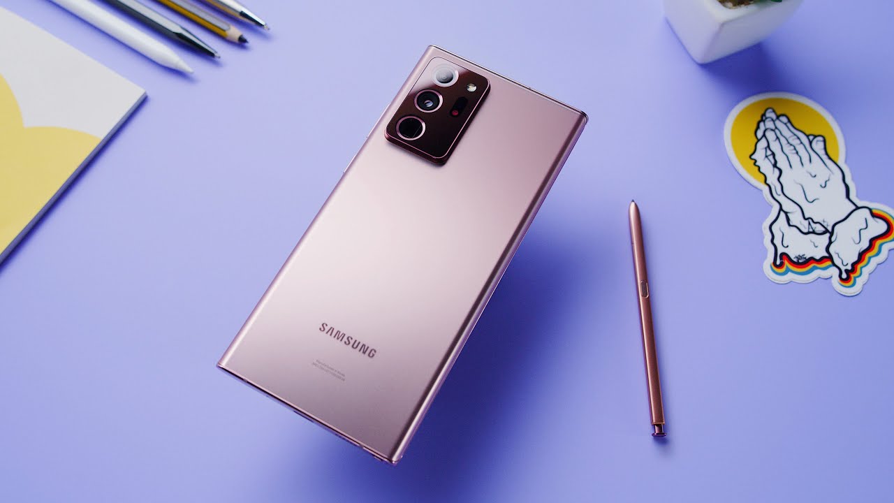
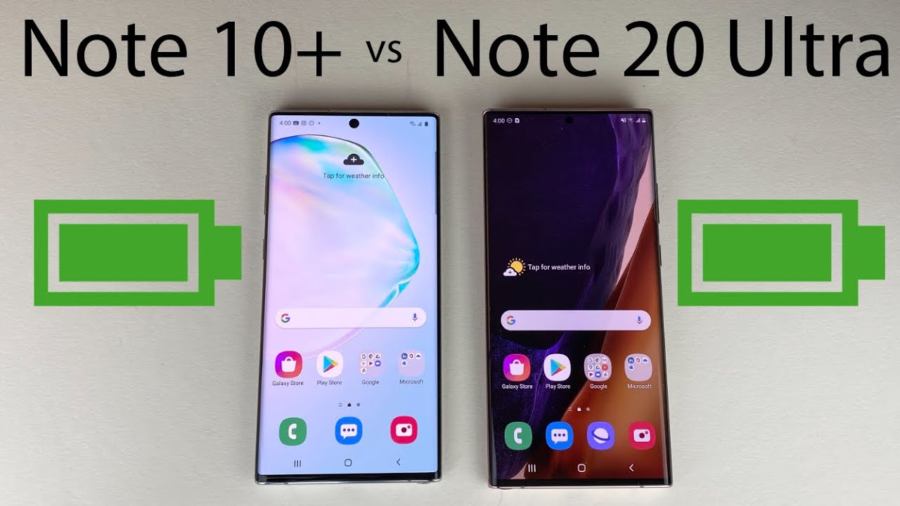
Samsung and Microsoft continue to work together and build on that relationship. There is a cache, though. All these features will only work if both devices are signed in to the same Samsung account and both are running at least one UI 3.1, which unfortunately, is only available on the s21 lineup. At the moment, if you have an older phone, you'll have to wait for the update. My note, 20 ultra, for example, is on one UI 3.0. So no new features for me.
Yet if you're a Galaxy Tab fan, there's a lot to be happy about. Samsung has proven that they're not giving up on the tablet market and want to continue to build a better experience across their products. The availability and quality of apps is still lagging behind the iPad, but DEX and the s pen functionality are awesome, plus the screen man. The screen is as good as it gets for watching content. I still admire how good it is at times anyway.
So what are your thoughts on the update and what new feature are you most excited for as usual? Thank you all so much for watching until the next one, I'm out of here you.
Source : Thao Huynh
