Surface Duo Review: Above the Fold (Duo vs Galaxy Z Fold 2) By Erica Griffin
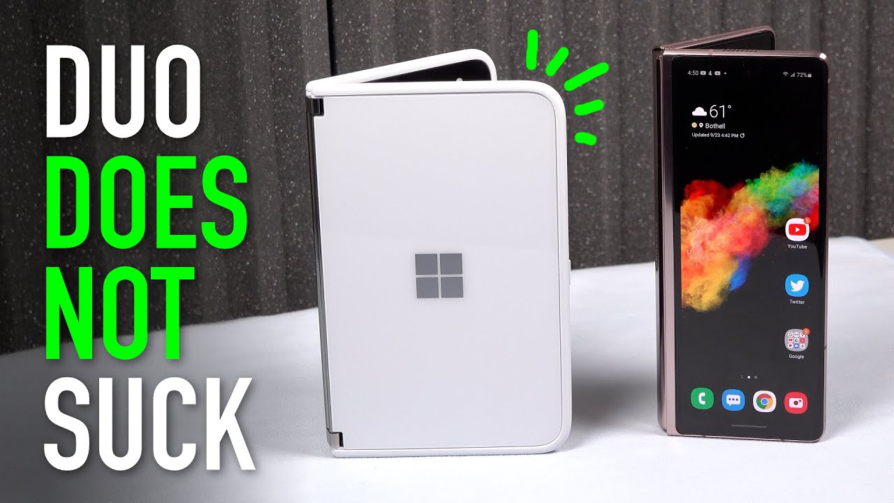
Hey everybody: this is Erica the technology nerd likes to film stuff. I just came from the Surface Duo and I really had a chance to establish a workflow on that device wow. These may both fold in some way, but I've discovered just how different these two devices are in function. This is exciting to see phones. Finally, don't all do the same things. The fold 2 is a multimedia device, the size of a small tablet that can fold to better fit in your pocket.
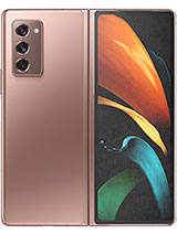
While the Surface Duo is a dual screened, multitasking device where media isn't king, but it still gets by which do you choose the specs on the z-fold 2 are clearly better. The fold has a fantastic camera where the duo is a potato camera, for example, which can be a big deal if your smartphone is your only camera, but specs aren't everything now, after several days with both phones as an avid multitasker. The duo has appealed to me in ways that I'm just not experiencing with the z-fold 2. So I will play devil's advocate to show that, while the z-fold 2 is undeniably media, king and probably the better overall phone, the duo really does hold its own for the right multitasker. The first thing that is vastly different between these two devices is how they handle multitasking.
The z-fold 2 uses virtual windows up to 3 at a time that you can push around and resize. While the duo uses two separate screens, I prefer running separate apps in their own environments. Each space stays compartmentalized to a task akin to having two monitors their own, easy to read, 4-3 aspect screens, it's so simple to flick, apps around placing whichever window where I want it. I can't help but multitask on the duo I find with the z-fold to that, even though I can move things around and resize windows till my heart's content, it just doesn't feel as natural and after a while, it can actually feel quite cumbersome. Like too many steps to stage my windows, even with app pair shortcuts, as the aspects can be kind of screwy, so I often prefer just using one app at a time full screen, which is where this device shines.
Anyway, then I swipe along the bottom to switch between apps. So I don't use it all that differently than a standard android device, it's just bigger, but yes, boy! Is it nice that I can just fold it in half and shove it in a pocket? It's definitely not as wide as the duo, but I still feel more productive on the duo now, barring my preferences for app environments. Let's look at some of the workflow examples I established on the duo and how they translate on the z-fold too. I quickly learned with the duo that the second screen could act as an extension of the workflow on the first screen, with what I call app, throwing or flinging just say, you're on a web page. If you press and hold on an element you're given the option to open it in a new window, it's then automatically thrown to the other screen, leaving your first screen uninterrupted.
This was a totally new experience to me. Even if you have another app on the other screen, you can still tell it to open a new window. Then you can just fling it over. Also, if an app like twitter opened a link within the app itself, you can still select open in chrome, and it will open by itself on the other screen, or you can fling it if something is already occupying that second screen so simple, there just isn't anything comparable on the fold that doesn't at least take some fiddling and trial and error to where you just won't bother. But of course I did bother the first example I showed you works if you use the Samsung browser, so press and hold then select open in another window.
So that's not too bad at all. Just keep this capability in mind now, for the second example: open twitter then use multi-window view to open chrome beside it. So you effectively have two screens like the duo, then click the link on twitter to open the in-app browser and select open in chrome. No one is going to do all those steps. It makes more sense just to use android as it's designed just continue to interact inside twitter's, in-app browser or select open in chrome, so that chrome is open, then swap back and forth between twitter and chrome or at that point open up, multi-window view and have them side by side.
That's just not efficient, I'm so free on the duo. I can open Google Maps. I can find a donut shop I want to visit. Then click on the website link from inside Google Maps and ultimately view what they have on one side while seeing how to get there. On the other side, simple, I can call them from Google Maps then throw the dialer out of the way without missing a beat.
I can be watching a Nintendo direct in the YouTube app on one side, while tweeting about it. On the other side, then I can go to the description and click Nintendo's link to their website, fling it and the video is still playing underneath uninterrupted. Then I can use recent to switch back to twitter swipe up again to switch back to Nintendo's website and so on and so forth. This just ain't happening on the fold. I've tried several ways and was just left frustrated with odd window aspects and keyboards that wouldn't behave properly.
So you can really appreciate what two separate screens for app spaces can do for you. Making this video took as long as it did, because I was trying to figure out a complimenting workflow on the fold now seriously. You guys don't get me wrong. I love the fold, but it does nothing revolutionary for multitasking. Now, of course, the duo doesn't just display two apps side by side.
It can span apps across the entire display, making them effectively full screen with an aspect ratio of 3 2 versus the folds 5-4 aspect. Now clearly, the z-fold 2 looks better when full screen, because it doesn't have the seam going right through it, but try turning the duo to portrait now. The seam is no longer an issue as it's parallel now to the content, and it's not cutting straight through it and actually in use. I prefer the taller aspect: ratio of the duo in this orientation. I love how much content can fit on a web page or social media feed.
This is where the duo truly shines. It feels like a piece of paper that I can hold along its bezels and also what's nice. Is that when I need to pay less attention to my phone and multitask in a real world environment, I love that I can just prop it up like a little laptop and continue scrolling or viewing notifications. While I go about my business, or I can pluck away on the keyboard for a quick reply without needing to handle the device, so I find its design and aspect ratio lens to fitting into multiple environments. For me now the full two can also bend, but it isn't as stable when it's sitting up, and it isn't an aspect ratio that fits much when it's folded.
I think I would like using the fold more if it was the same size but folded width-wise like hamburger style instead of lengthwise. The halves would be kind of like the duo and could fit more, but it wouldn't be as wide when closed. I'm sure some would lament the loss of one-handed usability, but the outer screen would be more useful as it could fit a more standard, 69 aspect panels. Sure for most things I want to have the biggest screen possible, but when I'm on the go, though it makes sense to fold up the phone, so I can use the smaller screen, but it's just too tall and skinny. For me, I feel this is also where Microsoft got it right.
So when both of these devices are open, they can get kind of unwieldy, and when I want a less unwieldy device, I fold them in half now, with the duo it folds back with its 360 hinge to be just one.4-3 screen, so it's nice and wide, I can read everything. A 4-3 aspect is totally usable and fits more across the screen than the z-fold 2's skinny aspect tall is good for scrolling, like through social media, but any bookworm will tell you that having too few words per line just breaks you out of your flow, so I will take a 4-3 aspect over a very tall and skinny one any day now when viewing media. Obviously the z-pole 2 kicks the crap out of the Surface Duo, because the z-fold 2 shows a nice full screen image. While the duo has a lovely hinge that slices right through the image when spanned this is just no you don't you don't watch content this way, so the best that you're going to be able to do is to fold this in half and then once you do that you're stuck with black bars and also some chunky bezels. So this isn't as nice as this clearly, but it's usable the advantage, though, that I've been noticing with this goes back to multitasking, so I can go ahead and open this up, and it becomes tent mode.
So I can set this on the counter. Just say that I need a recipe, or I'm watching a video while I'm cooking or with family or whatever I can multitask. Now. Of course, the z-fold 2 offers its own bending mode, so you can go ahead and bend the screen, and you can see you're able to watch it fairly. Similarly, but it's its not as stable, I'm a little worried about that, and you can make it full screen, which is also really nice.
But when you do this, you see you get a crease through your image and also there's a color shift on half of the panel. You can definitely move to watching video on the outside panel and even flex it open slightly. It feels more stable this way than when viewing the inside screen, but the duo's image is still larger. Also, the duo can be adjusted to more angles to match your eye line, so I can set it on any surface or at any height. As I go about my business, this has been extremely useful if you prop the z fold to open at a wider angle, the image automatically switches to the inner screen- and I haven't found a way around this, so I actually prefer the duo if I'm going to be doing any type of multitasking.
So what about when I need downtime from all this multitasking as a bookworm, I really appreciate that the duo bends slightly to become a book and is very thin and light to hold the Kindle app even looks like real pages when turning its delightful. If anything, this is the most expensive kindle that Amazon never made. I would really love it if the fold 2 got the same app treatment, but you would still be stuck with too few words per line unless you turn it to landscape, but then it doesn't bend in that direction, but the folds' aspect ratio does look great, as is full page similar to how a Kindle looks. So I do love reading on it and even taking notes. I typed this whole script on the fold too.
As I've said, this device shines for large full screen apps. Now. The last thing I noticed with my workflow that makes the duo more useful is that I love to be able to write on my screens. That's why I get the Galaxy Note every single year, the Surface Duo has gorilla glass 5 on all sides. It's not fragile like the fold, and it's got a digitizer to accept a pen, so I can take notes to my heart's content, which is really nice.
I can have my bible going on one side, for example, while I take notes on the other side, all while casting the sermon to the TV during this quarantine time when, on this guy, of course, I can use my finger, which is nice. I can also put text on the screen, so that works really well too, but there's just something so notebook about this. With screens this size. I really expect to have this type of tablet functionality. Now I understand this has got plastic in it.
It's ultra-thin glass. It's not there yet to be able to handle a pen, and I will be first in line to buy it when it does so. The question I'm left with now is: what does this provide for me over my Galaxy Note, 20 ultra, which is a lot cheaper, has a strong glass display? It's got a pen, it's got the best cameras that Samsung has to offer and then from a multitasking standpoint. This offers a lot as well, and it's cheaper still and also not as fragile, where this wins are having that large screen for viewing media and also for full screen apps, and then you can close it and put it in your pocket. But is that enough? That's the question.
So this is something I want to attempt to answer over the next several weeks of using it. Please stay tuned. So let me know what you think about all these use case scenarios and if your workflow matches mine, so this has been Erica. The technology nerd who likes to film stuff. Please, like comment subscribe, hit the notification bell to be notified of future videos.
I will be looking at all these devices here and have a good night. You guys bye.
Source : Erica Griffin
