Sony Xperia 5: But why?! By Pocketnow
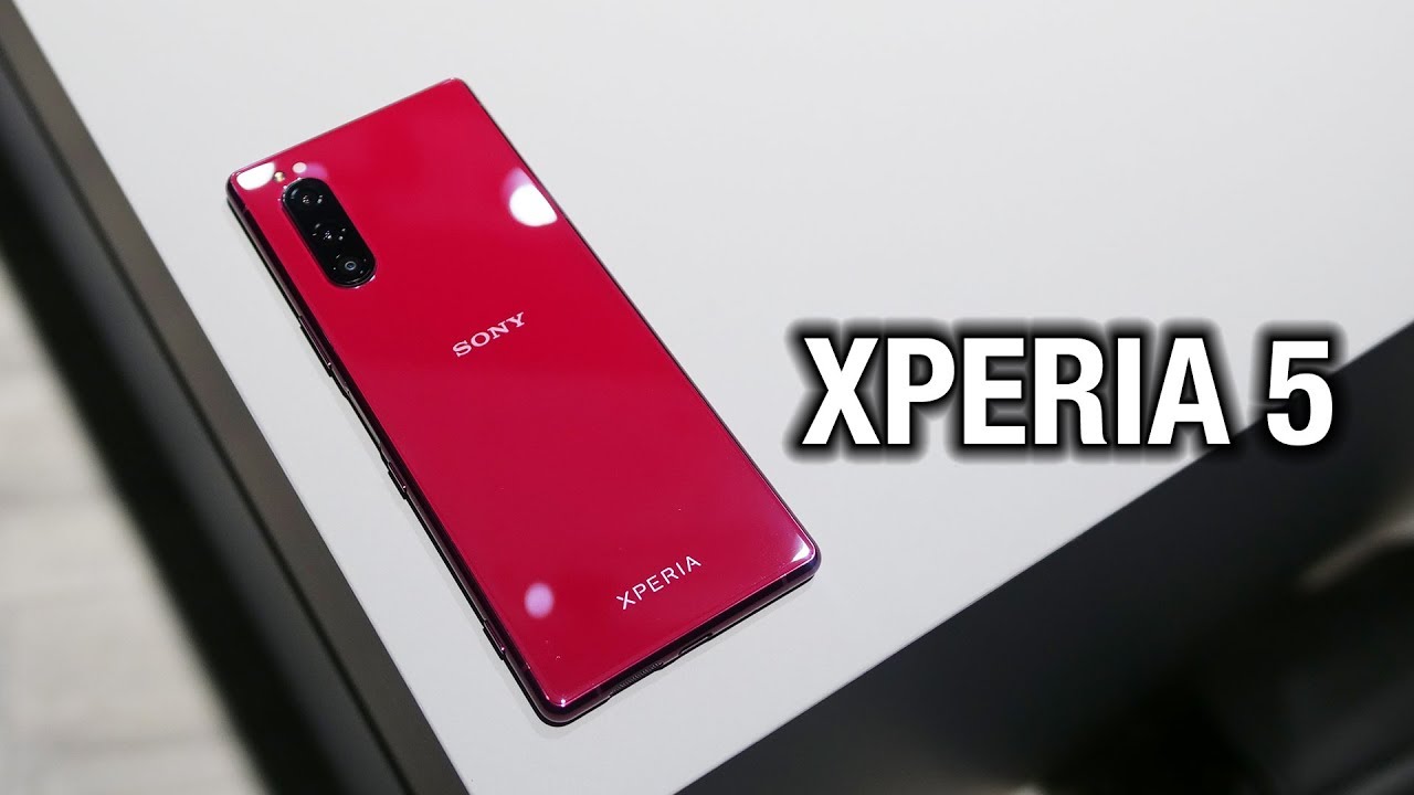
The Sony Xperia 1 was a very interesting smartphone in its own way as well. It was unique, had a new approach to the form factor and yet didn't really spell the best work. Sony has done I'm still holding on to my review, just to make sure that I give it a fair shot, but even that might be a little too late meet the Sony Xperia v, the company's latest flagship, which is somewhat of a step back when compared to its predecessor, I'm, hey metadata, Loathing, now reporting from night in Berlin. Let's go hands-on! That's for why this is Xperia v and on Xperia 2 guys. Your guess is as good as mine. No idea I wish that device felt for generations ahead of the first one, but in reality it's a different story, see visually.
It looks pretty much the same. I'd say it's a little more flat on the back and I also have to praise Sony for the color options. I mean this red is really fire. It is gorgeous. The rest is the standard, aluminum and glass, with a typical Sony neat tricks like a dedicated camera button, a sim ejector that doesn't require a separate tool and also the controversial aspects like a fingerprint scanner that doesn't necessarily double as a power button.
They call it a phone, that's easy enough to hold and use with one hand, but that depends on how you approach it. Yes, the new 21 by 9 aspect ratio is taller and narrower than your standard phone, but at the expense of tall buttons at the top that don't necessarily scream easy to handle. It is slightly smaller than the Xperia one now, with a 6.1 inch display that this time is 1080p + resolution instead of the 4k that you got every so often on the previous variant. Still, this OLED packs a punch and achieves all the bells and whistles of your modern flagship, with the benefits of no notch or punch hole thanks to the asymmetrical design of the display. And yes, there are stereo speakers here inside we have a Qualcomm Snapdragon, 805 processors, 6, Inca, bytes of RAM 128, gigs of storage, a 3 140 million power battery ip68 water in this resistance and no wireless charging yet again, which is also weird.
Cameras, are also the same trio of 12 megapixel sensors that we had on the one being a standard, telephoto and wide, and if you're wondering why Sony doesn't use its own 48 megapixel sensor. Once again, your guess is as good as mine and they megapixel selfie shooter at the front, and the camera is now moved to the side instead of the middle. When it comes to the primary shooters, which is also something that's a matter of taste, we have Sony's UI on top of Android 9 high. It doesn't seem to be optimized for one-hand that use on a tall display, with the exception that you can pull the notification tray with a drag in the home screen. You do have the side menus.
That Sony has been using since two generations ago, and I do have to hand it to the company for reducing the footprint of its skin. More and more each launch, but yes, this is the Sony Xperia v colors are blue red black and gray, and we should expect it to launch over the next coming weeks, though we don't know exactly which markets. Let us know what you think about the Xperia v I mean: do you care about this device? Do you like the form factor because I've liked my experience with the Xperia 1, but then again it doesn't scream anything unique to me? There's none of the comments down below and while you're at it follow us on social medias. Our extended coverage happens on Instagram and follow me on my personal handles to see what I do with these phones subscribe to our channel for more videos like this one. Please give this video a thumbs up.
If you like what you saw I'm highly metal, better thanks so much for watching we'll see you on the next one.
Source : Pocketnow
