Samsung Galaxy S21 unboxing and first impressions By Neowin
Hi everyone- this is rowan Newman, and today we have here the Samsung Galaxy s, 21 5g, so this is a pretty exciting phone for a couple more reasons. For me, one of them is the fact that I'm getting this pretty close to its release date. I think it's, the closest I've gotten the phone from Samsung so close to the release date of the phone and that's pretty cool, but there's a couple more reasons for that I want to in get into later so right now, let's just take off this lid, so I don't have to wear out those barcodes anymore and the phone is here right away. I'll talk about it more in a little. Furthermore, I just want to talk about the box first, because this is much, much thinner than previous Samsung phone boxes, at least the galaxy OS 20 Fe that I reviewed a couple of months ago, and that's because the phone doesn't come with a charger anymore. So if you open this up, there's a charging cable, which is USB type c, the type c and the manuals there.
But that's it there's nothing else. In the box- and I actually think that's a good thing, because now this is about half the thickness of the box from for the s9fe, and that means you're. If your say shipping, a million phones just to start off and each truck or whatever you're using to transport them can carry two thousand of the owned boxes. That means you can now carry four thousand of these, where you will need 500 trucks to take to ship those million phones. Now you only need 250 of those trucks on the road shipping, the same number of phones.
So I know a lot of people. Don't really buy the environmental friendliness, excuse of not having a charger anymore, but I think it makes sense this. This is very surface level analysis, but I think it makes sense from that perspective, and also you're just making fewer charges now. So that's less! That's fewer resources and less energy being used to make those chargers and, at the same time I think most people will now have charges at home that are USB type-c or, if you're, buying an iPhone and probably already have a lightning charger. Too, so I don't think the inconvenience that comes from that is that big- and I think this is probably a good step, even though I know a lot of people are upset at that.
But moving away from that here is the phone itself and Samsung sent me the phantom white version, so I'm just going to peel off these things, the front and the back, and it even has one I don't think on the camera module there. So this is the phantom white, and it's pretty darn nice. Looking. Oh, it's still got something on the sides. Okay, I think this looks really nice.
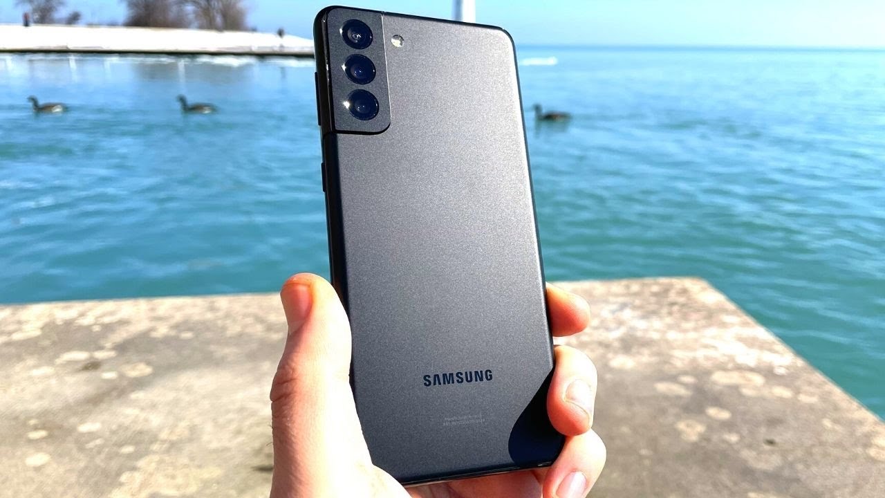
It's a matte finish, and it's its plastic, which is interesting for a flagship phone, but this is made of plastic, but it's pretty solid feeling plastic. I think it feels a little sturdier than the galaxy s20 Fe, and it's got a really nice feel to the touch. I really do like matte finish, phones more than glossy finish ones these days and I love the design they went with here. Furthermore, I know that for a lot of people it doesn't really matter much, but the camera bump the weights designed to mount into the frame here. Furthermore, I just think this is so clever, and it looks so good when you look at it all around.
This is probably one of the coolest design decisions. Samsung has made with their phones lately. I just think the camera looks so much nicer this way. I really do love the way the camera bump looks here. Furthermore, I wish I got the purple phone with the golden frame.
Furthermore, I think that contrast is absolutely gorgeous, but this looks really classy too, and it's just really nice to look at, and before we get into the specs. Specifically, I want to talk about why this is plastic and why, I think that's a good thing. Here's the thing for the few. The past few years we've been looking at. Smartphone prices go up and up every time, and especially with flagship phones and then last year we saw the galaxy s, 20 start at 9.99, and then you added s20 points which was 11.99 and the 21. The Estonia ultra was 13.99, so those were extremely expensive phones and then Samsung came out in the towards the end of the year, and they made this phone. The galaxy s20 Fe, which started at 6.99, and it still gave you a snapdragon 865. You got six gigabytes of ram 128 gigabytes of storage.
This is the main camera was the same as on the galaxy s20, but the others were downgraded and, of course it was made of plastic instead of glass, but it started at 6.99, and it's still got that top tier processor, quite a bit of ram not as much but six gigabytes is still pretty decent plenty of storage, a 120hz display a solid main camera. This was my favorite Samsung phone at the time and I don't know if I said it in my review specifically, but I know I said it in an in conversations with friends, but I hope that Samsung would learn from this that this would someone when Samsung will learn, and they did. They really did. I think they learned all the right lessons here. So now the s21 starts at 7.99. That's just a hundred dollars.
More than the s20 Fe and 200 dollars less than the s20 last year and for flagship, that's perfect pricing now and of course, they made similar sacrifices, specifically in the build so plastic back, there's no charger anymore. So that's the sacrifice. You're making, and the display is still 120 hertz, but it's only full HD now, so it used to be quad HD, that's downgrade that the s20 Fe made, and now they brought it over to the s21 that might upset some people. But again, I still think this is a super smart decision, so I since 2015, or so when um quality, display starting being the norm. I've always said you don't need that much resolution in the smartphone this- and I stand by that all these years later, so cutting back to full HD and keeping the higher refresh rate, that's an extremely smart decision, and that makes this phone still incredible value.
So now you have this flagship with the snapdragon triple eight or if you're in Europe, like, I am the Enos 2900, eight gigabytes of ram 128, gigabytes of storage, 5g support, 120, hertz, refresh rate and a pretty solid camera setup that I'm getting to in a bit for 7.99 or whatever the Portuguese pricing is probably 829 or so I actually don't remember. But in America it's 7.99, and I think that's such an great proposition just to start with. So I think Samsung really didn't learn on the right license with this phone, but anyways, let's get into the specs here. So the camera setup is still a 12 megapixel main camera just like last year and the galaxy s20 Fe. But here you have another 12 megapixel camera for the wide angle and then a 64 megapixel camera for the telephoto.
So those are better than on the s20 Fe at least the time of photo is, so you have a camera setup here. That should be pretty solid. I'm not sure because I haven't used it yet, but it should be fairly solid. I'm not a huge fan of Samsung cameras, but I actually didn't think uh. The s20 FES was too bad, considering the price and everything else that was on the table.
So hopefully the that will stay true here, and maybe it'll be even only done better and then on the front. You have a 10 megapixel selfie camera, while the s20 Fe, I believe at 32 megapixels um. So the resolution is much higher than on the s20, but you can tell that it's not as good. I actually already turned this on for a bit and had them side by side with the selfie camera turned on, and it was a huge difference. This was so much better yeah.
So in terms of the specs, that's mostly it this one. This one does have a 4 000 William hour battery, it's the same as the s20 and last year and slightly smaller, well a bit smaller than the s20 Fe, which rather 4 500 William hour battery. But this is also a smaller screen and a smaller phone in general, so we're just going to go ahead and turn it on. So now the phone's turned on uh. Just to quickly go around the phone here, it's nothing unexpected, but you do have the power button, slash Bixby button, which is still here, volume rocker, two microphones at the top here lots of antenna bands all around.
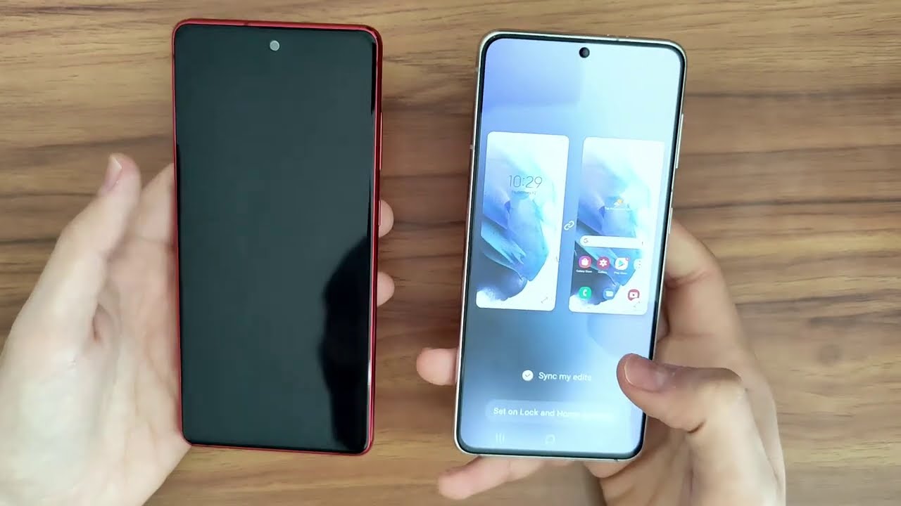
Of course 5g- does require that and at the bottom USB type-c sim card tray, which I does not include expandable storage, so only sim cards and a bottom firing speaker there. So in terms of design. That said, you can see at the top here how the camera bump is protruding a little from the bezel from the frame, but we're just going to go ahead and set this up. So now we've set up the phone, it's showing me a bunch of stuff, so the setup process is pretty much the same as it used to be, so nothing has changed there, but there are some differences. When you compare this to the s20 Fe, actually putting them side by side, one of just the display itself is already different.
Obviously the screen is bigger on the s20 FM a little, but the bezels are also bigger. So if you, if you look at the bezels, I mean the background on this one makes it a little harder to see the petals. So let's try to change it does something else. I don't like that. Oh, this is a video uh.
I don't know, I don't really want a video. I don't. Furthermore, I don't know how to do this. Um, okay, there we go welcome home screen. Let's just do it for both.
So if you put them side by side, you can see now the bezels are significantly smaller on the s21 compared to the s20 Fe and another difference. You'll notice in the software actually is that the s20 Fe would use the Samsung's messages app as the font. You see it right there, but the s21 is actually going with Google messages and if you open it, you know it's. It's everything, google, but really enough. It seems to have been customized to look more like Samsung's designer language, like the comma of the bubble here seems more Samsung than google, but it's just using some google service now.
So you can use things like messages for web and stuff like that. So I think that's an interesting decision. You still do get Samsung messages if you want to it's hidden there, but it's not the default anymore, which is fascinating and for e before you didn't even get google messages at all pre-installed. So this is. I think this is good.
I prefer when companies use the phone apps from Google for the most part, so this is a good improvement in my opinion, and also if you swipe to the side nowhere your Samsung daily used to be now, you have Google the Google feed, I don't care for it either. Furthermore, I don't care for either one, but if I'm going to use any one of them, it's problem with Google's. So again that is an improvement and really in terms of the software. That's the biggest difference. There's some slight design tweaks here with the devices and media buttons now being visible right away on the s20 Fe.
You have to swipe down to have them at the top, which also happens here, but now they're more randomly accessible there. This might be just my eyes, but I also think the cameras are only on Cooper on the s21. This one has more of a yellowish tone to the converse, and I prefer this one a bit, but that is just a quick comparison there. Aside from that, pretty much the same, all the apps look pretty much the same. Even the camera app looks pretty much the same, so no big changes there um the settings app, I believe, also very similar.
I don't like the light theme I should say, but aside from that, no big deal, how do you even turn under? Oh, it's at the top? Okay, so there's dark mode again, pretty similar to what it was before in terms of the software experience. It's going to be all very similar aside from that Google messages app thing that, I think, is a good change, so everything else is similar. This is running android 11, the s20 Fe I was showing. You are also updated to android 11 already so fairly similar software there, it's all very familiar. We have the gallery looks same as before.
You can move to OneDrive, but I don't really care right now. You get all the same Samsung apps pre-installed, you do have like. I said, Samsung messages here that used to be on the home screen on the same google apps, and now you have the Samsung free app this, which is new. I'm not sure why this is here, but it seems to be just a news app. Furthermore, I don't know why this exists.
Furthermore, I guess because they removed Samsung daily from the home screen. They just made an app for it, so you can read the news that would be there. I don't really care about this, but whatever everything else is the same game launchers here on the Samsung apps are here, it's all pretty standard business. So I think this is a pretty cool phone. Because of that price point it's two hundred dollars less than last year they made the right sacrifices just like they made with the s20 Fe.
They made the sacrifices that they needed to make they. They used plastic instead of glass and there's no charger now, of course, and they reduced the resolution of the screen, but not the refresh rate, and those are the right sacrifices to make. And now you have a flagship that starts at 7.99 instead, and in this case you actually have eight gigabytes of ram instead of the six of the s20 Fe. So the performance on this should be just fine, and it's just exciting. I think it's good that flagships are getting cheaper this year because it just is now more people can afford to have a premium experience from Samsung.
So I think that's very good, but you know- maybe that's just me probably, not though I will be, of course reviewing this for the next couple of weeks, and I'm very excited to do so. So thank you guys for watching, and I'll see you guys next time.
Source : Neowin
