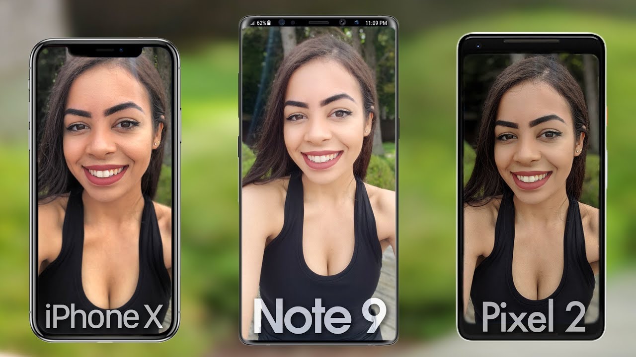
Samsung Galaxy Note 9 Camera vs iPhone X & Google Pixel 2! By Krystal Lora
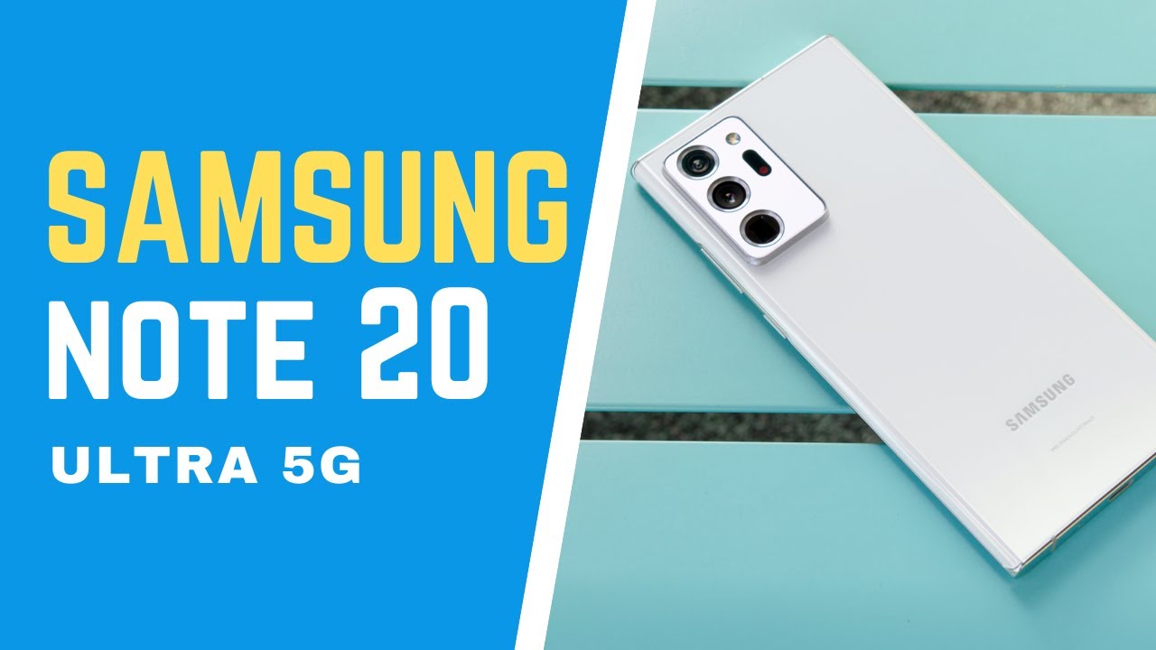
Hey guys its crystal and I got another 3-way camera comparison today between the newly released note, 9, the Google Pixel 2 XL and the iPhone 10, and before we get into it, shout out to Dee brand for the lovely looking skins. I have a great carbon skin on the note 9 black camels on the Google Pixel to excel, and this yellow skin on the iPhone 10 that I've been using for a while and I love it so much I also have it on my laptop, as you can tell, but yeah deep brand makes skins for all types of devices, so make sure you check out that link below to spice up your tech a little make it look a little cooler, but let's go into some camera specs. Now, on the note, 9 we're seeing basically the same exact camera that we saw on the s9 +, dual 12, megapixel cameras, optical image, stabilization on both and, of course, that variable aperture from 1.5 to 2.4. The only difference with this camera is that there's an eye in it now. So the camera is a little smarter and knows what you're. Taking a picture of when you point at it, and it'll better optimize the photo for it in auto mode and on the iPhone 10.
Just like the note 9, we have that dual 12 megapixel camera set up with the second telephoto lens, no variable aperture here, just a fixed aperture of 1.8 on the main lens and 2.4. On the second camera, we have a 7 megapixel, selfie camera with an aperture of 2.2 and next up some Google Pixel 2 XL camera specs, which, as we know, is the same as a smaller Google Pixel to that single 12.2 megapixel camera on the back with an aperture of 1.8 selfie camera has an 8 megapixel camera with an aperture of 2.4 4k video at 30 frames per second 1080p slo-mo at 120 frames per second, and also 720p slo-mo at 240 frames per second. So there's all the camera specs. Let's pull up those photos now in my laptop here. So we can really see those differences, and I'm really excited for this.
One too, because I haven't really put the s 9, plus against the iPhone 10 and the pixel 2 in one video, and now that the no.9 is out perfect time to do it. Let's start off with a good old selfie, because why not- and this is kind of what I expected to see from the three phones, like the note nine definitely the softest looking selfie just like on the s9 plus selfies iPhone 10, so close up, because that selfie camera is not as wide angled as I would like it to be, like the other two and pixel two-man pixel, two is looking good. It's just it's nice and sharp compared to the other. Two have another selfie, with my little cousin kind of the same thing that we saw in the first photo like the note.9 is looking a little soft and a little washed out compared to the other two highlights are a little too overexposed. So you can see that in my shirt and my pants' pixel to Excel gives us the most contrast but starts to crush those dark areas which you can see in my hair.
In terms of color, the iPhone 10 is the most vibrant and maybe a little too vibrant I also have a daylight portrait selfie. So, let's take a look at that now. I mean SNI Plus, consistently still the brightest one, also the more airbrushed looking one is too soft. This one for sure, pixel to excel, looks good. I.
Think the dark areas are a little to crush again in this one and like you can clearly see that with my shirt and my hair and the iPhone 10 gives us the most detail, we can clearly see that in my face. Okay enough selfie talk. Let's move on to that rear camera. Let's see some daylight photos on there, starting with this one, pretty basic photo, but I wanted to get a good idea of how it handles the sky. In the background and me as a subject and yeah on the pixel to excel on the iPhone 10, the shadows are definitely being a little too crushed, but also the note 9 over exposes the sky, like the clouds are a little too bright, but the iPhone 10, just like the mix of like the darkness and the photo and the colors like, even though they're the most vibrant I prefer the colors on the note 9 next up got a more landscape shot in terms of detail and like keeping information in the shadows I'm going to zoom in to this top part here of that ride in the background- and we are seeing that we're losing the most detail on the note 9 and with these photos, the iPhone 10 is the brightest, and it's bright, but Heal does not over expose anything really I want to get a better idea of the colors against the three.
So let's take a look at this rooster statue thing man that red is popping. On the note nine, like it's really coming out at you, which looks good I mean I like a good vibrant photo. The sky is kind of the same on all three, but the blue is a little more vibrant. On the note, nine I mean I feel like the pixel to Excel is a little too dark here, and I like the colors of the note 9, but the iPhone 10 is the best in terms of exposure and for the next photo. I went nice and close up to that flower.
That was at the bottom there, and I mean you know me. You know I like a good flower picture. So let's take a look at this one whoa, whoa, whoa, iPhone 10, is just a little too bright. It is blinding my eyes I'm being a little exaggerated, but I don't know the colors are just like it's a little too much. They're like the bright areas, are too brightest.
Overexposing the sky, love skating. It's a good-looking photo, but it's just like a little too harsh with those highlights, and the note 9 like does a perfect job at exposing the bright areas of this photo and keeping detail and the pixel to excel. Definitely again the darkest. So that's a given. We know we're gonna, get the darkest pictures out of the pixel to excel and on this next photo of this green plant I'm.
Just really appreciating that HDR mode kicking in on the note, 9 I love how the green plant is exposed on the iPhone 10 zooming. In the note, 9 is lacking a bit of detail compared to the other two there are things that I like about each I like the colors on the pixel to excel the sky. On the note 9 and the subject is best exposed on the iPhone 10 and here's our first rear camera portrait mode picture. All three were taken in the same exact spot, but the pixel to Excel is gonna, have the wider shot, because both the note 9 and the iPhone 10 user telephoto lens for their portrait mode pictures, but the pixel to Excel just has that one camera on the back. Besides the fact that the pixels of darkest is a lot of things I like about that picture, but it's also going to lack the most detail because zooming in, like I, said before that telephoto lens really comes true with the other two, or we see a lot more detail in my face there, especially on the iPhone 10 and here's another portrait mode picture of my sister and gas.
But man that background on the note nine is way too overexposed. The iPhone 10 has got that classic faded. Look that we're used to seeing in iPhone pictures, but again the background and Gobi is just very well-balanced in terms of exposure and the pixel to excel with the wider shot, which looks good like I love that you see a lot of the background. I really do appreciate that it takes really nice looking portrait mode pictures with just one camera on the back and this last portrait mode picture that I'm going to show was taken in the shadows but again kind of the same thing that we saw in the last two. All three look perfect, but those bright areas.
On the note, 9 are still a little too overexposed the pixel to excel this. A great job with the bright areas, but both the pixel and the iPhone crush is dark areas too much in this one and the note 9 being the brightest keeps the most detail in those darker areas in this next photo we're getting into slightly lower light, but it is more controlled lighting and the first thing that jumps out at me is the note 9 Gabys, looking very red, and also zooming in I, mean her face is so airbrushed on the note, 9, there's no Beauty mode on here, and I guess, like some people, do, prefer that look and zooming out I do like the way the colors look on the iPhone 10 the most, but is also over exposing a lot of the bright areas like on the bottom left of the picture. That white is just like. You lose a lot of detail that pixel to Excel does a pretty good job with his shadows here, I think they're, even more crushed on the note 9 in this picture. Let's get into some outdoor low-light photos.
Here's a more landscape, shot of this flower fountain thing, and it looks like the low-light photos of the iPhone 10 are gonna, be warmer and color temperature compared to the other two. But the note 9 does a great job at exposing certain areas, but well-reasoned then I'm also noticing that the note 9 also does the best in terms of green, because no nine just kind of softened sup. Those areas here is the low-light picture number two and oh, my goodness, iPhone 10 is really suffering in those bright areas like completely overexposed. In the background they're, both the note 9 and the pixel two Excel are holding up really well in low light, but I kind of prefer the colors and the overall exposure on the note.9 I also have a low-light flower picture nice and close up to this pink flower. It's the note 9 is softening things up a little too much when we're this close up and the iPhone 10 once again is over exposing some bright areas, but it also keeps the overall image brighter, which looks really nice here and in this next alike, picture.
We get a good feel for the color shift. Just by looking at the ground. We can see that we get warmer colors on the iPhone 10 and the coolest on the pixel to excel, and the note 9 is right in the middle. Of course, I have some little eye selfies. So let's take a look at that, starting with this one.
Oh, my goodness, the iPhone 10 it is blown out again. On that background, it's also looking super grainy and super green. In the note, 9 I'm, loving, the colors of the picture and the pixel to Excel does a great job with his highlights. It also crushes the darker areas the most, but the overall picture has a nice sharpness to it, which makes a note 9 look a little too soft looking and another little a selfie once again, pixel looking so nice and sharp and still keeping so much detail. The iPhone 10 is still over exposing some parts of its image and looking very blurry and grainy, and the note 9 looks perfect too, but not as good as a pixel in terms of details a little too soft.
Looking next up, let's take a look at some 4k video from all three phones in terms of color. If you want something, that's more true to life, you're gonna, get that out of the iPhone 10 the pixels to Excel is the most unnatural. Looking one and looks very color graded, it looks good, but just a little over saturated with some colors, especially in the sky, is very teal. Looking and in terms of stabilization. Both the note 9 and the pixel to excel seem to be doing a better job than the iPhone 10.
When it comes to exposure with highlights and shadows and note, 9 seems the most balanced. The pixel to Excel does the best with its highlights and the iPhone 10 is the brightest looking one, but it definitely over exposes is highlights. So now that we saw all the pictures and videos I mean all three did a really great job, but it always comes down to what you prefer, because there's a camera out there for everybody. If you like more contrast and a sharper, look to your pictures, you're going to love the pictures from the pixel to Excel. If you tend to go for photos that have a lot of vibrancy in their colors, while still keeping a lot of detail and also keeping a more realistic feel to the photo, the iPhone 10 is great and then there's the note 9, which is basically the s9 plus it's camera 2.
That has incredible dynamic range and also gives you consistently the most balanced photo in terms of exposure. Another thing to keep in mind with the note 9 is all the features that you get in the native camera app like, if you really like to take control of your camera. Having a pro mode is amazing- and I also mentioned this earlier in the video, but now that the camera has artificial intelligence, it's pretty good with knowing what is taking a picture of, and the native camera app also knows, with somebody beings sort of the shot is too blurry like a little message: pops up telling you that somebody may have blinked in your photo, which can really come in handy sometimes, and of course, we can't forget the new features with the s-pen. You can use it as a shutter button to take your pictures. You can also switch between the selfie camera and the rear camera.
So yeah lots of fun things with the note 9 s, camera I, don't really know how necessary that is for everybody like if you're just going to be taking pictures clicking and going in auto mode. Do you really need all those features, but, as always, let me know in the comments below which phone's camera you guys, like the best and again shout out to Dee brand for always making my devices look beautiful with their skins? If you're interested make sure you check out that D brand link in the description below thanks so much for watching guys, and I'll see you later.
Source : Krystal Lora
