Realme 8 Pro | Early Unboxing & Camera Test By Tech Spurt
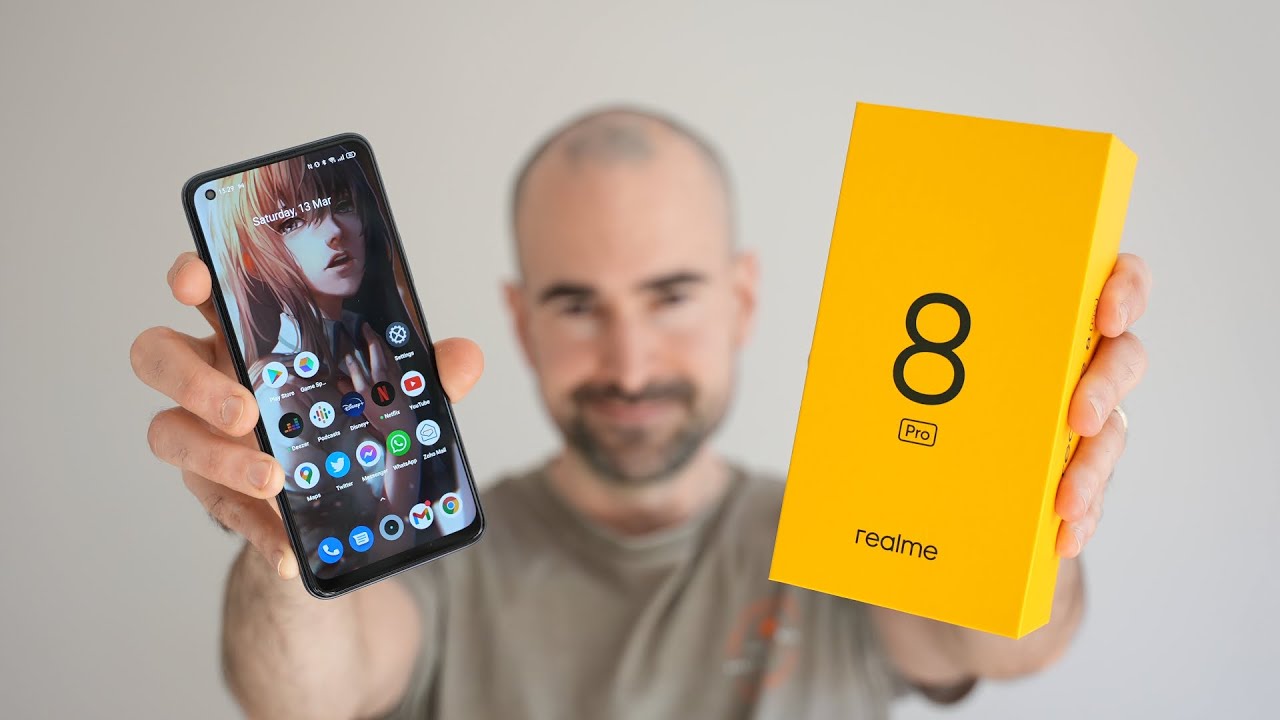
So fans of budget blows and anyone who's looking to upgrade their current smartphone without skunking. All of their savings should be eagerly awaiting the official launch of the realm 8 pro, which is happening on March, the 24th and to further whet your appetites. Those lovely folks at Realme have sent me an airport ahead of the official launch, so I can give you a sort of sneak peek now. This, unfortunately, won't be a typical unboxing that I do here on expert, because a lot of the specs and features are still under wraps, but what I can do is show off the actual phone itself. I can run you through the Realme UI 2.0 features, and I'm allowed to test out that 108 megapixel rear camera as well. I'm going to slap my sim in there, so my full realm 8 pro review will be dropping on March, the 24th after the official launch, but that's enough chat, let's whip it on out and for more than its greatest tech.
Please do pop subscribe and hitting that notifications bell cheers so no surprises at all. As far as the box is concerned, it's your lovely gorgeous, luscious, yellow effort, as always, with the same friendly. Little welcome as well, and the contents are exactly as you'd expect. You've got one smartphone one big ass, super dot charger with a type c, USB action and naturally a condom case for wrapping up your real me8 pro and keeping it safe. So, let's take an in-depth look at the design here on the realm 8 pro, and it's a reasonably compact handset, compared with a lot of other smartphones that I've reviewed recently and quite light as well so yeah.
Thank you real me. My weedy boy muscles are definitely grateful, so pretty standard design from the front. As far as budget smartphones are concerned, it's got a flat display. You've got a pre-installed screen protector on there to add a little of extra protection. You've got your selfie cam orifice up in the top corner, but then, if we flip the realm 8 pro around, that's where the design becomes a lot more distinctive, because, as you can see, there, you've got Realme slogan- dare to leap emblazoned across the ass end.
It's definitely quite a bold move, considering the mixed reactions are best when other brands, such as polo, have done a similar sort of thing. I'm surprised there is a plastic back in here on the Realme it's pro and, as you can see it's a textured surface and for the majority of the phone, whereas the actual slogan itself is in more of a glossy shiny finish just to help it really stand out now the Realme April will be available in two main colors uh. You've got infinite blue. Otherwise, this here is the infinite black model: infinite black, like the sweet embrace of the grave and apparently the Realme April, will also come in a special fluorescent design, known as illuminating yellow, which will actually glow in the dark, which might not be ideal. If you have it charging right by your head as you're getting some kip at night, unless you want to have it as like a night light, but anyway, let's power up the realm 8 pro and then take a full on tour of that real me, UI 2.0, and check out that camera tech alrighty. So the realm 8 pro is all set up and good to go, and what you get on here is the latest freshest android 11, but, as usual, Realme has slathered on its very own launch for the Realme UI version 2.0. So the Realme 8 series is the very first set of smartphones to come with 2.0 out of the box and for anyone who's not familiar with Realme UI. It keeps the sort of stock android vibe, so you've got the likes of the Google feed there.
You've still got your apps' tray. Thankfully you can drag down that notifications bar, which has all the usual toggles and so forth, but Realme UI is based on color OS. Once you dive into those settings, menus you'll find that you've got a lot of the same features packed away in there. So, for instance, it's nice and easy to customize the UI by diving into the personalization section. As you can see there, you can change up the icon style, the app layouts fonts and the colors all that good stuff.
You can also customize the likes of the always on display to a small, limited degree, at least just seeing exactly what is exhibited on it and realm UI also expands on existing android features, so, for instance, you've got three degrees of dark modes. Here, medium enhanced and gentle. You jump on into the convenience tools section you get lots of bonus stuff packed in here as well, including some great gesture support, including raise to wake and that three finger swipe for screenshot action and yes, thank the baby Jesus, even though the Realme air pro is quite a compact smartphone, you do have a dedicated one-handed mode as well, which you can activate with a quick swipe at the bottom edge, really handy when you're playing around with an app, and you can't quite stretch all the way up to the top of the screen to access various menu features. Now, unfortunately, I can't talk any more about the specs and features here on the realm 8 pro that is all tightly under wraps until that march, the 24th launch. However, what I can do is test out and show you some of the test shots that I've taken with that 108 megapixel primary shooter slapped on the back, which uses Samsung's, h2 3rd gen sensor.
Now the Realme it pro actually shoots: 12 megapixel images by default use a nine in one pixel bin, but it does have a dedicated 108 megapixel mode if you do want to capture shots at that maximum res. So here's just a handful of test shots that I snapped with the realm 8 pro nice and quick just to give you an idea of what that camera is capable of, and I can't provide any insightful commentary because I'm not really allowed to remark on the quality of the shots. But it's just to give you others here, a simple idea: oh cheeky, banana shot, love it there's all the usual camera features on here, including the AI mode, which, as you can see here, will boost those colors uh. If that's what you want to happen, uh, you can also shoot in 12 megapixels by default, using that 91 pixel bin, otherwise swap to 108 megapixels. If you want that proper full-on detail, and you've got usual portrait mode, smarts complete with various filters, all of that good stuff.
Sorry, there is just a sneak peek of the real meat airport ahead of my in-depth review coming on March, the 24th at around 3pm UK time, and I really can't wait to share the rest of the great specs and features of the Realme April with you guys, because for a budget price, definitely something special. So let me know your thoughts down below in the comments. Please do poke, subscribe and ding that notifications bell for more on the latest greatest tech and have yourselves a bloody, lovely rest of the week. Cheers everyone loves you. You.
Source : Tech Spurt









![NEW SUUNTO 7 [Suunto Combines Sports and Life] - Advanced Sports Smartwatch Review](https://img.youtube.com/vi/EACFz-GOUSA/maxresdefault.jpg )
