Origin OS Review. TOP 5 FEATURES! By Frankie Tech
Hi guys it's Frankie from Frankie tech good to see you guys again, and I'm here to share my review of origin OS and just like I did with mini 12 when it was launched. We're going to go through this, as my top five favorite features. So far of this much improved software from Vito, and I think it's fair to say, I really did not like fun touch OS. Even the most recent iterations of that software were, for me, a dealbreaker and I could not recommend VIVO phones as a result. Well, that is not the case any more guys. We have origin OS, which looks like one of the most refined and most striking software skins and so no particular order.
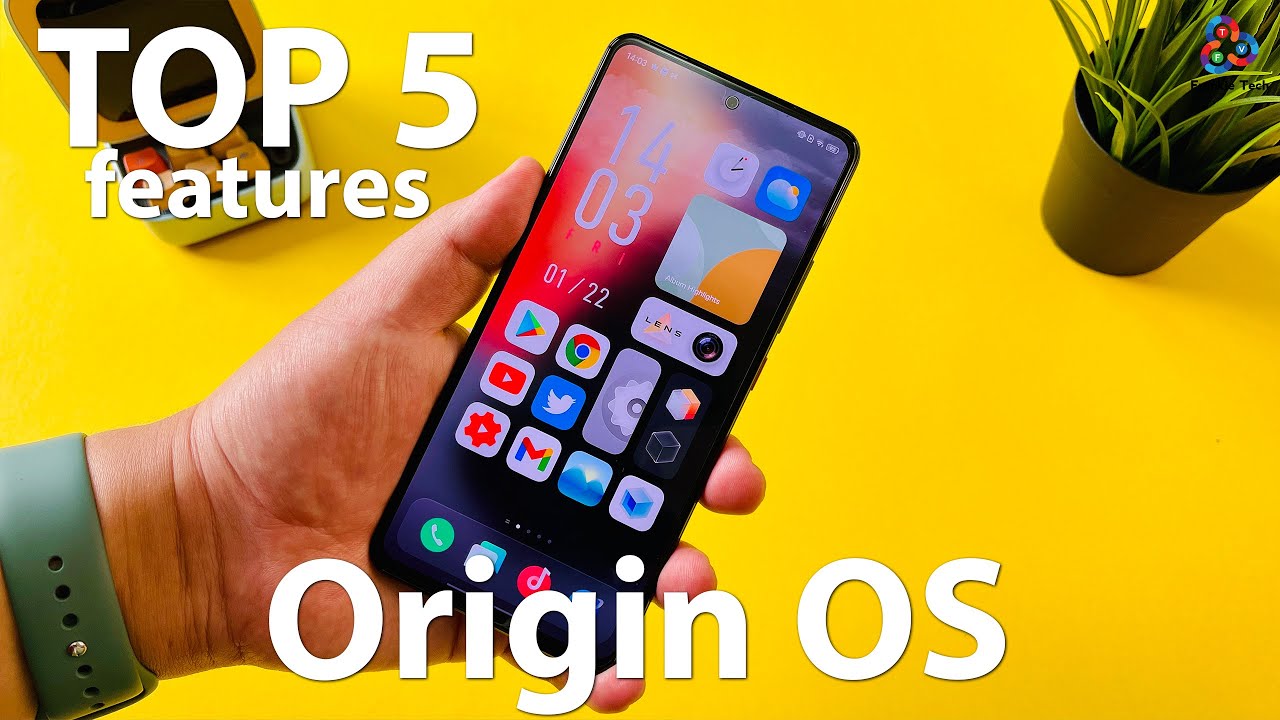
Let's talk about my top five favorite features of origin OS. The first feature has got to be the new launcher and according to Vevo, they were inspired by what are called the klutzy grid. So if you've ever played a Loki puzzle, it's this kind of little wooden puzzles where you have to kind of move them around to get a certain block out of the game, and they've kind of applied. That logic. Here to the launcher, by having a mixture of small icons, rectangular icons and squared icons, they claim that it makes it a more useful and a much more intuitive experience.
Now upon first use to me, it almost seemed like they were wasting a lot of space with these icons, but I've grown to really enjoy this look, and if you notice right there, I press and hold, and it actually shows you the name of the app. Otherwise, it's a very clean look- and some of you may not like this- and some of you may love it, but I think it's the lack of words, as you see there that make the entire launcher just look so much cleaner and so much better from the giant clock face to album. Highlights this lens icon and this giant settings icon, I'm absolutely loving the launcher on origin OS now. The second feature is kind of what's found within the launcher, and that is what I call these smart toggles, the first you don't notice are there, but they actually lend to a lot of customization on this software. So, for example, if you click on settings, you go straight to settings there you go, but these right here are actually shortcuts to different toggles that you can go to so, for example, here in lens, this will bring you directly to the camera.
But if you go here, you can actually choose which lens you want to use and then jump directly to that camera. So, for example, I want to go to video. I click it I'm automatically in the video camera, or I switch over to super macro and look at that, I'm already in super macro mode, but it's not just shortcuts guys. You also have a bunch of different ways. You can customize the look of the launcher, for example window style.
Furthermore, you can choose between monochrome blur sky and time. Furthermore, you can also adjust the icon style, and you can even go traveling through a parallel world. What does this look like guys? This is your traditional launcher. So if you're not a fan of using the what's called reformer, you can basically go back to the traditional look traveling through a parallel world, and we're back here to the origin, OS launcher. I think a lot of you guys would switch over to the traditional launcher.
But after using the deformed launcher for a couple of days, let me tell you it does grow on you, and it's all accessible in these types of toggles. You also have custom edge gestures, and you can go from back to super card pack. You can even adjust the gestures down here right from the home screen, full screen gestures, classic three sections or navigation keys. Let's switch the navigation keys there we go, I'm going to go back and switch to full screen gestures, press the x here, and we're back- and these I did show yesterday- were the toggles for animations performance, refresh rate and network display, and this will basically allow you to switch from battery saver balance modes to monster mode which increases CPU performance. You'll want to be on this mode for gaming as well, and you can also adjust the refresh rate between smart settings, 120, hertz and 60 hertz.
So all in all guys, the toggles are definitely my next favorite feature of origin. Os they're super useful and I just love the fact that they're easily accessible here from the home screen. The third big feature, I'm loving of origin OS have got to be the wallpapers, specifically the live wallpapers, and it's called parallel world. You can go ahead and apply this, and I swipe away- and I have this really cool parallel worlds- wallpaper in the background, but you also have what's called behavioral wallpapers that adjust automatically based on the media volume or based on your steps, including daily screen interaction levels and display brightness as well. So let's go ahead and turn on display brightness and let's lower the brightness and see what happens when we do lower it.
There we go it's pretty low there. Now, let's go ahead and crank it up boom. So that is cool that it's interacting with what you're doing, and I would definitely use the steps' calculator to be able to see throughout the day, if I'm actually completing my steps and have it be an interactive wallpaper in the back. But you also have some terrific static wallpapers. As you can see, this is the one that came included here on this VIVO iq7 and just really cool wallpapers very minimalist, but I think they are just a step above what we've seen from a lot of OEMs this year and so whether you're using static wallpapers live wallpapers or behavioral wallpapers.
I think you're going to have some pretty terrific wallpapers on origin OS on this VIVO iq7. My fourth favorite feature has got to be, and it's a small one, but it makes a big difference. The control center toggle- and if you remember, for the longest time fun touch OS, had you swiping from the bottom kind of like an old iOS device, I'm glad they moved away from that. But one thing they haven't moved away from is actually keeping the toggles here all at the bottom of the display and in my opinion, this works so much better than most other phones. For example, here we are on mini 12 on the mi 11.
All the toggles are at the top. They are much harder to reach, and even when you use iOS, you get the toggles, but they all stay at the top. Vito, I think, has been very thoughtful and the fact that they move the toggles all the way down to the bottom of the screen, which makes it not only so much easier to access, but it also looks better in my opinion, as you have all the icons here at the bottom rather than floating here at the top of the display. It may seem like a small thing, but for me, it's such a killer feature. I can't believe other OEMs, don't do it, and it's my fourth favorite feature here of origin OS and the last feature I'm going to share in this video are the core components or the additional toggles that you can add here to origin OS.
So if you swipe from the bottom, you basically get your app drawer, but if you swipe over to the left, you get what are called core components and that, in addition to these, NATO alerts that are brand new on origin OS will give you small kind of widget type of information. That will be very useful so, for example, core notifications, which can remind you of flight times or other appointments you have, which, if you see right here, is already installed on page number. Three and the combination of these NATO alerts and core components like a little screen time widget, which lets kind of move over here and just place it go ahead and turn that on and there you see it now. You have a little interactive widget for screen on time, but there's so many more of these core components to choose from like clean and speed. Like your alarms, like your weather, apps, your album highlights, and of course you can make adjustments to the clock as well, and the combination of these core components and the NATO alerts mean you're.
Just going to get more helpful, bite-size information here on origin OS. So that's it guys for my top five features of origin OS so far, and I'm just scratching the surface of this software guys I've not used Aviva phone in a long time and for sure there's a lot more to talk about here, for example, in settings with like dynamic effects that you can have all this stuff is kind of more similar to what we've seen previously on fun touch OS. But I think the overhaul that they've done just to the whole launcher and to all the different experiences you can get from the home screen, really means that you won't be interacting with the confusing settings which I'd say are the closest part to fun touch OS that still exists with this software and so all in all guys, loving origin OS. So far, it's a major step above what was previously available for viva phones, and it is no longer, most importantly, a dealbreaker. I can now recommend VIVO phones to you and know that you will have a great experience, at least in terms of software with origin OS, but hit me up in the comments.
What are your thoughts on origin? Os and what are your favorite features so far of this sleek new software skin from VIVO hit me up in the comments? I'd love to hear about it, and that's it for this video. If you liked it give me that thumbs up and if you love the content of Frankie tech subscribe to the channel hit, the bell icon for future updates stay tuned, guys more great Vito, iq7 content coming very soon- and this is where I leave you by saying this is Frankie. Tech signing off have a good one origin OS baby, and I can finally once again recommend VIVO phones. You.
Source : Frankie Tech
