Oppo Find X3 Pro Review - wait WHAT!? By Mrwhosetheboss
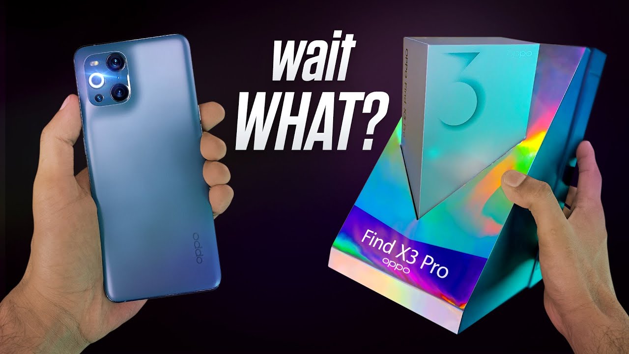
Okay this is opp's 2021, flagship, smartphone and so many emotions it arrived to me in this beautiful presentation box. I have to say, although you could argue that in the age of supposed eco consciousness, did we really need all of this just for a paper invitation, no literally apart from that, it's just two stacked empty boxes and then in the main, compartment is just the retail box of the phone. It is a great retail box, though clearly they've tried to add a little of flair and, to be honest, I'm all for it. You get an insert made of surprisingly nice material inside, of which a soft touch matte case you get an USB cable. You actually get a pair of earphones too, which, as far as free in the box buds go I'd, give a solid 7 out of 10 too, and a charger. A full powered, 65 watt charger, so very tough to complain about this, then we get to the phone, and I remember when I saw it for the first time.
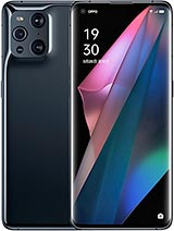
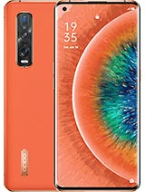
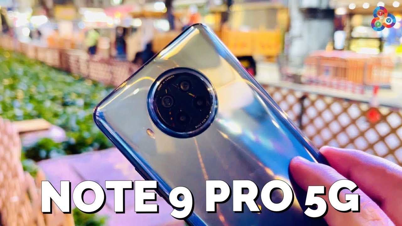
My very initial reaction was wait. What this is an iPhone 12 Pro max? This is an Oppo find x3 pro the opposed cameras, they're, almost a mirror image close enough that there is no doubt where the inspiration is from, but different enough- that it kind of looks like something's a bit off. It's not quite a square. The spacing between each of these lenses is slightly different. These two are raised.
This one is flush and even though everything else is a circle, they've elongated the flash module just generally. This is one of the most polarizing designs. I've come across because on one hand, I don't think it's particularly pretty this whole sloping design. I know it's meant to look gracious, but for me personally, I just can't shake the feeling that it's like a skin, that I've not applied properly and for a smartphone whose entire strap line is awakened. Color, it's just a bit dull like what happened to the gradient finishes.
They used to have well even last year's vegan, leather one. I thought that was great but at the same time opposed managed to make the most comfortable phone I've ever held, and I've held a lot of smartphones. It's this really delicate balance of being slightly thinner and lighter than you'd expect, but with still enough heft to feel luxurious. It's got this smooth matte finish with an almost shocking resistance to fingerprints, just look at it. Furthermore, it just stays clean and the fact that the entire back is just one continuous, uninterrupted sheet of glass means that there's practically no risk of your fingers bumping into anything at least when you're holding the phone.
Upright you get the idea. This is the least Abby experience. I've had in a long time, which is quite refreshing, coming from an iPhone 12 Pro max, because this phone by comparison feels like trying to hold a shrike okay design. Aside, though this was a really tough device for me to review normally after I've used a phone for a few days, a narrative just kind of hits me some sort of high level. One sentence summary that I can leave you with, but I don't hear the find x3 pro is a complicated smartphone, a bizarre combination of delights and disappointments of things, so good that I wanted to scream about them, but then other things that I just couldn't help but be let down by like the cameras of the phone, they seem like a dream, come true: it's using a high-end, 50 megapixel main sensor, and this in itself feels pretty flagship in terms of detail and dynamic range and because it captures so fast, it's got an impressive resistance to blurring like here versus a galaxy s21 ultra.
But what's fascinating is that we've got two of these sensors. This is the first smartphone that I've ever seen that also uses the exact same flagship grade main sensor for its ultra-wide camera too. So in effect, we've got two main cameras. That's such a cool idea. I love taking ultrawide photos.
There are so many situations it's useful in, and so the idea that I can now do that and not feel like. I'm compromising on quality is enough to make me internally squeal with delight, and this feels like a pretty good Oppo unity, to say that a sub to the channel would be radical, I'll, squeal even more, but it gets better. This third one is a micro lens, camera think macro only to the extreme and actually done well. You can get so close to objects that it feels wrong so close that you can easily see the pixel arrangement of a retina display so close that you can see every individual thread in a piece of clothing. This is true macro and because, when you get this close to objects, you're kind of obscuring a lot of the natural light, this camera has its own light, which, when I saw it for the first time, is one of those moments where I could feel this smile creeping across my face.
Thinking, yeah, that's that's pretty cool! It is only three megapixels, but it's just enough clarity that you could use these photos on social media, and it wouldn't really look like anything's off, and they've managed to do all of this and still fit in an optical zoom. Camera, so here you go, Oppo take my money except this is where it gets a little complex, because, yes, this is a good set of cameras, but it's not really what I thought it would be. So for starters, this whole idea of having two main sensors, I'm not actually convinced it makes a difference. Yes, you can switch between the main and ultrawide camera and there's no weird color shifting. But if you really compare the end, ultrawide shots to the Samsung, which makes no extraordinary claims about its ultrawide camera, it's really a personal preference which one you like Oppo goes for a bit of extra sharpness.
Samsung goes for a bit of extra smoothness, but I wouldn't say either is really winning and trust me. I wanted to believe that this would take better ultrawide photos, but I just don't see it, and it's a real shame, because you can tell the operas using a higher quality sensor like if you go and record ultra-wide video in super low light. It is cleaner, it is getting in more light, but as soon as you start taking photos which are more reliant on software processing, Samsung makes up for that hardware deficit without actually even needing high-end hardware, and then there's this zoom camera weirdly. I was told it was three times optical zoom, but it's looking an awful lot like two times to me. Either way, though it's completely minced by Samsung, but also even opp's own last flagship, the find x2 pro and even the front camera is, is a little hit-and-miss can be great, but the dynamic range completely tanks.
Whenever you try portrait mode shots, it really makes you realize just how good the competition has become to be clear. The fact that in most cases this is trading blows with the s21 ultra is a compliment. I'm not saying that this is a bad set of cameras. It's just that the things I was expecting to be blown away by I wasn't, and the thing I thought would be a useless gimmick. This microscope is actually my favorite feature.
Also. I should probably mention that opp's built-in photo editor is probably the best I've ever used very fast loads of options, and this leads me onto the main selling point of the find x3 pro awaken color. This is what you'll see plastered across all the marketing material, and the pitch is basically this other flagships can display life in 16.7 million colors, our phone can do a billion and what they mean by this. If we take away the marketing is that this is a 10-bit smartphone. To put it simply, every pixel of 10-bit color basically contains more information than a normal 8-bit one would, and so you could kind of think of it as a higher quality pixel.
We shoot these videos in 10-bit, because this extra information in those pixels gives us flexibility. It allows us to turn footage that comes out like this into smooth punchy footage that looks like this. The only problem, though, with 10bit, is that it's not really an industry standard, yet there are tons of programs and devices that just will not support it, and so what's impressive about this, is that we've got a phone here that cannot just capture in 10-bit color, but can store and read these 10-bit files seamlessly all while giving you a screen that can show that 10-bit content in its full 10-bit glory. But all that said, I wouldn't be surprised if 98 of users of this phone didn't even realize that was happening, the 10-bit photos look identical to the 8-bit ones straight out the camera, and even when I try to use an editor to exaggerate the differences. It's really not that obvious in this case, unless you're going to try and shoot in a flat, color profile, in which case you need all the flexibility, and I guess there's no better evidence of this than the fact that on this phone, 10 bites is turned off by default.
Don't get me wrong. It is still great to have that option. But it's just. I don't remember the last time I saw a smartphone get launched whose headline feature was turned off out the box, and that brings me to this display, which is an embodiment of this entire sentiment, because on one hand it is a technical marvel, quad HD plus resolution, one billion colors, 120 hertz, dynamic, refresh rate HDR, 10, plus up to 1300 nits of brightness. I could keep going, but at the same time the consensus I got from people was that it looks good, not amazing, not mind-blowing, but good, and I think the reason for that is that we've kind of seen this before the OnePlus 8, the Oppo Renault 4 pro the VIVO x50, everything from the dimensions of this screen to the subtle curve to the whole punch cutout in the corner to the general bezels around the sides.
It is feels like d?j? vu. Yes, it is technically better in almost every sense, but it doesn't feel distinctly different. It's cutting edge sitting in the canvas of mid-range, and it's just weird that opp's own find x from three years ago, actually had a more seamless display. It's functional. Furthermore, it's just nothing new.
I do like opp's software, though not everything about it. I think the home screens and some icons look very 2016 in design, but it's very polished you could tell they put a lot of work into refining the transitions and the animations to make sure they work. Well with that 120hz display, plus it's hugely customizable, and the menus are both pretty and functional like it's so quick to change wallpapers here that it makes Samsung and apple solutions look cumbersome, and it is just all around a well-packed, fast phone snapdragon 888 chipset 12 gigs of fast ram, 256 gigs of fast storage, which is double the industry standard. You go to 4 500 William hour battery. You get wireless charging, you get an ip68 rating, so hopefully you're starting to see why this was such a tough phone for me to review, because it is brimming with interesting features, good ideas and some genuinely groundbreaking innovation.
But it's just for each thing it does well. There is a slightly different asterisk next to it and as a result, I'm not really sure who it's for it's 1099 pounds here in the UK, so it is priced like an ultrafine and while it does have impressive specs for me, it is outdone by the s21 ultra in just about every important category. Overall, camera performance battery life audio and display the Oppo does have merit it's packing that same performance into a much more ergonomic shell and that microscope camera is how to do a feature properly, but it just feels a bit lost in the middle. If you wanted pro, the s21 ultra is definitely more pro, and if you just wanted a slim, fast high-end phone, then to be honest, you could get away with the s20 Fe for half the price or wait and see what one plus has coming, because if last year was anything to go by, then they might be about to drop a phone. That is about the same as this but cheaper.
Do you remember that video I made about lg smartphones, where I said that one of the reasons that lg didn't stick in people's minds was because they never sent a consistent message? Each phone just felt like an assortment of whatever features, seemed cool at the time. This gave me a very similar feeling like if you asked me what it meant to own a find x series device. I couldn't really tell you in 2018, Oppo announced the first find x, and they said, look at our stunning gradient finish. Look at our beautiful seamless display, no notches, no distractions, it's beautiful! Yet in 2021 we have a completely different, looking very plain phone with a hole punch on the front. Last year's find x2 sold us on the idea that zoom was really important on a phone and that vegan leather and ceramic finishes were the way to go.
But then this time they were just like forget that it's all about microscopes and glass. Now this isn't really a criticism of the find x3 in particular, but I just think the fact that I could lay down all three find x. Phones and the only apparent thing in common between them is the logo is detrimental to the brand itself. How can someone build an association with what Oppo flagships are all about if they're all about different things, and the implication of that is that as I've been using this phone, I kind of feel like I'm beta testing, features that instead of doing a few things exceptionally well and pushing them continually forward every generation to become a leader at them like zoom or displays or even finishes. This constant change in direction gives the impression that Oppo just tries things sees what the reaction is and then drops them sometimes killing features that people actually liked.
Now, the sponsor of this video is a company called morning brew, and it's probably not what you expect. It's not an app or a service or any kind of paid subscription. It's an email newsletter. So here's the idea, you pop your email address into their site and then, once per morning Monday to Saturday, they send you a five-minute summary on everything, important in business and tech, and I like the ideology behind it, because it's being sent to you, it's a very easy way of substituting checking Instagram first thing in the morning to learning something that you can actually talk about with people. So this morning I'd actually had a section about twitter super followers.
How twitter is going to let people charge their followers to see some of their content, and the idea is that, if creators can actually make money from twitter, then they might actually put some effort in and create some decent quality content which might draw more people to twitter as a platform. It's an interesting topic. Anyways check the link down below to sign up it's free. It takes less than 15 seconds, and it's a good way of staying on top of things thanks so much for watching my name is Aaron. This is Mr who's, the boss, and I'll catch you in the next one.
Source : Mrwhosetheboss
