Official iPhone 12 | 12 Pro Clear Case with MagSafe unboxing and review By Big Unbox
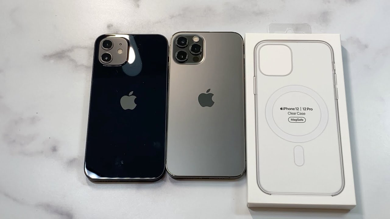
What is up guys welcome to the big unbox, where we do that small tech and today, I'm back with another big unboxing for you for the iPhone 12 and iPhone 12 Pro, and today we're back with the official clear case from apple to unbox. Do a quick review. As always, you know, throw up the link in the video description if you want to check it out, pricing about 40 bucks or so it's definitely going to be steep for a clear case. I usually can't recommend a clear case for that price point, but apple always up charges, so we'll check it out to see if it's going to be a hit or miss for your brand new 12 and 12 pro presentation very clean. You got the white box, and then it shows you it's MagSafe charting compatible and all that good stuff, the back really just clean as well, nothing really to it. So, let's get right to it.
Presentation clean, which you would expect from apple. You got a little tab up top to unbox it this little sticker, and then we'll get right to the unboxing as well. So, let's go on check this out boom, that's pretty much it! You can see that this is kind of a. I guess this would be kind of an eyesore to me um, that's it! It's going to be compatible with that new charging, uh cord- or, I guess little charging disc, but to me to that's kind of an eyesore for a clear case. What do you guys think about that and like the circular right there, it just doesn't look to me? It doesn't look very um clean.
I guess it's! The right word. It's kind of a gel style, hard, shell plastic combination, hybrid case. It's got a nice feel to it very nice as well, but to me that's kind of an eyesore for myself, especially when I'm looking at a brand new clear case. Um. Give me one second here: let me bust out this.
So I'll show you guys what I'm talking about. This is the brand-new charger. So that's pretty much what they're talking about yeah it's compatible, and it sticks right to it. Why do you need to look? You know what I'm saying to me: if I'm getting a clear case, I just want a clear case that doesn't show yeah that to me, it to me this is a no-go from the get-go. Just because that doesn't look very clean, that's not something I would expect from apple on a brand new uh case.
A clear case would be that just kind of eyesore. I get what they're saying here: it's compatible with this brand new charging disc, and it fits up perfectly. So that's cool! Look, it's a magnet, and it's perfect, but you take it off, and it looks just silly to me, but we'll check it out otherwise brand-new clear case wipe it down, wipe it down. This is going to be compatible with both the 12 and the 12 pro, so either one should look brand new and clean as well. Let's wipe it down, wipe it down, we'll do the 12 pro first, and we'll take that clear case snap it right into place.
So that's what you're looking at does that look funny to you. It looks really silly to me um. I don't really know what they're going for here am. I am I missing something I don't know what the joke is. You got the circular.
You got it's a charging, basically a pattern for the charging port uh nice. Looking case perfect, looking quality, you got the nice protection for your actual. You can see it's actually raised. They did perfect with the actual camber protection right there. You can see it's raised around the edges, so you are getting that raised edge for the camera protection, so it's definitely not flush around the actual back of it.
So that's very nicely done. Apple logo is shown, looks spotless, but again is that not an eyesore to you um to me, it is. I don't think I would want that on a case. That's just to me. I don't know what you're.
I don't really know what they're doing here to me that looks really cheesy. Let's check out the lip, because everybody likes a fat Liz hip and lip protection. You know decent enough. Your lip protection around the edges bottom parts exposed, but it does have some decent lip protection right there around the edges right there top and then all the way to the bottom, which the bottom part is exposed, volume up and down, and it's actually that's actually not too click yum. It's got this gel style finish to it, so I almost wish they would have switched up the buttons to a different material they're hard to press, which makes it very, very tough to press you not a huge fan of that.
I, like the buttons to be very click and responsive alert. Slider is easy. To get to speaker, looks good power, looks good, and then you can see in the butt same with the exact thing on the actual power right. There is kind of that tough gel style finish so to me, and we'll do the same thing: real, quick anybody rocking the 12 and the 12 pro it's the same exact build so put that to the side, and we'll slap it on. Let me do the same exact thing: wipe it down, wipe it down, make it look beautiful that black, that is nice, that black is a deep black.
Tell me that it's not beautiful all right slap it on again same exact thing. Yeah, to me. That's just not that's not impressive! That's not something that apple um. Unless I'm missing something that circular I mean it just looks, it looks garbage. I mean that's, not something I would recommend to anybody.
I don't see why they, I see you know the charting whatever their new charging thing is that's cool, but I don't need to know that it's there. That's to me not cool same exact thing. Everything looks else, the same all right, guys, here's my honest recommendation! This is a miss. This is probably one of the bigger misses that I've seen from apple in a while, and I'll. Tell you why that design is just not up to apples um, you know the resume is really strong in design.
This is not a nicely and nice presentation. This is not something that's premium. Looking this looks trashy I'm going to say this is a big miss. Let me know what your thoughts are on the comment section if I'm missing something I'll be glad to take it back. But to me this is a no-go.
This is a big miss hit the subscribe button. We'll see you guys next time you.
Source : Big Unbox
