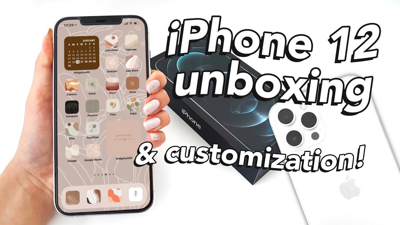
iPhone 12 Pro Max Unboxing & Aesthetic iOS 14 Customization By emilystudying
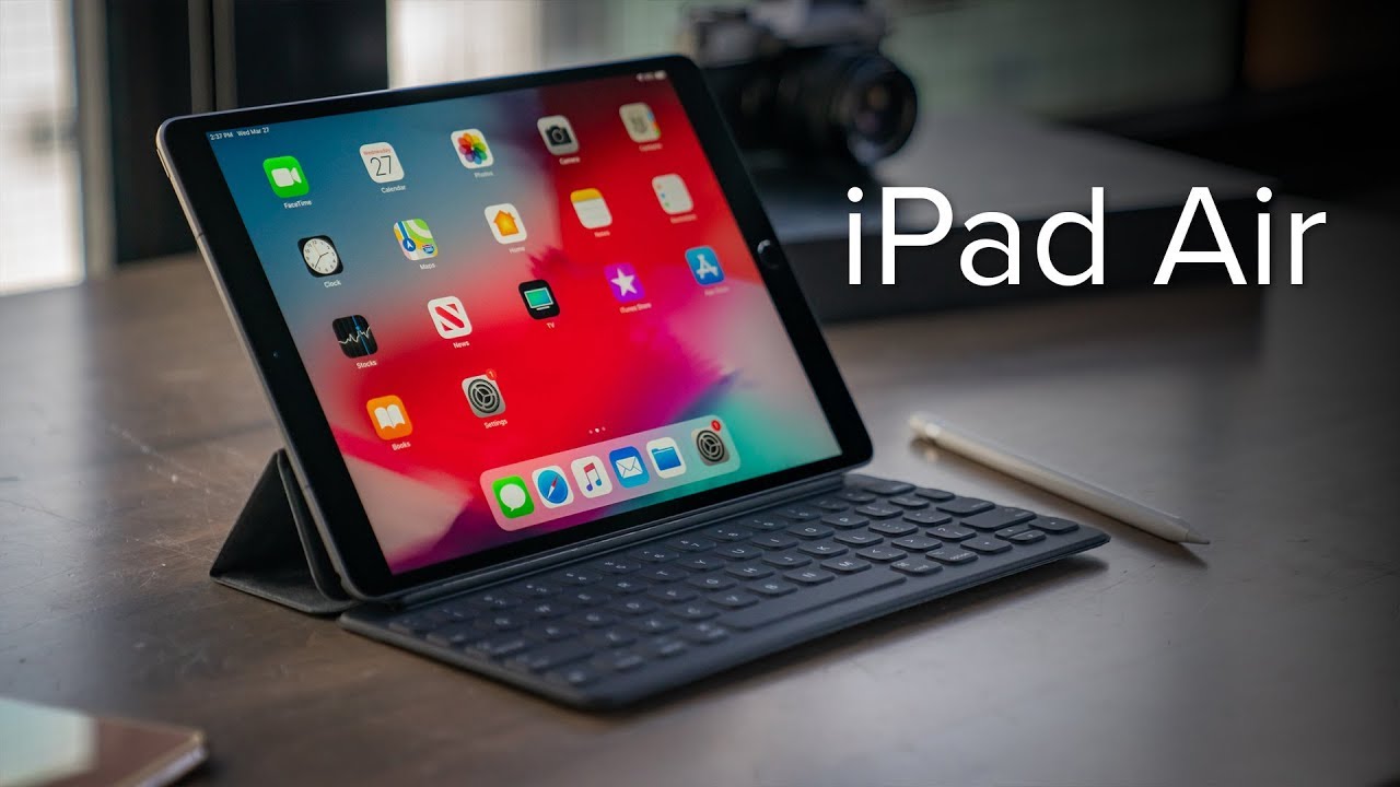
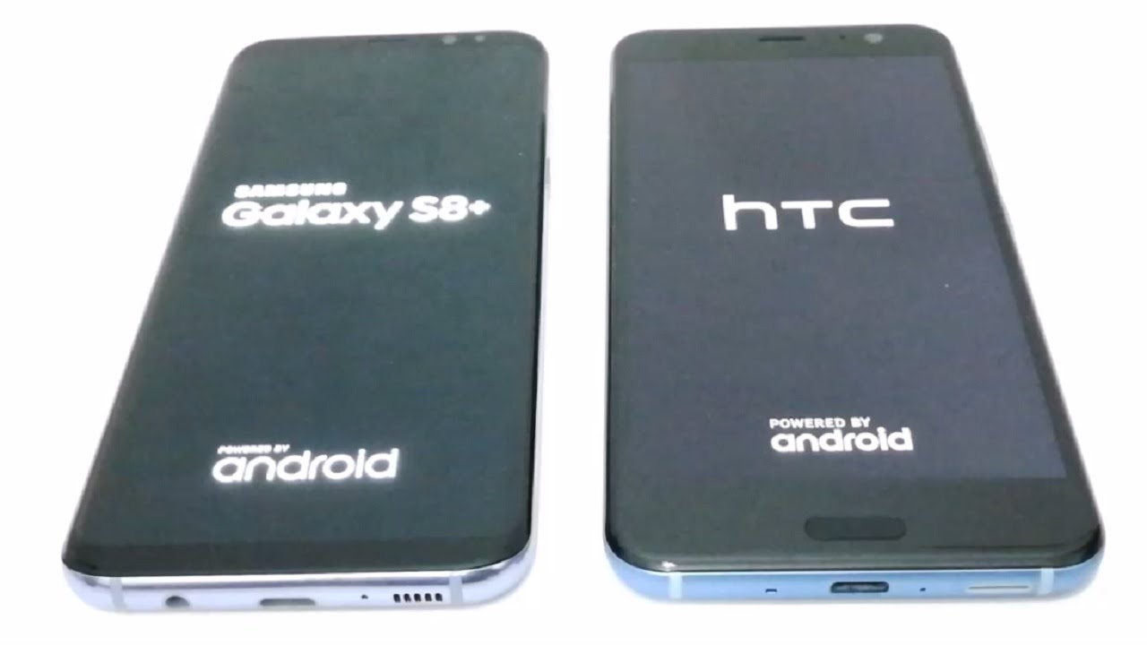
So, so, okay, so I think I'll talk for the rest of the video, but I hope you enjoyed that relaxing ASMR, whatever it was part of the video, but I'm just going to walk you through everything I did next with my iPhone and especially since I'm going to be customizing it and showing you guys how to do it, so first I had to set it up, and then I had to connect it by like scanning with my iPad to like to make it easier to set up. But anyway, if you made it this far, thank you for sticking around and like and subscribe. If you want to, but anyway, here is a comparison of my old android. It was pretty small compared to what I currently have, but it's a pretty big upgrade anyway. First thing I had to do was download all the apps I wanted. I literally didn't have any apps, and it was just all the normal ones.
They give you to start off, so I just started with like Instagram. I was going to download TikTok, but then I eventually did it's so addictive anyway. This is an iPhone case. I just got it off Amazon, it's pretty basic. I just wanted something just in case.
Furthermore, I dropped it anyway. So now we're going to get into customizing the iPhone first is. I got this wallpaper. Also, all the photos I use are on my Pinterest, which are linked below so check it out if you want to, but I just set it as my home screen as I just really like this wallpaper. But anyway I had all the apps- and I wanted to add app covers so first head over to shortcuts press the plus button and then select open, app and once you've found that you press open and then choose the app you want to.
You can choose any app. It doesn't really matter. I just chose word here: click the three dots in the corner. Press add to home, screen press choose photo and then choose whatever photo. You want.
Also. I have a more detailed video about this in my iPad iOS customization, and then you can just go and rename it to the normal app and then rename the shortcut name to word or whatever you want doesn't really matter and then press done, and then your app will be right. There, all customized and with an app cover, so next I'll be showing you how to make widgets for your home screen. First download widget smith, which is a free, app open it and then press add a small widget, medium widget, whatever you want and then click on the widget, and you can customize it to whichever one they have. They have a bunch of different templates.
You can choose from, and it's all free here I chose a monthly calendar, they have other options, but they cost money. So you can do that if you want it's really up to you, but they have a bunch of other ones. So once you've done that you can go to aesthetic and theme, and they have all these like fun ones, but I just like doing the customized one. So you click on customize theme, and then you can choose different font if you want, so I like New York, it looks very you know, modern and like serif, I don't know how to explain that anyway. Next is tint color, which is the color of the words, and then I'm going to go into background and choose a color.
I chose brown to match. Like my beige, aesthetic I was trying to go for, and you can choose a border color, or you can have like artwork all that stuff. But once you finished press apply to this widget only, and it's going to save it, and then you can also add another widget. So here I'm going to add a medium widget, and I'm not really sure what I want to do with this one. Yet they have just like a bunch of different options.
So I was looking through, and then I decided you know what I'll do the um, the moon, one cause. It looks pretty cool the moon phase, and it's like kind of matches. My aesthetic, if you know what I mean so once I chose that I went back, and it saved, and then I wanted to add another one. So I put another small widget, you can add a large one, but those are huge. So it's really up to you.
I decided I wanted to put a photo in there. You can choose like photos on an album like anything like that. It's really easy to add you press select photo, and you can choose. I put a quote from Pinterest next I'll, be showing you how to add it to the home screen and like rearrange everything so once you've done all the app covers. I suggest you do the widgets after so here are all my app covers, and you press edit home screen to get like the wiggling, and then you press the plus button in the corner, and then you'll be guided here, and it'll.
Have all these widgets you can add, but I'm going to add the widget smith one at the bottom, and you choose the ones that you have, so we currently have two small ones and a medium one. So you just press, add small and done there. It is then, afterwards you can add another one by wiggling the app by just pressing and holding it down, and you can press homes edit home screen, and then you can go back to widget smith, add a medium one and then, if you have another small one, just add it again, and you have to go click on it to change it to the small number one which is a different one. So once you've done that you just have all your widgets there, and then you can go around and rearrange them by then again, dragging it and wiggling it all around. And here I'm just going to give you like some tips for aesthetics.
You know, try to make it like asymmetrical and like different shapes, it really makes it look cool and interesting. If you know what I mean so afterwards, I had like a home page and I wanted to get rid of the colored apps, because those didn't really fit with like the aesthetic. So you just hide it, and then it'll go like off downloaded, but don't worry, you can get it back afterwards. If you want it next I'll be adding the widgets to the sidebar. So you just add another small widget or whatever you want.
It basically works the same. It's just on the sidebar, and then I'm going to go choose like a picture, and I'm going to put like something from Pinterest anyway. So I'm not going to repeat that same process, because it's kind of boring and I just rearranged everything into a nice fashionable order. You could say, and then I did change some pictures around, but it's basically the same thing. So here is the final setup.
I'm just going to go swipe through from the sidebar. I did change it up like I said, but it's basically the same, and it's very customized. So here is one page. I really like this page. This is my favorite personally, and then I have these little apps at the bottom, which are just like my essentials and then here is my next side, where it's like you know very nice and like I just like the theme of it.
Overall- and I think I did like a pretty good job personally like it looks pretty nice but anyway, thank you so much for watching, and I hope you enjoyed it and, like maybe you'll, go customize your iPhone, but if you're interested you can watch my iPad one here bye-bye, you.
Source : emilystudying
