iPad Pro 9.7 inch on iPadOS 14 - How Does it Perform? By TheTechPerson
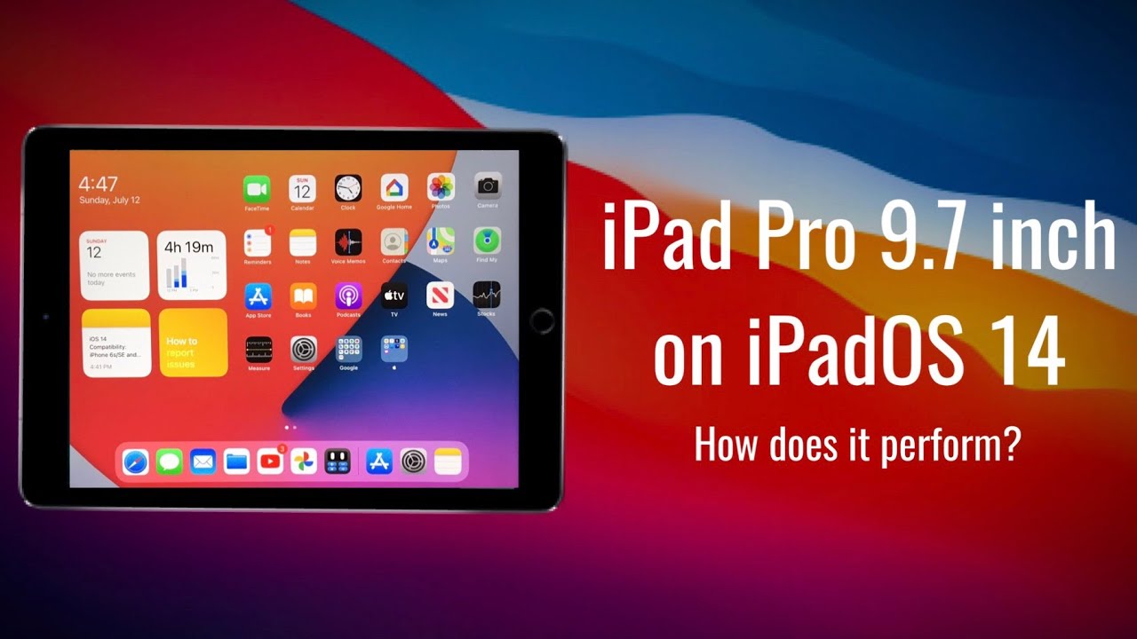
Apple recently announced that the iPad was fourteen public beta is available, but how is it performing on the iPad Pro nine point, seven inches and what features are available? Let's start with the home screen. The only difference we see on the home screen is the new widgets right from I was 14. They look perfect and are a nice step up from last year's widgets. We can all size them the way we want. However, you can't move them on to the middle of the home screen, which I don't see as a huge issue, but it would be nice stuff. The option one thing I would like to see is being able to have they will just pin to the site for all pages on the home screen, not just the first one.
We also don't have an app library on iPad away 14, but it's not that important on an iPad. We also have the Translation app on the iPad, which makes no sense, there's also a new feature, an iPadOS 14 called compact UI. This is in many parts of the OS. We're not in all spotlight. Search now doesn't take up the full screen and looks way better with a much richer search results similar to the Mac Siri, now also doesn't take up the full screen anymore and looks great and a new user interface by default.
You can't see what she heard from your voice, but you turn on a setting and Styrian search. You can see what she hears if you want to edit what she heard just stop one attacks and a window pops up with a keyboard. Furthermore, you can also send audio messages with serum, which is a good change. However, I, do you think that the new series erase is flawed for one major reason, you can't talk to Siri and use your iPad at the same time. So what's the point of it being in the corner, if you can't interact with the iPad, so overall, the new Siri UI looks great, but it doesn't work perfectly.
You all said a new call UI, which finally does not take up the entire screen. You can still interact with the display, though so that's good. Hopefully we see that logic applied to the new Siri UI. There's also compact. UI in many other parts of the West, for example- let's say your time is up for YouTube with screen time.
If you tap ignore limit, you no longer get a pop-up and instead it is a small menu, but hopefully this is applied everywhere. It's just low battery alerts and sending files with airdrop Safari also got a few upgrades. First, we now have a super cool privacy report. It shows you how many trackers each website uses that you visit. It also shows you what trackers you are using websites also load noticeably faster, which is a great improvement.
You can also translate pages on. Safari I have also noticed some UI changes at this point. I see no reason why to use Chrome when Safari is just so much faster and has better privacy. The notes have also got a good upgrade with some new features. It looks nicer and now also odor crack sweeps.
So that's how you draw a square, but it's not perfect. If I just hold for a couple more seconds and makes it perfect, you can also copy handwriting. So let's say I write. The type person I can just hold on it and copy it as text or as handwriting I can undress this anywhere, which is just amazing. It also detects information, so let's say I rent a phone number or a date.
You notice that it gets underlined, and you can hold on it to take action on that information, for example, create a contact for the phone number or create a reminder or calendar event for that date. This is a cool feature, but I don't see myself using it very often or at all. The good thing, though, is that it works with your finger or with any sightless. It's not just exclusive to the Apple Pencil there's also a new feature called scribble. This requires an Apple Pencil, but it is understandable, since it wouldn't be possible without one.
This allows you to write in any text field with without pencil. It is a cool feature, but even if I had an Apple Pencil, I still would use it, because it's just way faster to type voice, sounds all sorts of new Cola features. You can now create folders to organize your recordings, and you can now enhance your record with a single tap I have tested this, and I can confirm it works pretty. Well. All black elements have now been replaced with white in light mode.
So it's more consistent. One switch to dark mode messages also got a huge upgrade. An iPad was 14. You can now pin up to 9 conversations, which is a great change. You can also mention people in their inline replies.
My favorite feature, though, is to pin conversations. We also get the new sidebars, which are a great change in the iPad. It's way more organized which results in easier navigation in the app, for example, in the Photos app no longer have to go to the albums tab then select an album. It's all in one place, there's a pretty much copied from macOS, and it's a great change. The files have also gets the new sidebar, but the files are now in a smaller and tighter grid, which is great, and it feels more like desktop with this change.
The camera also got some small monaural upgrades. First, you can now finally change the video resolution within the app I have noticed that Began pictures feel slightly faster. Switching the camera to the front or back also looks like the new iPhones. You can also mirror the front camera in the settings which I, like you, also get the sound recognition feature which can notify you when there's a certain noise. In the background, for example, if water is running, you will get a notification or if a fire alarm sounds, you will get notification.
This will be very useful on wearing noise, cancelling earbuds, just airports pro or for people who can't hear well. There are also a lot of new privacy features, for example. Now, if you paste something you've copied that we're going to pin, this may not seem like a privacy feature, but it is many apps have been caught spying on clipboards. With this feature, you can also just skip access to just photos. You want, instead of all photos and apps.
You also don't need to share your exact location with that. Instead, you can just share your approximate location and apps. That may not need your exact location. I found keychain also tells you which passwords need to be changed, but dots also shows up at the top of the screen. Whenever an app is using your microphone or a camera, it also shows you which app used the micro camera in the control center, so great changes in the privacy department I'm also noticing a lot of smaller changes.
It has a slightly different Settings, app the ability to add captions to photos which is a great change, slightly different animations when there is a notification different animation, when opening a folder and screenshots show up much faster while taking them, there's also a new color picture when working of screenshots documents or photos. So these are pretty much all the changes on iPadOS 14, what's great, though, is that they are all available on the iPad, 4 9 1 7 inch, and finally, we made it to the last thing on the list, performance and bucks. This is important, makes it or breaks it for an iOS or iPad or something, but I don't want skills about the stands. iPad was 13. It just feels a tiny bit more stuttering in some areas, but nothing major cue in mind.
This is an early beta, and it will really improve. As always surprisingly, this video is performing amazingly in terms of bucks. Now this I mean there are no busts whatsoever, but the bucks that are present are very minor. The biggest book I have noticed is the other storage I usually use about 35 gigabytes on my iPad after the update I used 9 gigabytes, which is just crazy. The bug is part of the interface is the new widgets.
Sometimes one of them just randomly disappeared when I switch back and forth between light and dark mode, then we'll just don't change until about an hour later, but I liked. Last year, with my petawatts 13 I haven't had a single respiring, but there was slight overheating, but it's totally usable with no super major issues. The battery life is worse than I. Paddle was thirteen point five point, one I'm getting about one hour less screen on time. That's pretty bad, considering I wasn't getting amazing battery life and I hadn't watched thirteen point five point one.
So conclusion this is a great update. It's not super major like iPadOS 13, but it's not like I was twelve, so I would say it's kind of major. So if you have been thinking of getting the public beta for the iPad for nine point, seven inches I would say depends on either okay with some minor bugs, but mainly the storage bug and worst battery life. By about one hour and I would say, it's not a bad idea. Performance is good, though, and of course, the feature set is incredible.
I really like this update and I can't wait for the final version. As always, please like comment and subscribe thanks for watching.
Source : TheTechPerson

![[Sponsored] Top Five Reasons to Buy Samsung Galaxy M12](https://img.youtube.com/vi/YMDSJzTtHYE/maxresdefault.jpg )

