HTC Desire 600 dual sim tutorial intro overview hands on unboxing By SchwabTV
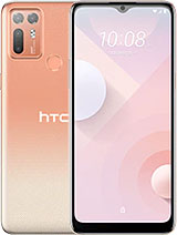
The HTC desire, 600 dual sims, has come to our office to be subjected to our review gauntlet before we dive into the user interface. Let's see what comes bundled with it. Opening the box greets us with the phone itself. HTC has included a micro, USB cable cool, looking headphones with adjustable earbuds, as well as a charger with a detachable plug plus some informational leaflets. The desire 600 design takes several cues from the HTC one. The more affordable smartphone may be entirely made of plastic, but it's still got the dual front.
Speakers complete with the beats' audio software enhancement, the similarities with the one continue below the screen where we find the back and home capacitive buttons combo surrounding the company logo. Speaking of the screen, it's a 4.5 inch super LCD 2 of HD resolution, resulting in a pixel density of 245 pixels per inch. A 720p display would have certainly been nicer, but obviously the budget didn't allow it. HTC has aimed the desire 600 duels at the lower mid-range segment, which also explains the inclusion of a second sim slot very, very popular feature in emerging markets. Under the hood.
The desire, 600 dual sims packs a Qualcomm snapdragon 2 chipsets with a dual-core 1.2. It hurts cortex, a5, CPU and arena 203 GPU. The relatively low available processing power, probably explains why the 8 megapixel camera is only capable of 720p video recording rather than 1080p. Happily, the back cover is removable and reveals the two sim card slots with a micro SD card slot. Next to them is the 1860 William battery, which HTC says it's good up for up to 11 hours of 3g talk time, just like the HTC one, the desire, 600 dual sims comes with the sense 5 user interfaces.
That, in this particular case, is running on top of android 4.12. This includes the all new lock screen that gives you shortcuts for apps, as well as info on the current weather conditions and missed calls or unread messages. Past it, you're greeted with the Flipboard like blink feed. It combines your social updates with news from present sources into one straightforward, informational punch. The blink feed is the first pane by default, but can be moved or even disabled.
Moving to the right of blink feed reveals the familiar old home screen. You'll notice, however, that app icons are refreshed entirely in sense: 5. You can have up to 5 home screens, which can hold apps shortcuts and widgets instead of side scrollable paginating panes, you get an interrupted vertically scrollable grid of icons with added settings. Google play and search shortcuts. The task switcher interface is redesigned too.
You get to it by double tapping the home button, and it displays a grid of nine thumbnails to dismiss an app hold it and flick it up to get to google. Now you can simply hold the home button. You.
Source : SchwabTV

