Customizing the Galaxy Note 10 Plus: making it mine By Android Police
Hey guys Zach here with Andrew police, welcome to another making it mind. Video I got the Galaxy Note 10 to down below in the description. So for starters, the lock screen wallpaper I've decided to use is Samsung's own built-in video wallpaper I actually think these are pretty cool, but sometimes I'll use their dynamic, lock screen wallpapers that change every time, I lock and wake the phone alright. Now on to the setup. This is it now, this time around I'm using lawn, chair v2. In fact, I've completely switched over from Nova Launcher to lawn chair v2 a few months ago.
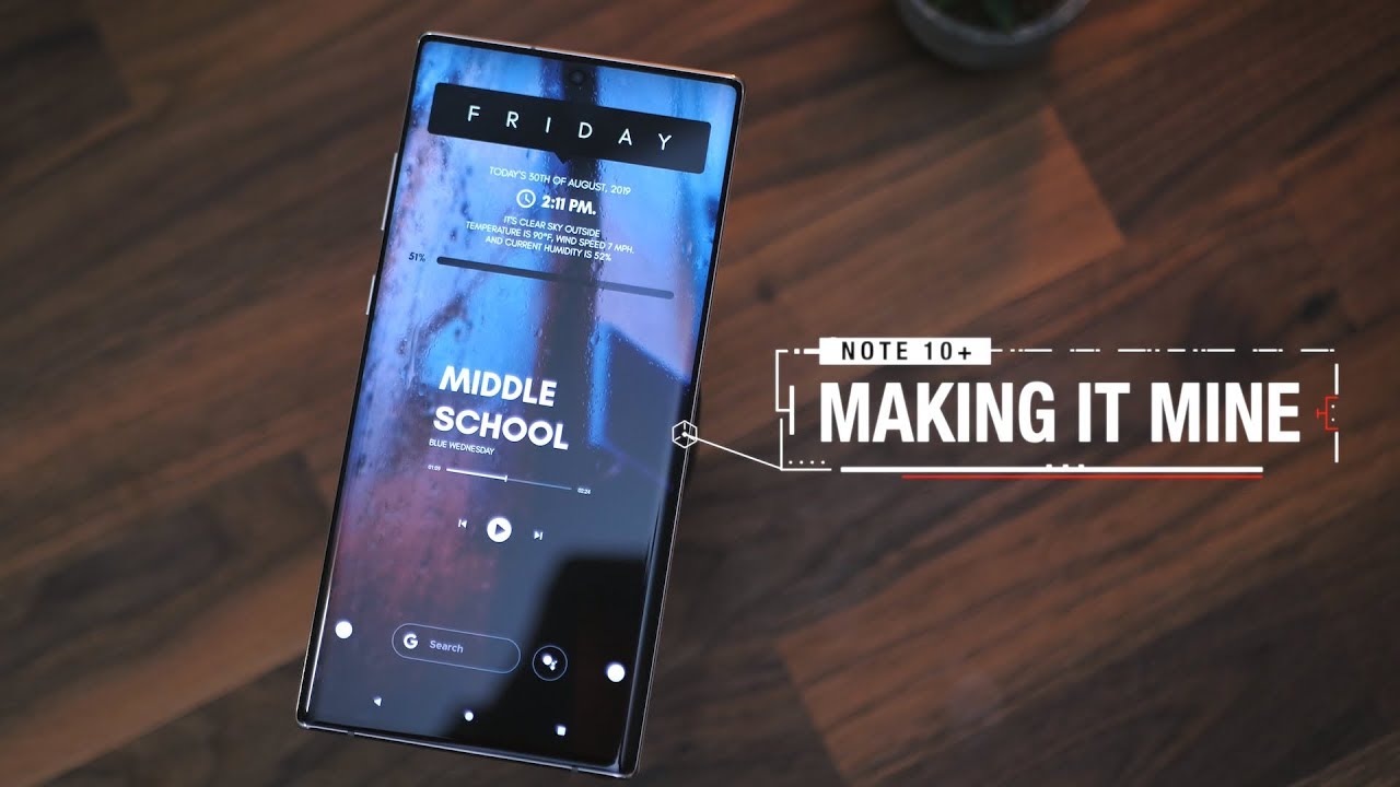
Don't worry, I still love Nova, and it may move back to it a little later, but as of now I'm comfortable with what this one has to offer, I've got a grid size of 9 by 6 I've, hidden the status bar in the dock, as well as the desktop icon labels. For that what I like to call clean at trifecta, the Google feed, is off to the left. I love having this. It's always super handy and I also enabled the blink app animation go ahead and drop a comment, if you remember which version of Android this comes from it's a nice little throwback, those two white dots you see flanking the search bar are actually folders. The dots are from the candy cons, unwrapped icon pack, and some of you may remember: I've used these white dots quite a few times in the past.
A single tap on the one on the right will open it up, and it holds all of my Google applications and, if I swipe up on the dot it'll open up the Play Store tapping on the Left dot will open up a folder holding the applications that I found. I use the most it's my usual suite of apps, then, if I swipe up on the dot it'll open up Twitter now you may have noticed the icon pack. Now this is Moxie. I've tried to tons and tons of other icon packs and I found that I usually come back to this one. This has become my default I've been using this pretty much since it was released last summer without question.
One of my all-time favorites, alright, so that search bar at the bottom I ripped that from exquisite 4k, WET I had a different one. There originally, but I felt that this one fit the set-up better with its spotless. Look originally I had the middle of the home screen completely blank, but it felt pretty empty, so I decided to put something there. I went with this. This is from mini music player for KWG team I.
Just like the way it looks, and that font is really nice. Next I've got what I believe to be the star of this set up so to speak, and that's this widget up top. This is from a spiffy 4, kW GT, and it has quickly become one of my all-time favorites. It's an all-in-one widget of sorts with time date, weather info and the current battery level. Originally, the text here was black, but because I'm, using a darker, wallpaper, I decided to switch the text to white and actually think this looks a lot better.
It falls into the theme of the setup very nicely another way, I like to customize. My phone is with skins I'm using white marble from this video sponsor D brand online. To give the phone a nice fresh look and to not have to deal with nasty, smudges and fingerprints. You can check this skin out, along with a bunch of others, using the very first link in the description. As for the wallpaper, this one actually came from a Twitter follower of mine.
They took this picture themselves, I like it a lot it's a great shot. Is it not bars, but for those of you that know me, you know that I had to toss rain paper on top I felt it was a great way to separate the background from the setup, but also keep in with the vibes of the wallpaper itself. In addition to that, it actually kind of hides the hole punch cut out up top. So that's a nice little added bonus. Moving on to the next page, I've got an upcoming event.
Widget. This one came from exquisite 4, kW, GT and below that I've got a 7-day widget from good old month. Calendar widget I've been using this for years. It's an all-time favorite for sure, as for other customizations I've got one UI's night mode enabled gotta have that, and I've also taken advantage of the good luck application from the Galaxy Store. This is, what's allowed me to change the navigation buttons on the bottom, as well as move the clock in the status bar back over to the right, where it belongs, closing things out with the app drawer.
You guys know I, usually organize my applications using folders, a shout-out to the developers of lawn chair launcher for finally implementing this. It is greatly appreciated, but other than that, that's pretty much it for the setup. I hope you enjoyed it if you did feel free to give it a like to subscribe to the Andhra police channel. If you're new I'll talk to you guys later, and thank you so much for watching.
Source : Android Police
