Meizu 16s Pro Review: The OS is Epic! By gizmochina
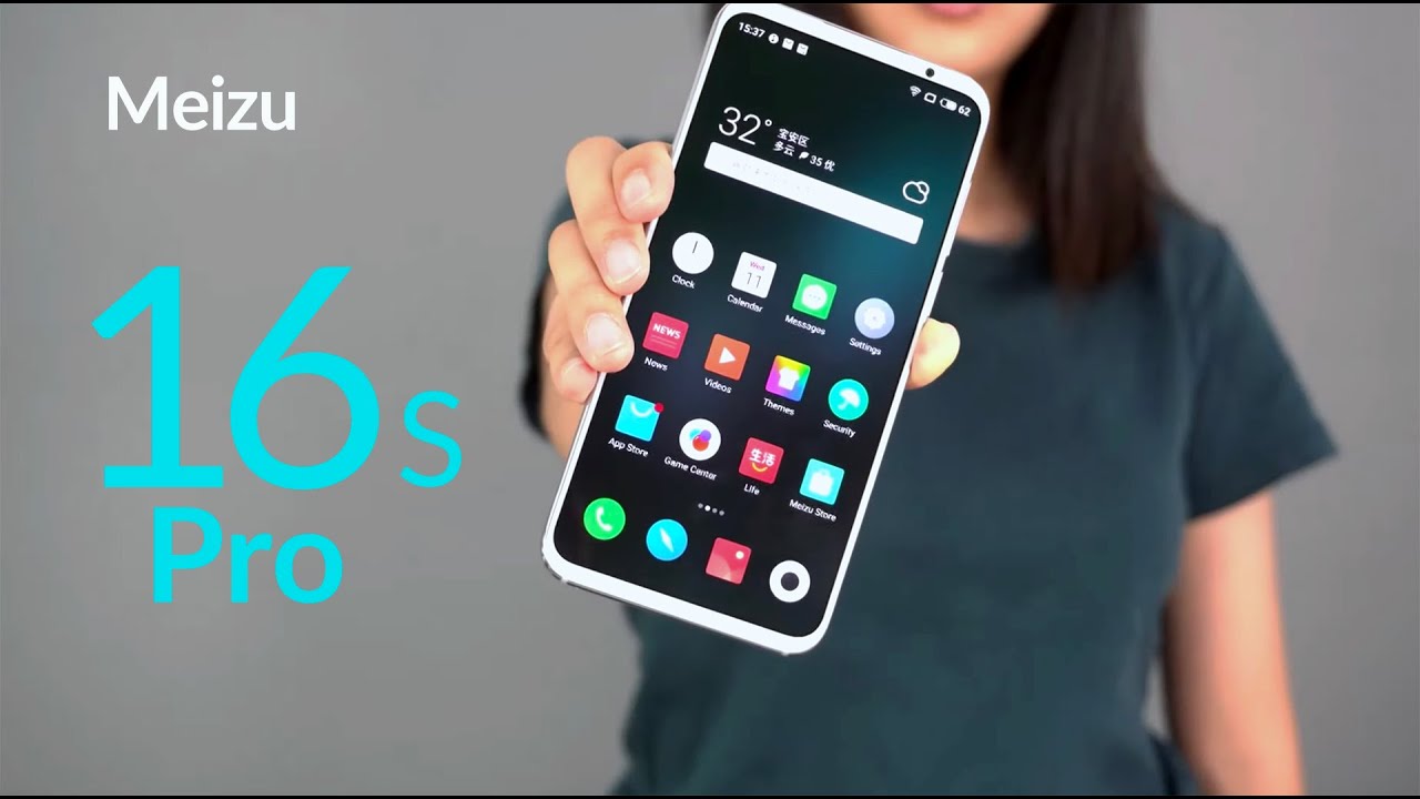
Hey guys welcome back to gizmo China, I'm, Nadine, and I'm here to welcome you today and to give you a review on the mate to 16s Pro. The price is 2699 UN, no more than $400, so with a combination of snapdragon, 855, +, Sony, IMF, 586 +. U FS, 3.0 + dual speakers: is it really a must-buy we'll find out in this video today, the overall design of the 16s Pro compared to the 16s, is almost exactly the same. I mean even the cover for the 16s Pro and the 16s is usable. You can use your phone cover or a phone case for the 16s Pro and the 16s it's exactly the same. The only difference is that the back camera has been updated to a triple camera setup.
If you take a close look, you will find no flashlight around the cameras which confused me for quite a while until I took a photo with the flash I realized that the flash is mounted around the main camera. It's like a two-in-one design with the camera inside and the flash outside as a ring. To be honest, this kind of design looks pretty refreshing which I'm actually quite a fan of, but I guess some would give it a thumbs down, because it does increase the surface area of the camera and I guess it does increase or make the Bulge more obvious and also bigger. So it does get a bit uncomfortable when you're holding it. The color scheme has also changed.
There are four colors altogether twilight: forest dream, unicorn black mirror and white story. I have to say that some manufacturers are trying too hard on naming the color editions. The buttons are on the right side of the phone, and they're pretty solid on the bottom. We find a SIM card slot, type-c charging port and a speaker chamber. There is another speaker house on top of the phone, the actual feel of the 16 s pro inherits the great tradition of the made SU phones, Fitz, and it's actually very light.
Only 166 grams super light and I would say it's pretty liberating for those who are used to those brick phones that are 200 grams. This is definitely a nice upgrade. Now. Let's talk about the screen, the display of the 16s Pro is the same as the 16s. The parameters are basically the same.
It is a 6.2 inch, AMOLED symmetrical full screen with a resolution of 2232 by 1080 manual. Maximum brightness is 425 nits, and we have four color modes available. Adaptive standard photo and bright mate SU 16s Pro has a rear, triple camera setup. From top to bottom, we can see a 20 megapixel telephoto lens the Sony, IMF 350, a 48 megapixel main camera, the Sony I MX 586, the last one is 16 megapixels super wide angle, lens Sony IMF for 8:1. The 16s Pro has a brighter overall picture and clearer details in the dark.
The white balance is not particularly accurate. The 16s Pro color temperature will be slightly colder with the photos taken in the 48 megapixel mode. The resolution is significantly improved compared to 12 megapixels, the edges of the building are more solid and the text is clear at night the advantage of optical image stabilization comes out. The purity and noise level of images are good. After turning on the night scene mode, the highlight is suppressed.
There are more details of the dark part and there are traces of sharpening in general, the night scene mode is turned on to make the first look of the photo better. Besides the 16s Pro night scene mode photo processing. Time is quite fast. Now, let's look at the operating system. The launch of the mate SU 16s Pro is more like the launch of the fly me 8 fly me is the official operating system.
For me, too, it took a lot of time to introduce the design, animation and function of the fly me 8, so the 16s Pro is more like a supporting role. So, let's take a look in detail at fly me 8. First, icons have new design. Comparing to the icons in fly me 7. There are no more shadows which make icons look flatter in many places.
In the system we can see that excess lines are removed and in order to better adapt the full screen, the desktop icon has been changed to a 4 by 6 layout and many content displays are also moving closer to the middle. This time a lot of new animations have been added in actual use. We can also feel the various elastic efforts in the system in general. Fly me.8 has changed a lot in terms of visuals. This time fly.
Li 8 has improved visual effects and functions when compared to fly me 7. We can really feel its intentions and efforts in many places, but think about it. Fly me.8 is now in the Android environment. So can it really be competitive? This ultimately depends on how the fly me system can satisfy the various demands of customers. In addition, every time you mention fly me, you have to talk about advertising now.
The UI has the option of close all tools, ads I, wonder if the fly me will have the same option later. In addition, the fever of 16s Pro is still very serious. Sometimes when it's used daily, you can also feel the heat. The heat is more obvious. When you're playing games, the heat, is mainly concentrated on the mobile part of the back shell.
So here is just a reminder for those who want to adopt the fly me 8 upgrade with caution. I just hope that in November mates you can bring a more stable and a cooler fly me 8 version to consumers. So to sum up made SU 16s Pro overall is a pretty well-balanced mobile phone, with a light touch that is unfair, terrible, and it has the mainstream flagship, configuration and performance. So at this point, I would give the mates u16s Pro and a ?, but in future when fly me, 8 is officially published. I might give it an A+.
So thanks much for watching and sticking around to the end of this video. If you liked this video, please give it a thumbs up and don't forget to subscribe. Today we were going through the May 216 s pro and the internal system so see you next time, I'm Nadine with gizmo China. You.
Source : gizmochina
