Android 12 is here and I like it By Linus Tech Tips
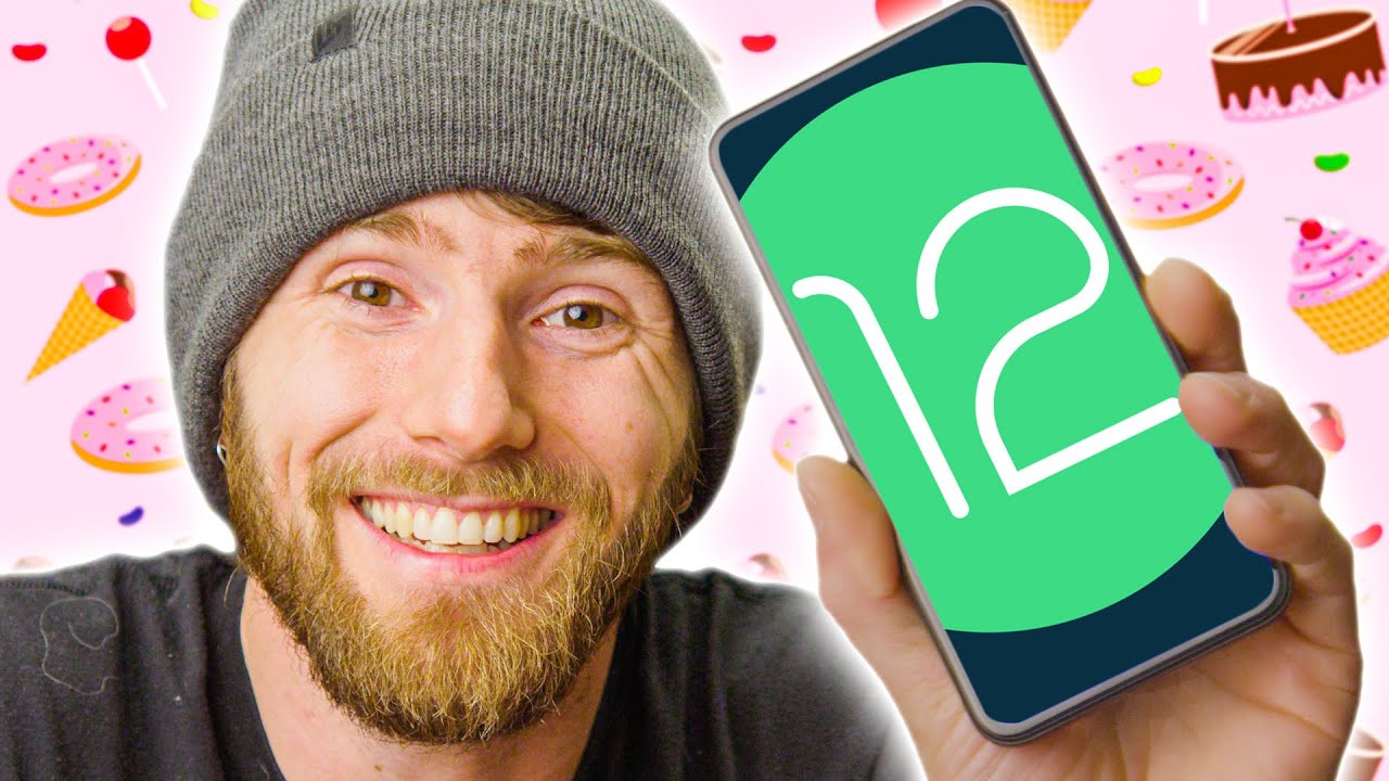
- From cupcakes to gingerbread, all the way to Oreos and pie, Android has come a long way over the years with more than 12 major versions, but not a lot has changed visually since Google introduced Material Design back in 2014, until now. With the Android 12 public beta announced at Google I/O, we are getting a massive redesign of Android, along with a bunch of fancy new tools to tailor the look and feel of the device directly to you. Material You. And you can actually try it on partner devices this time, not just Pixels, but after you try our sponsor. Today's video is brought to you by Antlion Audio. Antlion Audio's ModMic Wireless microphone delivers best in class audio quality, 12 plus hours of battery life, and it can magnetically mount to almost any headphones.
Get 15% off ModMic Wireless and other ModMic products at the link down below. (bright music) Material You is basically a cute way of saying, "We're gonna let you change the way that Android looks," because I guess I and me we're already taken in the phone space. And the customizability is both extensive and deep, including, this is really cool, a feature called Color Extraction which will pull from your wallpaper and generate a pallette of primary and complimentary colors for use in the notification shade, the settings menu, or even user interface elements like the volume slider and widgets. Third-party developers can even hook into the API to allow their apps to recognize all or some of the colors, that is as long as their marketing departments don't get in the way because branding. Unfortunately, color extraction is not available in the public beta yet, but we're expecting it maybe around the time beta two rolls out later in June.
For now though, at least you can manually adjust the colors. So that's something. They've also focused on making Android feel snappier and smoother with a ton of new subtle animations, starting with the re-imagined stock lock screen. If you're using the lock button, the screen wakes up with this effect from the side, or if you're picking up the device, it sort of lights up starting at the bottom. I don't, I'm not quite sure how to describe it, but you guys are looking at it and I think we can all agree, it's pretty sleek.
They also changed how the clock behaves. So if you clear all your notifications, the clock expands to make it easier to see the time, which will also signal visually that, "Hey, you're all caught up. " Moving on to the home screen. This looks pretty familiar, but with a new set of widgets, which along with icons, you can actually customize the shape of, finally. Now, the notification shade in quick settings are one of the areas that seen the biggest retooling with quick settings options switching from smaller icons into big gold rectangles.
Wonder where they got that idea? This supposedly allows them to display more information, but it also means that you have fewer of them immediately available. And as a power user, I'm actually a little iffy on this one. Hey, Material Me. How about, you know, letting me have either one I want, I mean, at least they do look nice and matchy. Google is also moving Google Pay and home controls away from the secret long power button press menu to the quick settings menu.
So that means that long pressing your power button can now open the Google Assistant, similar to how iOS functions to open Siri. But this wasn't enabled by default, and instead, is a toggle in the settings if you prefer it the old way. See? More options. Now, if you're a small business owner like me or just a busy person with the tendency to accidentally swipe away some of the 8 1/2 million notifications you get in a day, I have good news for you because Google has added a notification history shortcut directly in the shade. Thank you, thank you.
I actually have to use this stupid third-party, Nice Catch app in order to see my vibration and ringer history because sometimes notifications don't have a timestamp on them, which should be illegal. And I'm very happy about this. Usability-wise, Google announced a few new gesture controls including a swipe down on the navigation bar to enter the new to Google one-handed mode, that's neat. Although, I don't really think there's any Android devices that are, (phone banging) ow, hard to use with one hand. Okay, there are, that's a very, that's a very large device.
(people laughing) But if you don't care about that, you can actually bind that action to something else. And at least for Pixel users, there's a new double tap gesture for the fingerprint button that you can set to do any number of things, that is unless you have a pixel 4. You only have face unlock. Performance-wise, they've actually managed to reduce the CPU time needed for core system services by up to 22%. And this is a big deal.
They've also managed to reduce the use of big or performance-oriented cores by up to 15%. That means your phone is gonna spend less time processing crap in the background which should save you battery and ensure that you get the most possible FPSs in "Fortnite" or whatever it is that you do on your phone because you run Android and not iOS. Google also managed to package up the Android runtime as a Project Mainline module allowing it to be updated directly in the Play Store. This is just one more step towards making it easier for partner device makers to keep their devices up-to-date as Google can issue lower-level system security updates without having to wait for partners, or even worse, mobile providers to issue full over the air system updates. Less low key, probably the best news out of this whole thing.
And the last big staple of the Android 12 release is privacy with a slew of new tinfoil hat features that I'm sure Google really cares about, and are definitely not just a response to Apple's privacy changes and entirely designed to make it appear like they care. The keystone of these features is Google's new privacy dashboard, which provides a nice timeline of permission uses by apps, which Google made a point to clarify, does include Google apps because they care so much. Why did they think to say that? Oh right, because they care so much. Jokes aside, (laughing) it also includes a direct way to revoke permissions if you don't want your favorite apps tracking your every move. Speaking of tracking, Google is adding a new type of location permissions, (video popping) approximate and precise, because your weather app doesn't really need to do turn-by-turn navigation.
Make sure, by the way, that you don't forget (video popping) your LTT Store Stealth Hoodies so you can stay warm regardless of the weather, lttstore. com. They've also added a system-wide task bar indicator for when apps start using your microphone or camera, kind of like the record light on a webcam, but it's software-based and that means it's definitely not hackable, just like the new, dedicated, quick settings toggles for the camera and mic that override existing permissions. The last of the privacy updates comes in the form of Android's new Private Compute Core, which is basically just a separate privileged sandbox to store data that's used in machine learning functions, like the personalized Smart Replies or the Now Playing feature for identifying nearby music. And it's open source like the rest of Android, so it is free to be audited by third parties.
It all just goes to show how much Google cares about your data, (clearing throat) privacy, excuse me. There's a few other random improvements that we wanted to mention. So here's some rapid-fire, quick-bit, oh shoot. This is the wrong, this is wrong channel, sorry. Android has switched from using a shadow effects to indicate when you've reached the end of whatever you're scrolling to a global stretch effect.
Wi-Fi sharing just got a bit easier. And instead of being limited to QR codes with Android 11, you can now use Android's built-in Nearby Share to sort of air space drop them to another compatible Android device. That's pretty cool. Inside of the do not disturb scheduler, you can enable Game mode, which allows you to toggle on an FPS indicator and get quick access to screen recording and live streaming to YouTube. Google has also put a bunch of effort into making their camera processing more equitable.
Specifically when it comes to displaying the skin tones of people of color, they've made tweaks to the automatic white balance, the exposure systems, and they've even reworked their AI processing models so they can handle it more accurately. And for portrait mode photos, they've also created a better depth map for curly and wavy hair types, rather than just cutting off a subject's hair altogether as though they used spray-on glue in their hair. Google also launched Digital Car Key, which allows your phone to lock, unlock, and even start your car, and can even be securely shared to a friend. I mean, as long as the car supports it, though we will be getting in some cars that do support it for future car reviews. (bell dinging) So make sure you're subscribed so you don't miss that.
Whew, that was genuinely a lot of new stuff. It's always fun for us to do these sorts of videos. So let us know if you like seeing them. And while you're down there, let us know what you think of the new redesign. It looks pretty spiffy to me.
And if you want more phone-related content to watch right now, maybe check out that time we water-cooled a phone with a crazy, external, reservoir cooling case from AliExpress, that was a good one. - Did it work. - It did work. (laughing) And you know what else works? Squarespace. You think you don't need a website, of course you do.
And with Squarespace, you can make anything you want. It's easy to use and their award-winning templates help make your website stand out instead of looking like it's from the 90s. If you're looking to open a business online selling products, they've got you covered there 'cause Squarespace can help you showcase what you're selling in a modern style. They've got inventory management features, and there's no limit to how many items you can sell. Even we use Squarespace for both our linusmediagroup.
com and LTX Expo websites. And honestly, man, guys, the big feature is how quickly and easily we can make updates. Once they're set up, just (snapping fingers) boom, they're immediately live. And if you ever get stuck with Squarespace, they've got a 24/7 support team that is ready to help you out via live chat and email. So go to squarespace.
com/ltt and get 10% off today. Wait, I'm still here. Normally we call out another video to watch right now. - We already did. - Oh yeah.
The water cooling phone video, go watch it. - Yeah.
Source : Linus Tech Tips
