2018 iPad Pro 12.9 - unboxing and physical comparisons By James Julier Art Tutorials
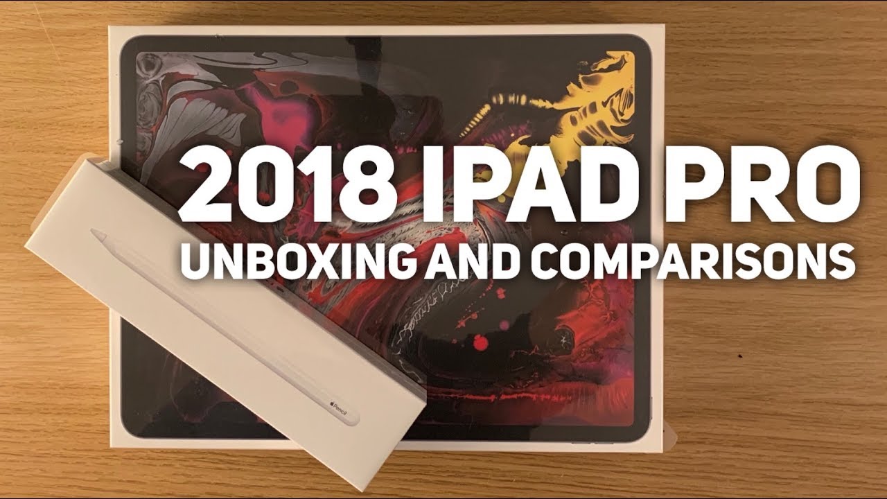
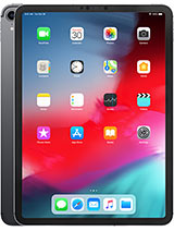
Okay I've been really excited about this one to arrive so here it is I'm going to do an unboxing and an initial comparison between this, our new iPad Pro the third generation and the first two generations as well. So this is the new iPad Pro the third generation, and this is the 12 point, 9 inch version. Now it's been quite substantially updated. Quite a lot of changes this time round. The screen size remains the same diagonally as 12.9, but the border the bezel around. It is a lot thinner, and it's got a new Apple Pencil, 2nd generation of Apple Pencil interacts with it in an entirely new way as well.
First thing: first hold the home unwrap the iPad literally just binning pick this up. Swiss I'm very excited I'm, more excited about this version of the iPad Pro, and I was the second generation, because there's definitely more changes happen this time, the previous generation, the second generation and the first generation the same proportions. Different screen appearance because of the refresh rate and some minor details were the speakers and things like that. But fundamentally it was the same pattern on different colors here, obviously, but other than that aesthetically. It was extremely similar.
This iPad, however, is very different, so I can't wait to get into the box. So, let's see what we've got. We've got a nice illustration on there really nice imagery this time, quite an abstract piece of work. Okay and then we're presented with the iPad itself, usual iPad or usual Apple products, kind of quality feel as soon as you open the box, and here it is, and just feels perfect straight away here so yeah. It is really thin.
I really like the flat edges on it. I think that's a really nice look. Furthermore, I was a big fan of the iPhone 4 and iPhone 5 for that kind of block. Yes, that's it I think it's a look that really works. So let's look okay, so here we go.
Is the iPad looking particularly stylish? Definitely noticeably smaller than the first and second generation iPad Pro 12 or 9 inches, a really lovely version. So there is on the side, the area where the Apple Pencil, the new Apple Pencil attaches the magnetic part, and it actually charges from here as well. We've got the volume buttons, and we've got a power button. The top we've got the usual kind of speakers at the top speakers at the bottom. We now have a USB-C port.
Now we have the camera that just protruded quite a lot, and we've got the flash, and we've got various microphones around the actual housing here, and you can see that you've got a couple of there. Well, so if we got them, we've got one at the side here, yeah, and then we've got the sticker all the technology that enables face ID for the top, as well as the front-facing camera. That's all the way else is in the box, so we've got all the instructions we go. Some very nice stickers never once found a use for those, but they're very nice things, though I suppose, and then we've got a new power. Brick, it's looking very different from any previous one.
It's a square, a design. This is the old version compared to the new version. Obviously it's a UK plug I do like the way that collapses in on itself. It's a really neat design, just sort of snaps opens like that. That's really cool, more compact, less bulky! This is actually quite irritating.
You know large when you have to sort of go on your travels. You've got a holiday, it's quite a big item specific to put on your suitcase. So that's more compact, and obviously this is where the USB cable. So no longer do we have the Lightning port. We have a USB, see now that's better for charging more quickly, and it's more compatible with lots of different types of devices.
Quite a short cable I think it's the well. It feels a bit less than a meter to be honest, I'm not quite sure how that compares with other poor cables feels, quite sure, I'm sure it's one meter, but it seems to be a little sore I sure love to check that one out at some point. So there you go, there's the plug, so I'm just going to do a little of a comparison to the second generation iPad Pro. So if I literally line them up as flush as I, can you see? There's a massive section, they're been removed from the overall sort of proportions and there's a bit of the width as well. So we've got the height depending on how are you hold the iPad, but there's a big chunk missing there and then there's a lot smaller in this dimension as well.
So it's quite radical difference in size which is fantastic. Comparing the edges. We have significantly bigger speaker, grilles on either side. We have more microphone areas. Sadly, no headphone socket anymore, that's gone, so it's Bluetooth or after get a dongle or headphones that fits the USB.
The camera does protrude a lot more on the new one. If you notice there was hardly anything on the second generation iPad Pro, but this one is a hefty camera bump again on the other side, bigger speakers, so I'm going to pair it up there, we go, we've got the nice Apple logo, and then we get the usual setup installation that we do in all Apple products with the screen on. You can really appreciate the size of the bezel going around it's nothing like as reduced of the size of the bezel on the iPhone tens, but that's a good thing, because using an iPad, you go into one to hold it with one hand where you might do things with the other hand. This is something that you're going to actually use a lot and hold a lot in this way. It's not a small item where you can just hold in one hand like that it needs to be properly gripped.
So, therefore, your thumb on either side is going to have to hold onto the screen at some area so having that empty area where you're not actually touching the screen as such is just touching the bezels. It's a very useful feature, and I'm, not to sure it's ever going to change I'm, not really convinced that they're going to make that bezel, any smaller, really I. Think that's just about right. So, while I set up that I'm just going to have a look at the Apple Pencil ? and look what we've got you all nice, cellophane, nice illustrations, nice feel to it. Good quality I'm, not sure how to get into this.
That's a look. We've got a tab, and it slides out really nice designed by Apple in California. Take that out. This is anything interesting in there, probably not interesting I, remember on D. It might well be in there hidden, but doesn't look like it.
I remember on the first iPad, so the first Apple Pencil we had a spare nib that came with it doesn't appear like we have a spare one this time, although in fairness, I have never had to replace the nib on Apple Pencil. Let's take the rough, it feels more matte, it's not the glossy finish. It feels more kind of not rubbery because it doesn't give any, but it has that slightly more tactile, rubbery quality, Stephane they, something that sits more happily in the hand. So, let's compare it to the first Apple Pencil as you can see, it's quite a lot shorter by a good sort of centimeter 1/2, an inch shorter, you'll notice that I have a grip on the original Apple Pencil. That's because of the glossy feel to the pencil.
The grip just gave that extra bit of confidence feeling like you've, really had a good hold of the pencil now first initial impressions with a nice flat edge on it. It's more like a traditional pencil. I know you can get rounded pencils too, but this feels more like the typical kind of pencil I would actually want to use. So I am imagining that with use your finger will naturally sort of gravitate towards that area. On the Apple Pencil, that's going to be important because that's also where you can interact with the Apple Pencil, and it responds to being double tapped.
If we look carefully at this end, obviously we have the method of charging and a cap on the original Apple Pencil. Now we just have one sealed unit. Apart from the tip which, if you like me- and you still got the original Apple Pencil, then you probably got a spare nib still from the original one too, and I believe we just remove both the nibs are going to be the same anyway yeah. So if you still got the spare one from your first Apple Pencil, then you've still got a spare. So that's fine, so there's a wait.
I'll take the rubber tip off it. So I can compare it fairly. Let's have a look, doesn't feel drastically different, maybe a little lighter hard to tell really. It might just be in my imagination, because it's smaller, but it definitely feels better, really glossy on that. One, nice and matte on that feel, with the flat edge really feels good feels lighter feels more and natural pencil length.
I did always feel that this was a great tool, but it felt a little too long for most pencils and just the balance of it wasn't quite there how you watch straight away. This feels significantly better in hand. Okay, so setup is almost finished there. Now I've got the Apple Pencil I'm, going to try and pair the two, so I know that it clicks to the top there, and it instantly now is pairing. Would you like to use this Apple Pencil with your iPad, so I do want to press connect, and we're done nicely tells us here that we can double tap the Apple Pencil to switch between different tools and there we go, so now it's paired? We can actually use the Apple Pencil.
We go into apps like procreate, which is some reason. It wasn't quite cooperating, so I just scrapped it rather than having to wait for it and I. Can then just manually transfer things across from my other iPad and there we go I'll be doing a proper test of the iPad I'll, be showing it's in action with an actual piece of work. Next, it is obviously old gesture-based, just like the iPhone, 10 and notice. There are a couple of differences.
Normally, if you were to happen and hold on and apply that you get the option to delete, obviously, but without the home button after you've done that say, for example, and I'll just delete that then, instead of clicking the home button to go back, it's got now a little pop-up section. There assist on all the little changes. Then you attach the Apple Pencil. It tells you, the battery level clicks really nicely on there. Every time you do that it just pops and if you move the iPad around and click in place, you get that popping up wherever the top of the iPad is now I'm, not sure whether that works.
If you like this way around, let's test the theory yeah there you go so wherever the top of the iPad is, it obviously knows, and it updates you so more than ever is difficult to really determine where the top of the iPad is. Obviously it has the face: ID cameras at the top and the selfie camera, as well as the power button. But, interestingly, if you press and hold the power button down, you get Siri the way to power down now, rather than clicking on the home button at the top is to hold the volume up and power button down at the same time, and then that's how you get to power off. So that's a bit of it there's bound to be lots of little changes along the way that are going to be noticed, but they're just ?, they're ?, the extra ones so first impressions having gone Booster, it's a really lovely design feels perfect in the hand the screen looks fantastic, just much more streamlined, less clutter. It just seems to be pure screen now, apart from the obvious bezel around the edge.
But again that's really a necessary thing with something this large something you're going to want to hold while using it. You don't want to put your fingers all over the actual screen and be interacting with the icons or anything else that you've got open, so great I probably will be buying the smart, Keyboard or Smart Cover at some point screen protectors -. This is such a lovely, iPad I feel like I'm going to want to protect it as much as possible, like I, say, I'm, going to be doing a more extensive sort of review or test of the actual iPad using procreate and testing the Doubleday functional now Apple Pencil as well that'll be another video that will be released extremely soon, and I'm also going to do an update video for the app procreate there is 4.2 version been released, so I'm going to do a video for that as well. So please subscribe make sure you come back here again, and I shall see you later.
Source : James Julier Art Tutorials
