Unbiased Note 20 Ultra vs 11 Pro vs Pixel 4A Camera Test By Max Tech
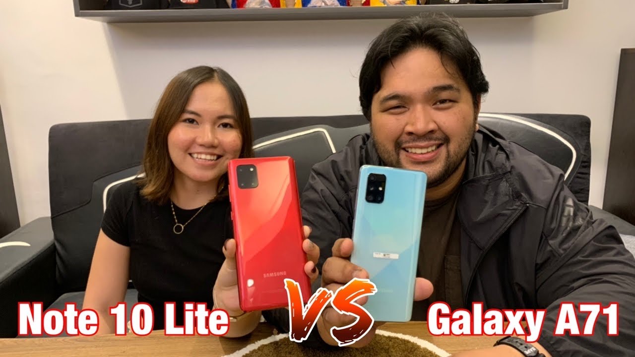
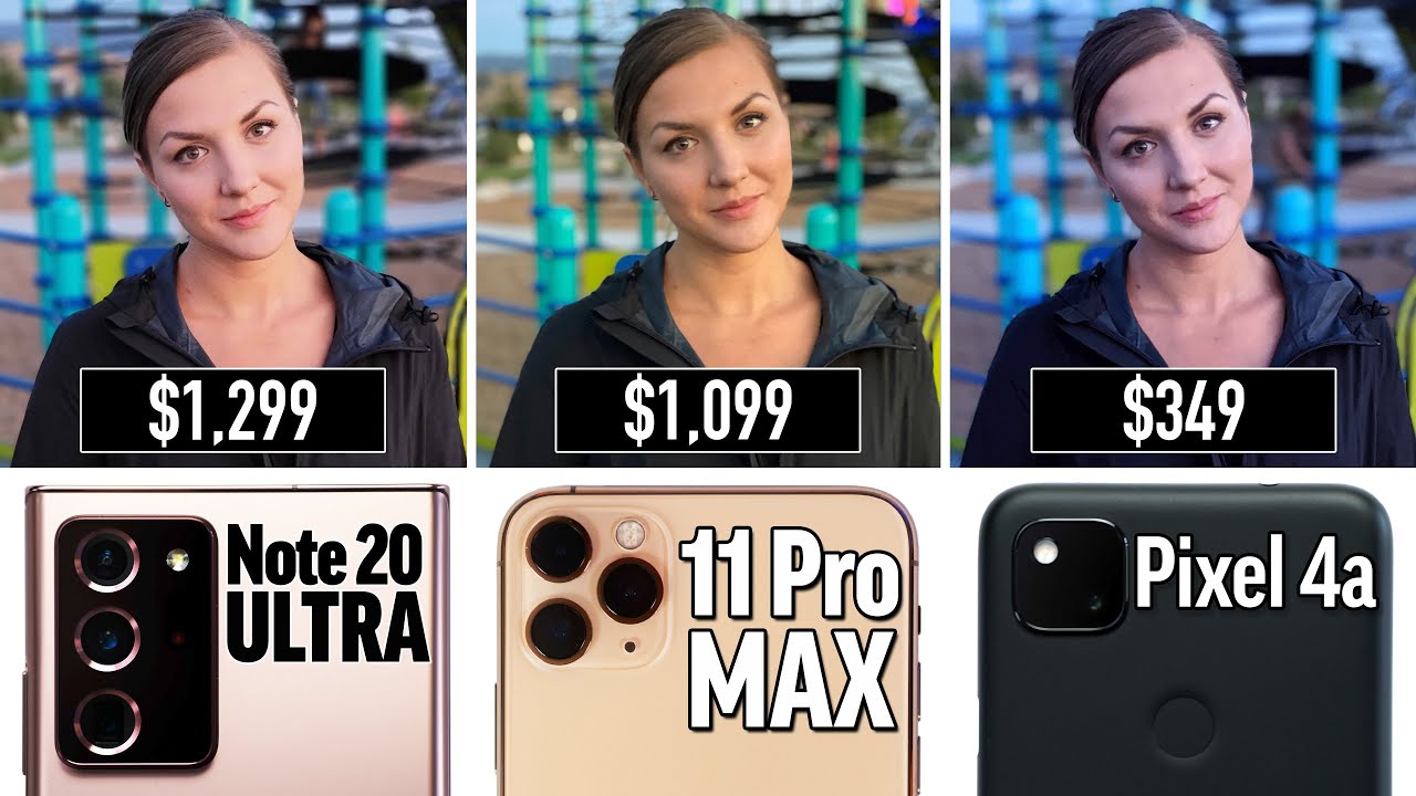
Hey guys its max and Angelika, and today what are we doing? We are doing another unbiased blind camera comparison and Angelika's replacing Vadim in this one she's going to give us a more real world view instead of Vadim and I being super critical about each image which is fantastic, and you have a piece of paper ready on there. You have three phones, you guys already know which ones they are. We have the brand-new note, 20 ultra. Of course, we have the iPhone 11 Pro max and I thought it would be great to put in a brand new budget phone 350 bucks for the Pixel 4a compared to, I think, 1300 yeah. That's a massive difference in price just to see. Maybe we'll get confused a couple of times here and actually think the pixel images are better.
It's going to be very interesting. Now get your own piece of paper and pen pull out your app on your phone. We want you to do this as well. Do this unbiased test- and we want to hear your guy's opinions before we get started- go ahead and check out our new Mixtec zip up hoodie yep, or we have brand-new white face masks. We know the black ones are super popular.
So if you need to stay safe, you need to pick up a few of these check out the merch shelf down below now. Here we have our first image, which one looks best to you. I think I like the one on the left the most, because you can see the most detail in the trees with the other two. It gets kind of dark and the detail gets crushed and that one is the note 20 ultra. So we got one point right away for the note 20 ultra now, I'm actually taking some score as well.
I've seen these images, but I'm just going to vote for my favorite. It's not unbiased, but I'll give you guys my opinion as well. I like the iPhone one, because I like the pop of color. I like a little extra contrast. Now we have a selfie.
I think I like the one in the center, the most the one on the left is extremely blown out in the clouds and then the last one. It looks so dark and lower color as well so another one for the note 20 ultra. So we have a macro shot here. I think I definitely like the one in the center. The most it seems the most vibrant and detailed iPhone 11 Pro max.
It's very interesting how you get so much more texture. I don't know if it's delusion here or not- and we have this tough HDR scenario- I'm not going to give you any advice. This has to be unbiased. I was about to say something do not uh. I think I, like the one on the yeah, the very left, the most the one on the very right is doc.
Just go. I'm just joking go. You already said the left. You can't change your mind. I was gonna, say um.
When you look like in the back in the shadows and the darkest areas, the one on the right. It's super crushed. It is, and then the one in the middle is still a little too, like you can see the most detail in there 11 pro you voted for the iPhone. I think this one just looks so sharp. You know, look at all the detail.
Look, how everything pops, but they're, all close, they're, all good, even the pixel. No, actually the pixel doesn't all right next one. This is a zoom shot wow. Can you tell the difference? Yeah? Definitely the one in the center has the best detail and dynamic range. Yes, uh it.
It definitely looks much better now out of the two on the side. It's just out of curiosity, which one do you think is second place, probably the one on the right they're on the right. Second right, yeah bam. So, of course the note 20 ultra has that super zoom camera that's sideways in here. It's a massive amount of difference.
It looks perfect, so one on the left looks really like what is it a lot of artifacts, a lot of compression artifacts that the pixel doesn't have so, of course, the note got that one but pixel good job. Now we have food shot here. This was some pizza that said low-carb and I figured out later low, carb, okay. I have a feeling you're going to disagree with this. I actually forgot, which one is which on this one, but I know which one I'm voting for- I like the one on the right, the most you do, yeah, okay, yes, I disagree.
Furthermore, I like the one on the left. Why pixel four there you go, and I chose the notes one, and we have a standard shot here. Uh. I think I like the one in the center the most it looks really nice, even though the colors might be off. You got another one for the note 20, and I agreed with you on that one too, the iPhone's really blotchy and too green.
This is a portrait shot. I wanted to do a tough scenario. We got to test the algorithms out okay, so I really, I really do like the detail of the uh, the left and the right one, but since it's a portrait shot- and you look at the background- uh the one on the left- it doesn't seem like it's working in quite a bit of like areas and then obviously the one with the right two. So hey the one on the right blurred half of the tree over here this one in the middle definitely did the best, and it's the note 20. It did a phenomenal job.
Yeah. You look even if there's a few miss ups, but even through here it blended had a nice transition here on the sides over here everything the algorithm, I think Samsung has updated it quite a bit, and here we have another zoom image, definitely the one on the right, and that is of course, the note 20 ultra it's crazy and good lighting. This looks like a DSLR shot. It looks so good. The detail is incredible everywhere.
It looks fantastic, and this is a shot that I wanted to push the HDR I'm in the shade. Here it's sunny out there. I think I'm definitely going to go with the one on the left, the one in the middle some areas are blown out and then comparing the left one to the right one and the one on the left has like brighter nicer colors, and that one is the iPhone and I would have to disagree. I'd have to go for a note again, and I actually forgot on this one too um that just looks too cool. It's sunny outside it's supposed to be warmer on the concrete, and this one is our first ultra-wide.
It looks a little confusing. This goes to this image that one goes to this image, so the pixel is not in this one. We don't have an ultrawide camera on here. I think definitely, the one on the left looks way. Better has way more detail way more.
The colors, the one on the right is just so dark. You can't even see very much, and I wasn't trying to get you to be biased. I personally wanted to test out detail because they're both 12 megapixel sensors and the note gets another point here, and here we have our first video. So I'm going to play this back and let me know whatever differences you see between them instantly. I, like the one in the middle.
The most I don't like the one on the left at all. It's really warm and weird, and then between the middle and the right, the one in the middle has like way nicer, colors yeah- and this is 4k 30 uh on all of these, which they can all do the pixel. I don't think you could do 4k 60. , you're right, the iPhone looks nice, it's detail, looks natural, looks perfect. The note 20 has a 8k sensor and has to over sample that- and I don't know- maybe we'll show a video clip right here.
We have all this artifacts on the building over there. Just from all that megapixels that has to deal with, then I have one more video here. This is the front facing. I definitely like the one on the left, the most for sure. I hate the one in the middle, it looks so weird you do not look human, it looks so waxy uncanny valley, stuff going on.
Furthermore, I don't like it. Furthermore, I don't like it all right and that one once again the iPhone the pixel look at that the detail is smeared. It is gone, my beard, you can't see it, I hate it is it. It doesn't look good, but let's be nice, it's 350! Furthermore, it's cool, 350. , okay, and this one.
Furthermore, it's a tough white balance situation. I try to set it up that way. Okay, I think the one on the left definitely looks the best, the one in the middle, the yeah, the white balance is really off, it's pretty cool and then looking at the left and the right, the one on the left looks way nicer, more detailed. Your car looks so nice and shiny. I don't know if I agree, but that is the pixel four.
That is actually your first one for the pixels. I like this one, it's actually a little warmer than here. You see the sunset, so it actually did the white balance spot on. I had the greenery here to confuse it. I'm glad you like the pixel, though I'm glad you gave him one point, and here we have this beautiful sunset, I'm kind of stuck between the left in the middle, but there's a lot of things.
Furthermore, I don't like about the middle one, the sky, some parts of it are blown out and there's detail loss and then, with the grass and the landscape, whatever back there. It just looks really like forced detail, yeah it's over sharp and doesn't look that natural. Basically, most people would agree, that's a better one and that's the iPhone 11 Pro max, and here is our first portrait shot of a person of my wife. I really, really like the left image. It looks so nice, but at the bottom left the portrait mode did not work.
So I think, for that reason I'm going to have to go with the middle one, and you chose the iPhone now I have to point out my opinion after you said yours point something else: okay, the note 20 ultra I like the skin tones. I like how much how little noise is in there good detail and the iPhone and the pixels have quite a bit of kind of bitchiness and noise in the face I'll. Forgive that little. I actually never even noticed that until you pointed that out. So I'm glad Samsung fixed that actually- and here is a shot of my kids after dark the background, and this one is really blurry.
But it's really I'm trying not to say anything, but it's really like artifact-y and weird, it's just not very pleasant to look at so the one on the right is really dark and really cool tone, but I don't like the other two very much at all. You chose the pixel one more for the pixel and yeah. It's very interesting to see. We were not using the portrait mode on here, because the note20 has a much larger sensor. That's natural blur there.
It doesn't look the best compared to DSLR, but the other two are completely in focus so right. It's focused on them the background's blurred out- and here we have a selfie. I know which one you're going to choose. Definitely the left one um. No, I think I honestly like the one on the right the most, even though it's really, really warm like red, and it's obvious that it's like blurring out your skin but yeah.
I think I like it more. The pixel is the one you show hey. Is this a streak for a pixel, or you're getting multiples? Now it's starting to your know catch up there, the iPhone come on apple. Why do we have such a decent? Looking image? I still think you know 20 is better. I like the more detail there, even though there's a little more noise but 350 right, 350 bucks, and it could do um the night mode on the front face you can see you can actually, yes, this you're going to throw that away.
You're, not gonna, keep that now the pixel photo. It's usable looks way better. We have another night shot here, this actually seven times a zoom in low light and there's a pretty big difference here. Yeah, definitely the one on the right, and that is the note 20 ultra the iPhone, looks terrible again. The pixel, the white balance, is not true to life, but it looks good.
It looks nice, and we have our last shot here. It's a night mode shot, and we have some drastic differences hands down. Definitely the one on the right. The one in the middle looks like complete garbage. It looks awful.
I don't know what happened the one, because all these have night modes. The one on the left looks also pretty gross. To be honest, like it looks like baby food like pea soup like everything's, just mushy, all the colors, there's no separation in colors really and another one for the pixel man. If only we had more night mode shots, the darker, it gets the better, the better yeah exactly, so I don't know what went wrong with the iPhone, but we're done here. We got 20 different images.
What are your results, and before you mention it guys? Let us know down below if you actually voted what your results were and if you didn't vote at least, were there a couple images that surprise you? We want to hear your guy's opinions now Angelika for your blind, unbiased comparison. What did you get for the Pixel 4a? I got four points for the iPhone 7 and for the note, 20, ultra nine, nine, so good job Samsung now. For me, it wasn't unbiased, because I knew some of these ahead of time. I just voted, which one I thought was the best, and I'd want to have. I have three for the pixel and actually some of them were different from the ones you voted for the pixel.
This last one, I think, is pretty obvious, though that's the one we matched up on uh the iPhone. I got six so uh. What? How much did you get? Six? Seven? Seven for that, and then note I got 11. So good job Samsung. Definitely improvements from the s20 and some downsides have been fixed.
You know what actually I want to mention. I also didn't have any autofocusing issues, which was an issue with the s20 same camera sensor, but they added the laser, see this little thing right here: yep, the laser, autofocusing and that helped at all. I had no issues with auto, focusing there you guys go. Let us know your thoughts and if you guys want to see my one week, real world video on the note 20 I've been switched over from my iPhone, make sure you guys are subscribed with those notifications enabled and check out our merch check out our new zip up hoodie the masks. The other great shirts has been max and Angelika, and we will see you in the next video.
Source : Max Tech
![25 Best Apps for Apple Watch Series 6 [2020]](https://img.youtube.com/vi/NTod8cXUxmU/maxresdefault.jpg )
