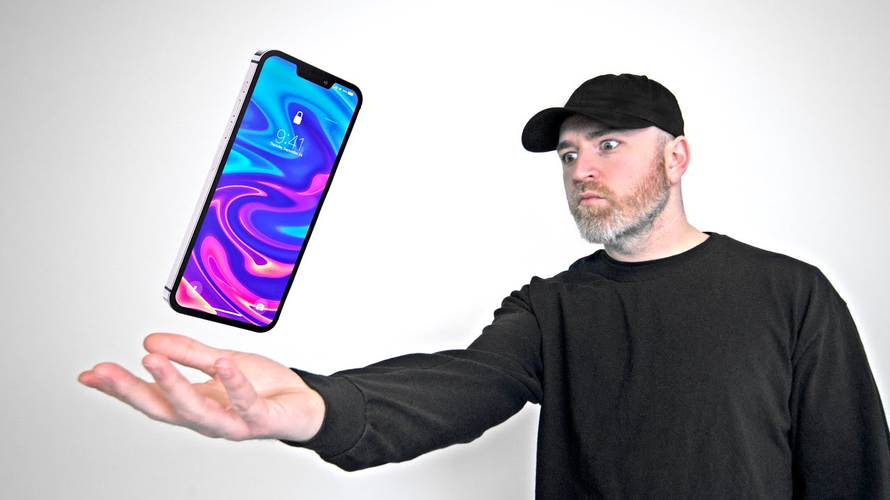
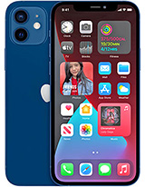
This is the iPhone 12 By Unbox Therapy
Remember to subscribe to unbox therapy for your chance to win this custom, iPhone 11 Pro valued at $5,000. So today, we've got the most recent renders of the upcoming iPhone 12 courtesy of concept. Creator and I thought why not sit down, relax, take a glance and what that next iPhone will probably look like based on these, renders and have a little of feedback and then reference it against what Apple has been doing and talk about why they might be moving in the direction that they're going to move in for the iPhone 12. So let's go ahead and hit the play button right here, and the first thing you're going to see is a very boxy squared off design, reminiscent at first of an older iPhone. So there seems to be a trend here with Apple going backwards in order to go forwards, and I know that could be a bit frustrating for some users, but in other areas of life. These rings true, particularly in fashion, wear and design, where an old thing comes back around and there's a kind of nostalgia with it, where people appreciate that old form over again.
So inspired by the iPhone 5, some people say, but then I started looking around the office and realized that this boxy design actually dates back to the iPhone 4, and even though it's going backwards to go forwards, the first iPhone was actually curved, not boxy, not until the iPhone 4 did we start to see this kind of design. Of course, that carried through into the 5 now in examining this particular render you're going to see not only a design reminiscent of an older iPhone, but you're going to see a more modern camera design to go with that boxy exterior and the camera design is going to be reminiscent of a more recent iPhone. That is, of course, the iPhone 11 Pro 11, Pro, Max or well, even just the iPhone 11. For that matter, this model will stretch the display in a way that a lot of people had hoped for with the iPhone SE. So it takes a small form-factor but brings a larger 5.4 inch display with a face ID style, cutout and slimmer bezels in each direction. The camera layout on the back is dual camera setup, similar to the current iPhone 11, so bringing modern features to a form factor that some people still like and appreciate, especially for single-handed functionality similar to the current iPhone SE.
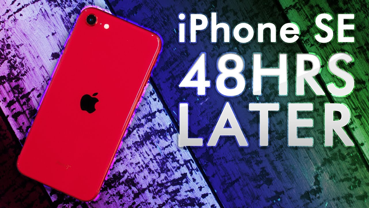
Now the rumor is that this will be available in a number of different colors, and it will start at six hundred and forty-nine dollars which isn't cheap. It's not at the entry-level price, but it's obviously substantially less than the pro models have been sort of settling in closer to $1,000. Truthfully I've been playing around with some of these smaller devices a little and I do think. There is a place for them to exist, and I'm glad that Apple is going to maintain a small form factor device and bring that bigger display into a body that is very comfortable to hold. In one hand, I was just actually typing on the iPhone SE, and even an older iPhone, 6 I, don't know if you guys saw the post on my Instagram.
It's amazing how similar the iPhone SE the current 20/20 iPhone SE, is to a device I. Don't even when did the iPhone 6 come out a device from a long time ago you put them side-by-side, you realize the body is almost identical. Now I realize I've taken a variety of different approaches to the analysis of Apple their design language and how to feel about it and I've even called it unimaginative, and certainly that's one way to look at it. When you see it on a table, and you realize how uniform the design has been and for the amount of time that it's been like that. But, of course there is the alternate angle, as there always will be in which you might see this uniformity as an advantage, the ability to take a form and have it persist over long periods of time.
It's a difficult task, and yet still people look upon older generation iPhones and for whatever reason, have nice feelings around them and that's not an easy task. Are they all brainwashed? Possibly every single tech brand has its fans, but there is something to be said about sticking to a particular approach, because it allows you over time to create refinements that wouldn't be possible if you were completely changing things with every single now the reason I've got all these devices on the table is because upon seeing concept, creators rendition of the upcoming iPhone 12 I started to think what is this phone really inspired by and is it truly the throwback that it seems like compared to the rest of the iPhone design, language Apple's design, language in general? That's why I've also got an iPad on the table so in front of me, I have an iPad Pro I have an iPhone 4 I have an iPhone 6, the 20/20 iPhone SE II, and an iPhone 11 Pro, a kind of bizarre combination of devices. Now the reason being is that I just want to illustrate how similar iPhones have been for a long period of time. We're not talking about just a single generation we're talking about dating back almost to the original iPhone. That's the reason that the iPhone 6 is here.
I held these two devices, the iPhone 6 and the 20/20 I phone SE and realized that the body shape and style and the curves around the edges and the button layout and the camera modules these things to an alien that knew nothing about these objects. They would think they were very closely related, and they are even though they've got this enormous gap in time upon their release, then I thought to myself: well, wait a minute: the curve around the side, the height and weight and just the feeling in hand, isn't all that different in fact, from the latest iPhone 11pro either. Now this thing's a bit heavier. It has a different camera layout and, of course, has different components, more modern components than either of these two, but Apple is incredibly consistent on how they address the curves, the materials that you can pick up any one of their devices and kind of feel comfortable right away. Probably the current generation iPad Pro is your best look into the fit and finish or the potential fit and finish of the upcoming iPhone 12 and, of course, the other iPhone 12s, as well with the pro and pro max designation, and so what that gives.
You are a squared off edge. So if you were able to shrink an iPad Pro into a phone format with the thinness and the weight and the materials in use, you would be holding on to an iPhone 12 funny enough. This phone from all the way back then could act as a pretty significant inspiration for the upcoming model. So what is the effect of having this flat edge rather than something curved? You end up feeling a little more confident in your grip, probably because you can feel that edge, but there is a slight expense here where some could argue that the grip is slightly less comfortable, because you are constantly aware of the fact that it's not matching the curvature of your hand. Instead, that edge stands out it pops out from a design perspective.
However, there is something pleasingly minimalist about these corner curvatures and the flat edge, which seems like the simplest approach to making anything rectangular in industrial design. So with the upcoming iPhone 12, you may be giving up some comfort in your hold and in your grip in exchange for a more minimalist industrial design and slightly more confidence in your grip. How this will map out to larger devices will be very interesting, particularly in the max models of the upcoming iPhone 12, but I actually think the iPhone 12 standard with the 6:49 entry price and that big screen, small form-factor combination could end up being the most popular upcoming iPhone and when I'm saying big screen, small form-factor, imagine an iPhone 11 screen to body ratio or even a little greater inside a form factor like the current generation, iPhone SE or any iPhone, leading up to it that shared that 4.7 inch display form factor that includes the iPhone 6 6s 7 8 the bunch see the main drawback with the current generation. iPhone SE, isn't the form factor as a whole. I think a lot of people could get used to it and actually see it as an improvement, particularly people on the go that are doing a lot of single-handed input.
The drawback with this particular design in 2020 is the fact that your screen to body ratio is just terrible. You have this tiny little display an enormous forehead and chin as you're well aware, you've been following the iPhone SE stuff, but if you take this form factor- and you stretch a display from corner to corner now, you're not giving up nearly as much multimedia enjoyment and instead, maybe you find a nice middle ground between single-handed functionality and multimedia consumption, where you spin this thing around, and you still have a decent sized display so to make it clear we're talking about a form factor almost identical to this in your hand, but instead of a 4.7-inch screen. You'd have a five point: four-inch screen. So there you have it a glimpse into the upcoming iPhone 12 courtesy of concept creator. Now these concepts are based on rumors that have come from a number of different sources.
It's starting to look fairly concrete that the upcoming iPhone will take most of its inspiration from those previous generation iPhones, the iPhone, 5 and 4, and, of course, that first generation S II. Let me know down in the comments: do you think this is a good move? Do you appreciate that design language is that your favorite Apple design language, or will you miss the comfortable curved sides on your iPhone that you've now had since the iPhone 6 and to non iPhone users has Apple finally done enough? Is this encouraging when you look at the concept creator designs, if the upcoming iPhone 12 looks exactly like that, then, are you going to switch over at 6:49? Are you considering?.
Source : Unbox Therapy
