The Phones Show 309 (Full review: Blackberry KEYone) By Steve Litchfield
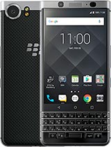
On the phone show chat, podcast, Ted and I've been pining for a long time for some imagination for some differentiation Android phone hardware, as in the good old days, yada, something like the BlackBerry passport, became a refrain as stunning form factor that was rather wasted on BlackBerry, OS, 10 and so into the BlackBerry key one. It hasn't got the passports with or extra usable QWERTY keyboard, but at least it does have one it has the passports, capacitive sensibilities, plus it's just a solid and well-designed. In short, could this be the differentiated smartphone we've been looking for? Actually, yes, at least if your phone uses more about getting things done than watching media and playing games. The 4.5 inches 3 by 2 1080p screen here is rubbish for such things. It's like going back to media and gaming on a phone from 2010 at worst case on some of my retro YouTube favorites, which themselves outside black bars encoded into health.4X3 videos sit within a 16:9 environment, keep up in the back. They end up with black dot added top and bottom by the key one, and is then like watching a video on a three-inch screen from a decade ago, but that's the only huge downside at the Android 7.1 part key one from plenty of upsides, which the presence of a permanent physical keyboard is huge and, interestingly, it's nothing whatsoever to do with weather. Hardware typing is faster than typing on virtual on-screen keyboard, often Hardware typing is significantly slower even after a week of practice.
Here, it's partly that you never lose screen realistic, the keys of course, as here, whatever you want to type in any field in any application, you simply never have to see half the screen temporarily vaped to make way for an on-screen keyboard. That's a big benefit right there. It's also that there's a mindset change now when you hold the key one, your thumbs rest on the keys. You feel the heft, your hands. You instantly feel like doing business catching up with email and interacting with others on messaging services, even typing out notes for some upcoming meeting, and you never have to reach up to tap in a text field to get started.
Furthermore, you can just start typing immediately. Furthermore, you actually do become more productive, not because the keyboard helps you enter text faster. It doesn't but because you'll enjoy doing productive things more and yes, because you'll get less distracted by media and gaming along the way. I do have a beef with BlackBerry's design here, and it's a biggie rather than go with standard size, sculpted, blackberry keys, for example, on this cute own classic u-turn and virtual Android controls BlackBerry, has specified shrunken domed keys and capacitive controls. This makes absolutely no sense to me by all means shrink the keys.
If it means the display could be an extra half an inch diagonal, maybe even get into a sixteen by nine at say, five inches with virtual controls. Getting out of the way we'd n be into a more standard. Smartphone experience and the keywords. Remit will be widened to appeal to far more people, but smaller Keys, smaller screen and clunky capacitive controls give the worst of all worlds. I can only think that there were technical issues with hard work with your Android.
Apparently it's something of a pledge by blackberry at the OS level, and that virtual controls were a no-go. So initial plans for a larger screen had to be scrapped in favor of capacitive controls, which just sit there taking up space, even when occasionally rather have extra pixels in their place. But the key one keyboard is what it is, which is a lot fiddly her than the keyboard on a passport, a q10 but not unusable, especially if your fingers are nimble. The placement of the color traditionally on BlackBerry alt n here still drives me crazy on a daily basis, as does the absence of a British crown design. I did find it eventually under settings.
Language, keyboard, settings, blackberry, keyboard, advanced down, some stairs and a lock toilet with a sign saying: beware of the leopard. No, that was a different note, but I swear I'm, not making this up then currency. Finally, I set this to, and then he's done, alright on now, I can't type dollar signs anymore. Oh, hang on press and hold dollar I mean kind, I mean dollar and then select shoe. You do get the swipe upward predictions a swipe up when the word you want appears in the correction bar and this works opposing me.
Well, then, practice is almost always faster just to keep on typing and rely on the automatic spelling correction. I found myself when you're, using the swipe up system for really, really long words and yes, swiping up on the keyboard as with the passport before it, the key tops are all capacitive, so you can swipe left while typing to erase the whole of the last word enters, and you can swipe around up down left right within web pages and documents as needed. It's a cool feature, though rarely gives you more than you can do directly on the touchscreen. The keys are backlit, and you'd expect, given the premium design and using the key word at night is a genuinely cool, futuristic and for 2017 downright unusual experience. The phone is built like a tank as you'd expect from blackberry.
The aluminum chassis is flat on the top, but all other corners and edges are curved, but not in a slippery way and backing this up is a beautifully drippy textured back so crashes, not asleep as out on my old classic u-turn, but it's a heck of a lot better than on most current glass and metal slippery flagships. The power wake button is on the left, which I'm still getting used to, though it's usually easier to use the fingerprint sensor built into the keyboard space Parsons. This also weights things up beneath the volume keys on the right is a convenience key which, unlike Samsung's Bixby effort, can be genuinely programmed to launch or switch to anything. You like, after some experimentation, I settled on launching the super device search utility. Now this is reminiscent of par mos's search function 15 years ago and such as everything on the device so that you can type to find contacts, notes, calendar entries, emails, help entries and well you get the idea.
In fact, it's almost impossible to lose something, not the key one. The extra key also acts as a new to win in a phone call, which is a nice physical touch and saves fiddling around on screen within the groove of people, perhaps organizing something sensitive. Now talking of quick, launching and switching apps long pressing, the keyboard keys can also be assigned to specific functions or apps. Now this sound is more useful than it actually is, since a've got to remember all the assignments restricting them to perhaps a dozen B. The long press only works from the home screens from where you can usually well.
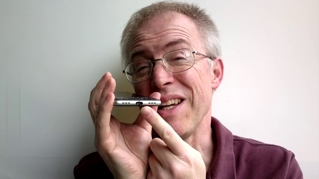
You can see the appropriate, app icon it up anyway and see finding out how to assign the shortcut isn't trivial there found by opening the app launcher than tapping on the Settings icon, then on keyboard, shortcuts and so on down. The bottom is a USB type-c data and charging port, and this is quick charge.3 enabled making for really fast talkers when needed, 50% in half an hour. Anyone and somewhat Heading are complaining about the keyword not having wireless charging slowly. Oddly, there's the option of using boost mode as well. Now this is a blackberry tweak which temporarily suspends a lot of background tasks while charging, but after some testing I can't see any discernible difference whatsoever, just plug it in and go also down the bottoms, a single speaker ii grill is a cosmetic dummy rather annoyingly here the demo full volume shoppers, the fidelity is not bad.
The volumes not bounce very similar for speakers on the LNG, g6 and Galaxy S8, plus I reviewed recently, but still not stereo, but then it's not a media device. Staying with audio up at the top is it 3.5 million Jacobs is perfect and musics with it sounds fantastic at least through professional headphones, blackberries supplied in a headset is basically the extreme just ignore it around. The back is a 12 megapixel camera. That's surprisingly, capable is certainly the best that has ever graced people, Akbar largish, 1.5, micron, pixels and F over to footnote aperture 1 over 2.3 inch sensor results are generally excellent. As the light levels drop things start getting nausea, but once the multi frame night mode kicks in then alignment and averaging algorithms make for amazing low-light shots.
Given there's no physical. Oh, is here almost Google Pixel like in the dark, and it's got the same physical sensor, which is unsurprising. Shots are by default in three by two, which is an odd screen. Matching crop ratio from the sensor, but there's a central control to switch this to four by three or 16 by now, and it has needed, video is shot up to 4k. The only is electronic frame based stabilization when shooting at 1080p and thirty frames per second or below, which is fair enough, see the sample here.
It works pretty well. On the whole, the front camera is unremarkable at peak megapixels in terms of the Android experience. There's a lot here, that's stock or standard. The only thing that Blackberry duplicate is calendar, presumably so that it can tie into the swipe out productivity pane here with catch-up views of events, emails and tasks. Again, a nice idea about unnatural how many users will actually use it, the hub so central BlackBerry, OS 10, is here too they reduced to a single home screen, icon it amalgamates emails and messaging from multitude of other chat based social services.
Should you prefer everything being mixed up and thus treating incoming comes with equal priority? Okay, in fairness, you can set up custom views filtering things by service, but then in that case, why? Wouldn't you just view tweet replies and Twitter? What's that replies in what's up and so on? Still he did have to use it. Blackberry old hands may well love that this is still an option. As usual with blackberry, you get the D Tech Security check utility, always good to know that someone hasn't packed in or fiddled with the device well and attend it. I guess, plus the aforementioned device search tool which I love and BBM, which I honestly haven't thought about. Since I last looked at the BlackBerry.
Does anyone still use BBM in 2017? There are a couple of note-taking utilities, one graphical and one text-based, plus blackberries' password keeper, always a great idea, or I have my own key parts to base system in place. Workspaces are BlackBerry's own shared cloud service and also present. There are lots of potential end users will should whether it be set up on OneDrive, Google, Drive, Dropbox or similar, so I suspect workspaces might be an IT department thing for companies. Overall, BlackBerry's choices have add-on software over and above the wealth that that Google provides and which are also pre-installed. Blackberry choices are sensible, and you can't really accuse the company of bloat.
Finally, this power center with shortcuts the various things you can do to optimize battery life, which I've left to last, because it's superb, a thirty-five hundred million power battery allied to the frugal Snapdragon, 625 chipsets and read three gigs of ram together with the 1080p LCD screen. All add up to a well-balanced and efficient setup in my two weeks of use. I regularly got through two days on a charge. Well done to all involved is essentially impossible to drain the key ones battery on the heaviest and longest day, which is one less worry for users, and all of this software works well on the unusual screen aspect ratio, just as with the LG G 6 and galaxy s, A+ recently reviewed most Android apps, now adapt perfectly to odd screen resolutions. These days, nowhere was content, cut off even some games adapted to use the whole of the three by two screens.
That's another worry perverted disappointing me. There's no Google Assistant yet apparently is coming in a software update soon. Until then, you'll have to make do with tapping the microphone in the Google search bar and using Google. Now, as usual, storage is 32 gigabytes built in a witch 20 degrees, free, out-of-the-box bless, micros absolutely finds the target user was demonstrable, not fine for real jet there's, no dual sim option. You know thought this would have made sense to the international jet-setting market.
Maybe a missed opportunity. Pricing is on the high side. I contend that prices are relevant releases. The key word is unique. If you want a physical QWERTY in 2017, then this or maybe the older privet, the only game in town choose it, don't choose it based on what it can do or can't do, but don't judge on prices is playing a totally different space to other mainstream smart friends.
The space wasting capacitive control bar aside the key one is a stunning bit of design it's hard to think of doing QWERTY any better within the accepted 2017 phone form factor. The key one is solid. Durable, though not waterproof, note striking an appearance and a real pleasure to handle look. If your idea of a smartphone is Snapchat YouTube mobile gaming, then the key one isn't for you, but if you're more into keeping in touch with the world, making more productive use of traveling time, then the key one should be definitely of interest. You.
Source : Steve Litchfield
