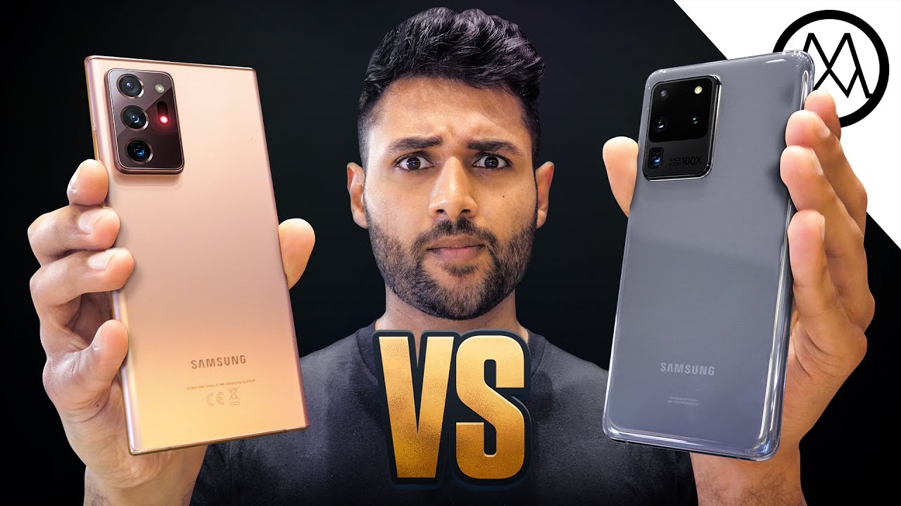
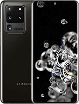
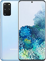
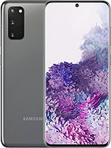
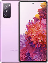
Samsung Galaxy Note 20 Ultra vs Galaxy S20 Ultra. By Mrwhosetheboss
When I first picked up the Galaxy Note.20 ultra, I thought whoa, it kind of looks like Samsung have just dialed their already super phone s20 ultra to the next level, but as it turns out, the note does have some interesting caveats so which one is actually better. I will say this right out the gate: hats off to the design team. The s20 ultra is a cool phone, but wow does it look bland with its colorless plain glass back, so it's kind of cool that in one fell swoop, Samsung have gone from quite possibly one of the weakest flagship phone finishes to my top three of all time. The note has color for starters and combines a drippy fingerprint resisting back with a logo, that's embossed, as opposed to just flush with the body and a high-gloss camera module. Also, I like the fact that the cameras now look defined and purposeful compared to their more floaty nature on the last phone. My other first impression, though, is that this camera protrusion is enormous.
I was about to get mad about it, but then I realized it's only because the phone itself is slimmer. They've kept the thickness at the camera section the same, but for the rest of the body, it's fallen from 8.8 millimeters to 8.1 and in that process it's become lighter too. Both are sealed against water and dust. But what I think is fascinating is that the node 20 ultra is the first phone in the world to be fitted with gorilla glass 7, which I'm told is 1.2 times more drop, resistant and 2 times more scratch resistant versus the gorilla glass 6 on the s series and every other flagship phone. Now that doesn't mean it's going to be able to resist materials that are twice as hard, but more than likely, it means that something that would have previously given it a deeper gouge will now just give it a lighter scratch, but still that is great news and will definitely mean less deterioration over time from sharing pockets with your other life essentials.
My only ergonomic complaint is that the note phones have always had these razor sharp corners to make them look. Boxier and visually separate from the s series, and also, I guess to make them feel more like a pad for writing on, but I just can't get used to them compared to the soft corners of their other phones. This just feels a little stubby. Overall, though note kills it in design, but possibly the most interesting thing about the way they've put together. This phone is that this is the first note that isn't any bigger.
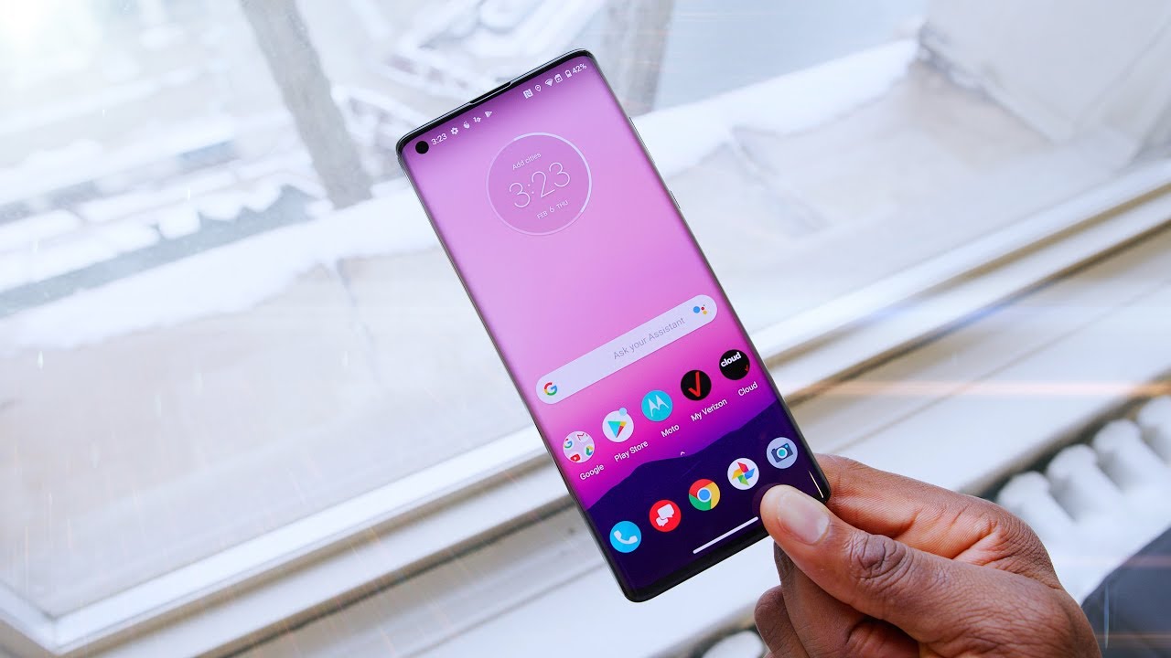
I mean, thank god. It is a good thing. It's just interesting. Furthermore, it perhaps indicates that we're reaching the feasible limits of how big a phone should be watch. How I get proved wrong in like a month's time, both have a very similar and very beautiful 6.9 inch super AMOLED, quad, HD, plus 120 hertz, refresh rate display. They both push the boundaries in every metric, and the note gets two wins here, a small one in that its screen to body ratio is ever so slightly higher, making it actually the highest screen to body ratio.
Samsung has ever put on a phone and a pretty huge one in the fact that it's 25 percent brighter, while the peak brightness of the s20 ultra maxes out at around 1200 nits. This new note comes in at 1 500. I think that makes this the brightest phone display period and Samsung did a good job at keeping the curved sides on these phones because they look good, but turning that curvature down, so that the whole screen area is still usable. So that's another point to the note alright. So when the s20 ultra came out, it was all about this camera.
It had every single spec imaginable: 8k video, recording, a 108, megapixel main camera 100 times space zoom an ultra-wide camera, a depth, sensing camera. It even had a 40 megapixel camera for selfies, but in actual real world usage it was only good. The 108 megapixel sensor didn't get as much dynamic range in as more affordable phones, and I just had a real hard time focusing on things. The 8k video was super detailed, but came with a whole load of compromises and that 100 time zoom was fantastic. I did have a great time playing around with it, but to be honest beyond 30 times, it wasn't very good, and I didn't find it a particularly useful feature.
So with that in mind, the note 20 ultra feels like a more considered approach to a similar camera system. It's basically the same with a few key advantages. It comes pre-baked with all the software improvements Samsung made for the s20 ultra, which includes better dynamic range and better night mode and here's the crucial part, even though they did somewhat improve the focusing on the s20 ultra through software. Furthermore, it's still not great. So now, on the note, we have a hardware solution.
Samsung have swapped out the depth camera for a specialized laser autofocus module they're saying it does everything that the depth camera did, but now also means it's snappy. At focusing- and this I can verify, there's also the pretty niche edition of just more options baked into pro video mode like being able to select where you want your phone to pick up audio from. Are you all around you or just focus in front or focus behind, and it lets you shoot? 120 frames per second video at 1080p. We have technically seen a lot of phones already. That can do this as part of their slow motion feature, but the quality hit seems to be less here, but it's not just additions.
In a sense, the note camera has almost scaled back. The 40 megapixel selfie camera has been dropped to a 10 megapixel one, although in real world testing it seems very comparable, but also one of the s20 ultra's key selling points.100 times zoom has been dropped to 50. , because the telephoto camera has been switched from a 48 megapixel four times, optical zoom to a 12 megapixel five times optical zoom. But, interestingly, when I tried both at 50 times the notes photos did appear more detailed, so I'm not actually convinced that this is a worse telephoto camera. It's probably just the fact that for this note, they're not marketing it as a 100 time zoom camera anymore, because they don't need to, so they've limited that feature with the marketing.
For this note, they'll probably focus on its productivity features and the benefit to that for the camera. Is that they'll only put things on there if they think they'll make it better? So I'm giving camera to the note. But if you want to see a more detailed camera comparison than do consider subscribing. I would really appreciate it. This whole thing definitely marks a transition.
When that first Galaxy Note came out, it was basically just Samsung's way of making a plus phone a bigger, faster, more extreme flagship, but it's just not the case anymore. If you've been paying attention to the marketing over the last few years. What Samsung's trying to do with these phones is not to have one good phone and one ultimate phone. It's actually just to make two different phones, the s series for social media and sharing, and the note for productivity and sophistication, and nothing makes this transition clearer than the fact that for the first time ever, the note is launching at a lower price than the s. Even if that is like saying someone is shorter than the Empire State Building 1179 pounds for the note in the UK versus 1199 for the s when that launched.
But before I just hand the point for pricing to the note a couple of things, you should bear in mind in defense of the s20 ultra, because it's older, you could probably find it for quite a bit less than that list price and almost definitely cheaper than the note, and that phone goes up to 16 gigs of ram compared to 12. But now, in the notes, defense, the phone comes with two times: the base, storage, 256 gigabytes versus 128, and that storage is faster. UFS 3.1 versus UFS 3.0 Samsung is saying that, because the storage is up to 60 faster, you actually now need less ram because, after all, all ram is your short-term memory, after which things can be shifted to your now faster long-term memory. But it's tough to say right now, whether this faster storage actually compensates for how much less ram you're getting so. This pricing section we're going to call it a draw now, probably the most confusing spec of this new note that we need to talk about is its battery.
This is again something that I had my pitchfork out and was ready to run about, but there is a silver lining on the face of it, though, it's not good news. The capacity has been cut from five thousand million powers to 4500 the max charging wattage is now capped at 25 watts, instead of 45 watts, and we need to talk about the Enos in the room. You probably know by now that Samsung for its flagship phones, makes two different versions for different regions and for their s series. Earlier this year, the Enos 990 powered phones lagged quite a way behind the snapdragon 865 powered phones, I'm talking up to 20, lower performance and 20 worse battery, that's enough of a difference that you're almost looking at two different phones, depending on where you live, and so you would think this note phone would be the perfect chance for Samsung to put all that behind them to build a more powerful Enos chip to level the playing field. But the gap just got wider.
The regions that were already getting the superior snapdragon get an upgrade to the 865 plus, which is about 10 faster, but if you're in the UK or India, the Enos that we get has stayed the same. So even though this isn't bad news, performance isn't getting worse, it kind of stings and the Enos chip is not particularly friendly for battery life. However, the silver lining is, in this new display, see hidden deep within the spec sheet of this new note is a feature called adaptive refresh rate, and it means that the screen can refresh anywhere from 1 to 120 times per second, the s20 ultra can only flick between 60 and 120. By having this full control of the refresh rate, the note is no longer wasting battery if, for example, you're running an application that only refreshes 30 times per second on the s20 ultra, the screen would still be running at 60, but the note can reduce that to 30. And so according to Samsung.
If you combine this display with the faster, more efficient UFS, 3.1 storage and the new one UI 2.5 software, the note battery will actually last longer and speaking of software, either way you're going to face the usual Samsung deal so fast, responsive, UI, fantastic haptics. The way the phone feels when you type or interact with it, but also an absolute landslide of bloatware that you'll probably never use. But the note does have a few important perks, because it's a newer phone it'll probably get updates for longer, and it starts ahead with a new one, UI 2.5, which isn't anything big but definitely feels lighter. I noticed things like app opening times and camera shutter times were just a little snappier, and I'm told this. Software is also more efficient with ram usage.
Both phones can connect to a display with Samsung DEX. But the note can now do that wirelessly, and it's equipped with something called an ultra-wide band chip. It's a bit of a weird one. It basically gives the phone a sort of spatial awareness that past phones didn't have it'll become more useful as more and more people start to get phones with it, but even now what it can do is allow you to send a file to another USB user, just by pointing your phone at them and flicking it towards them. So, in this battle the note 20 ultra is sitting pretty, and we're only just getting to its trump card the s pen and I think it's quite a big win.
In fact, every year as Samsung adds more and more stuff to it, some useful some not it becomes a bigger win, but this is the biggest upgrade in a while. If you've ever used an s pen, you might have been surprised how tactile and responsive it feels, but with this one in particular, they've cut the latency from about 42 milliseconds to 9. It feels precise and instantly reactive to your touch and the subtle pencil sound effects make it a very enjoyable experience. I was half tempted to just sit there, drawing dragons instead of filming phones. Would I use it day to day, probably still not, but you might so to round off this absolute monster of a comparison? Neither has a headphone jack both have an a-grade set of stereo speakers and both support wireless charging, and reverse wireless charging.
Okay, when I came into this, I was expecting it to be a closer battle. I saw the note spec sheet and I could see that it had improvements like the laser autofocus like the brighter screen, but I could also see it had compromises like the smaller battery and the less amount of ram, but in the end, it's a bit of a whitewash. This tally. I've been taking, isn't an exact measure, but it should give you an idea. There are a lot of improvements here, a lot of subtle, refinements, a focus on carefully trimming things, but at the same time, improving efficiency and all of these nudges, the phone in the right directions.
In almost every category. If you enjoyed this video, a sub to the channel would be incredible. My name is Aaron. This is Mr who's, the boss, and I'll catch you in the next one. You.
Source : Mrwhosetheboss
