Remarkable 2: Update 2.5 Features Overview By My Deep Guide
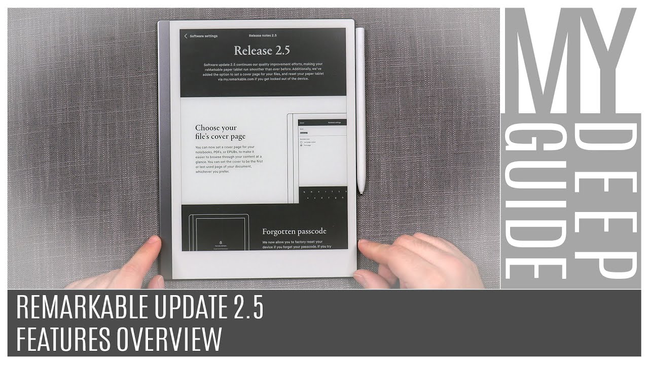
Hello, my name is Goya and welcome to my deep guide. Today, I'm going to be checking out the update 2.5 on the remarkable 2 and 1 platform. So, let's check out what it brings to the table and yeah. What do we get all right, so we're updated and using the version 2.5.0.27 and the release notes are interesting before I actually, when, once you first update, it actually tells you that they further focused on the optimizations and speeding things up, so it has continuous our quality improvement efforts? Making your remarkable paper tablet runs smoother than ever before, which I think is a good thing, especially considering that the update 2.4, which was primarily like an optimization update, but unfortunately, while it did optimize dramatically those switching between the tools in the notebook which is really, really cool. It's much, much faster. Unfortunately, um yeah when I tested it uh back to back version 2.3 to 2.4 the booting time was slower, EPUB font change was slower and the that large image or the Hercules load type of test that I do. That was also dramatically slower when compared to what we had on update 2.3. So my hope is that, since this is the first thing that they're saying that they've kind of you know zeroed in on those things and further optimized the optimizations, but as far as features go, we have one new functionality or a feature, let's say, and that is the main one, which is that now you're able to actually choose the cover page between the document or the notebook.
So now you can choose to have the front page of a book or a user manual or any document to be shown in the file browser or in your notebook. Should you choose to do so, and we also have the ability to um yeah to deal with the forgotten passcodes? If you basically uh forget it. So that's something that's kind of uh cool. I won't be testing the forgotten passcode because it requires resetting the device, which is something that I won't do, but I will test out first, the optimization things or the performance I'm going to run the same test as before, and then I'm going to check out the new cover page all right. So the first thing that I'm going to be testing out is the power up speed or the startup speed.
And, of course, I'm going to run the timer in the edit as well. But I'm just gonna check here, because I'm generally doing this for the first time and the old startup value on 2.4 was 24.3 seconds on update 2.3, it was 22.8 seconds. So, let's see where do we get uh yeah with update 2.5? So, let's start and let's see what we get, because it would be nice to actually go back to that 22 second or faster kind of range hey. That's a new boot up thing cool, alright! So now we're back to the same uh speed as before so cool we're now at 22.8 roughly seconds. So the boot uptime is faster than it was on update 2.4, but it's basically as fast as it was on 2.3. So at least that one is good.
So far, so good, let's check out the next one. So the next test was the um yeah, how long it takes for the device to actually reformat a very large EPUB file. So this is account of montane crystal it's around 2000 something pages and the continuing problem that we had from before is that the platform? The way it works is that as soon as you touch on any of these settings, it's automatically going to wait for an extensively long amount of time, and it used to be 45.2 seconds on update 2.3. Then it actually got up to 47.5 seconds in update 2.4. So, let's see has it been fixed or if it hasn't been fixed.
How long does it take? So it's exactly the same testing as before. So I'm just going to go one step lower in the font size and let's go three two one go and yeah. This takes a long time, so I'm just going to speed it up all right. So it's definitely not fixed, and now we're nearing the 40 second, so it was 445 seconds. Seven, eight whoa, okay, oh wow, all right, so we're around 53 seconds for an EPUB change, so that's most definitely worse, not only not fixed but worse than it was before.
Well, that's unfortunate and finally, this is the Hercules load. Somebody asked like what is Hercules loads test. Well, it's me loading up this document, which is a Hercules DEC, whatever kind of user manual it doesn't matter. The only thing that matters is that the front page is a super high, res unoptimized image of a large size, and it basically tests out and stress tests the uploading and memory operations of the system itself. So it's something that I consistently test on each of the performances, so it used to be on 2.3. It would open up by 4.16 seconds originally then update 2.4 it jumped up to 15.4 seconds. So, let's see what we get now three two one go and now this is just a preview.
We're waiting for these guys, the little dots loading dots to finish because then the whole document is going to be loaded, and I'm not looking at the timer, I'm just checking whoa where wow. So now it's even longer well, it is what it is so yeah and I also updated my remarkable one to the latest update 2.5 point to zero point whatever, and I'm just going to quickly run through all the tests and see how the two devices compare to each other, the performance after the latest update. So let's start with the power up, so I believe it was around 22.8 seconds on remarkable two. So, let's see here same type of loading screen, which is kind of cool, I think we're running very similar time, 21.2, so slightly ever so slightly. Well, no, it's actually second and a half uh faster than remarkable 2 in the boot uptime.
Now, let's check out the count of most dearest EPUB change, all right. So now we're going to lower the format. So three two one go, so it was 47 seconds, update, 2.4 now 50 something seconds on remarkable. Two, let's see: where do we get on remarkable one? Okay, no more playing with fingers, because now we're going to have the stopping time soon, hopefully wow or maybe not there. We go 56 seconds for a single formatting change.
All right, so remarkable two is definitely faster. All right and now, let's do the Hercules document load. So we're page one. It's going to open, that's good and let's go three. Two one go so I have the loading screen.
You know it used to be three dots when you were bought booting up, and I really love the new boot up logo, the progress bar. So it would have been nicer if we had that consistently throughout the whole user experience. But let's see how long does this take, so that was around 20 seconds, which is really, really slow, so yeah all right. Well, that's those are the results all right. So now we have a new feature which is choosing the cover page for your notebooks or the documents it works the same on both and that's in basically in the document management.
So now we have notebook settings or the e-book settings, and in this case, when you go to notebook settings we can check the name which is kind of cool and also this is the one that we are looking for. So notebook cover last page visited or the first page, and now, if I switch to first page and enter and if I now go to page management and yeah yeah, I've done that, but it's okay, all right. So let's say that I go here, and I want to move this page to the front, so this is going to be place before all right. So I go to this page. Let's change no template, so it's going to be blank or no, let's make it even better.
So let's do line lined heading. So this is going to be my title page, and then I can just say with the flourish right so, and I'm going to make a little smiley dude here so that we can recognize the smiley dude from afar as a small, thumbnail and yeah. Let's just cover in the light there we go okey-dokey. So if this is my title page, let me just double-check that it all is good yep, that's the title page. So now, let's go somewhere all the way down here to the elephant dude.
So that's going to be an interesting um, yeah change. So now, when I close the document yeah, we have the um. I don't know how much you can see, but we clearly have the indication that we are 22 pages. It's showing me the notebook title page and when I tap, I go into the current page that I was at, which is great, and it should work the same way for documents. So PDF documents, yeah we got PDF settings, I can choose PDF cover to be the first page, select enter, save and now, let's go to another page.
Let's say go to page: I don't know five, six, seven, whatever that's the page, I'm going to go to, so now we are at pan. Of course, it's empty! No! It's loading! Okay! So there we go stages of fear, okay, so this is clearly an indication. This is the page where I'm at and when I close, we should have the cover page and we do so. It works properly on a PDF and, let's check out one pubs count monetarist. This is gonna, be the first page, and we're going to do first page for the cover enter, save and now, let's go to another page, for example, yeah one four, five two: here we go, it's loading there, and we should have the cover once I exit, and we do so that actually works.
I think this is an excellent addition, and this is something that can help you really organize your uh files, and I think it's going to be way more beautiful, actually to to to have an overview over your documents and your notebooks. However, it really dug for me at least it absolutely begs the question of why the addition of being able to actually upload your own templates, normally not as a hack but as a normal functionality of the device that is actually supported by them. Why wasn't that a part of this update? Because it's absolutely perfect, I mean to me this is exactly what I would like to do is to create my different types of templates for notebook, title pages or notebook covers, but I can't unless I want to do hacking and if I do hacking, then all of my title pages are going to kind of the templates are going to be gone after each update and I don't want to hack the device I want to use it normally, and I really don't understand how why why but yeah, so the cover page works. It just begs the question: why not let us use our own custom templates. That would have been a very logical thing to go hand in hand with this update.
As far as I'm concerned, at least oh you beautiful, problematic little one. I so loved the design of this thing, and I love the device a lot, but it really pains me to see after each update just how it's being treated, I it deserve so much better. It's just um yeah. It's its a shame, but anyway, let's just summarize so one of the main uh focuses of this update was to improve the further improve the performance optimizations and yeah. They weren't.
It's the same trend that we had from 2.3 to 2.4 the boot uptime at least, is back to where it was on 2.3, but the EPUB change not only hasn't it been fixed, but it's actually longer on the same document using the exact same settings and loading of a more difficult type of document with an image is also longer than it was on 2.4, which is still now, I think, five times longer than it was on 2.3, which is just sad to see that rhymed. I think the good thing is that we do have that new cover feature for the notebooks and the documents for the documents and for the books. It works perfectly, and I think it's a very, very welcome feature to actually help you organize and maintain your document and book library. However, as a reader, this thing doesn't have even the most basic functionalities, such as bookmarking or yeah bookmark. Let's just add bookmarking to the table, it is primarily a note-taking device which is fine, I'm fine with that.
As I said, I think this was the perfect moment absolutely perfect moment to have introduced the ability and support to actually load your custom templates, because it just makes absolute sense to be allowed to load up your own notebook templates, because then you can just make your own templates and have fun and just imagine if they were more creative and more hard working as a software developer team like how cool it would have been if they incorporated into their desktop app a very simplified template designer, so that you design your own template, and you just save it within the remarkable desktop app, and it's automatically saved on to your device like there's so many simple ideas that they could do and yet none of them actually are there. We get absolutely for me personally below the bare minimum and yeah. I am not happy with this update. I'm not happy with the update 2.4, I'm not happy with the update 2.5 update.2.3 was the last one that actually made any sense. Um remotely because it added a calligraphy pen, but even that was very minute because it's just a new brush, but it's a great brush, um, so yeah, and that was back in September.
I was definitely hoping and expecting more, and I still maintain that this design and this device itself the hardware side of it, deserves so much more and it could be so much more. Hopefully, here's hoping that in 2021 now that all the units are shipped out, and they get all the stuff that they can get their act together and finally start making things that make sense and improving this platform properly and not just etching out updates, 2.3 2.4 2.5 on paper. You got like three updates in four months, which in hr world and for investors, sounds great, but for the actual users, when you put on that same paper, what did we get? We got a calligraphy pen. We got a new uh font for pubs. Furthermore, we got zero issues, fixed uh.
No sorry one issue fixed with the eraser and cover pages for documents definitely should have been a lot better. Taking into consideration the state of the platform itself because it is severely lacking, here's hoping that update 2.6 will actually bring some meaningful things that are gonna, transform the platform significantly and not be yet another iterative update as what we've had so far, and I really do hope that they actually improve the performance in the next updates, because yeah so far, it's going in the opposite direction. It's not really what the optimization means. Thank you so much for watching. If you liked the video please like and subscribe, stay safe, stay healthy and see you in the next video bye.
Source : My Deep Guide
