OnePlus 8 vs 8 Pro: Unboxing & Review By DetroitBORG
What's up guys Mike here, the Detroit Borg, with two new flagship phones from one plus the 8 and the 8 Pro we're going to compare them side-by-side in this video, because there are quite a few differences. Now they've sent these phones in these large press kits. So these are not what you'll get when you receive yours, but of course they do make for nice. Unboxing experiences they've also sent me their optional wireless charger, which works with a new 8 pro more details on that later, but first, let's get to the phones. So once we remove these sleeves, revealing these never settle boxes, all we have to do is lift the lid. Then the first thing we'll get are these reviewer packets? So these are really nice.
Well, Illustrated, information, packets that tell us about these specs and features of the new phones. So again these cases are optional, but they reveal right away that the OnePlus 8 pro has a different camera design than they one +8 and, of course, we'll get into that. Next up we have the retail packaging, so these bright red boxes are what you will get when you buy your OnePlus. The boxes themselves are very similar, but the one for the pro is a bit taller and thicker than the one for the 8, but they make it easy to get into these boxes by putting these tabs on the back to remove the plastic wrap so lifting the Liz there's a difference in terms of how these are packaged. You can see that the 1 + 8 on the left has its paperwork, and they pack it on top of the phone.
While the paperwork is inside the tray for the 8 pro, the paperwork is identical between each phone, just resize for the packaging. One of the more interesting pieces here is the SAR value, which is the radiofrequency emission of these phones that might have something to do with the new radios inside these phones, which includes 5g and Wi-Fi six support. We also get a matching set of OnePlus stickers, including reference to the smooth, fluid AMOLED display. As always, we get the invitation letter from the OnePlus CEO and on the back of that invitation letter is our sim ejection tool. So if you want to read this just pause, your screen, all the accessories are identical.
The only thing that differs here is the included case for the 1 plus 8 Pro. It's a pretty nice clear, CPU style case with the never settled branding emboss on the outside. Although wireless charging is exclusive to the 8 pearl, both phones get the exact same warp, 30 T wired charger. So these are 30 watt chargers that can rapidly recharge these phones from 1% to 50 in under half an hour, and it can do this without overheating the phone. So that means you won't suffer any sort of performance limitations.
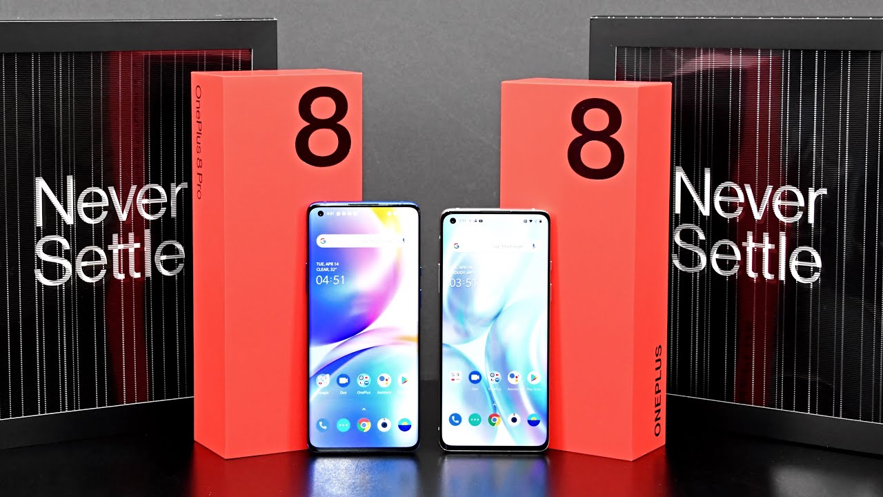
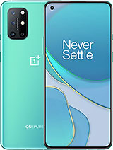
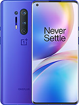
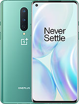
While it's charging in terms of the color selection, both phones are available in Glacial, green or onyx black, but the colors I have here are exclusive to each model, so the ultramarine blue is exclusive to the eight pro and the interstellar Go is exclusive to the 1+8, at least at the time of this video in terms of interstellar glow. It's more of a special effect than a color in itself, just because it changes so much depending on the lighting conditions. Now it's extremely reflective and that can be a problem when you're photographing, something if actually found that it reflects too much light back at the subject and distorts that light. So personally, I would prefer something matte or just put a case on it, but I really love this ultramarine blue. Has this nice satin color, which hides fingerprints and looks really nice as the light changes across its surface for the most part.
Both of these phones look like scaled versions of each other, both of them have the rounded edges. So that means the display is pretty steeply rounded toward the edges, and the back glass is also rounded to a very symmetrical design that sort of evokes Samsung phones. So that means we have a really nice smooth edge to grip the phone. It also looks really nice, but, like all curved displays, it does cause unintentional presses of the display, which can be annoying. It's mitigated, if you're using a case, but if you're using it without the case I think it becomes a problem pretty often, but again we have a stainless steel frame and the intended design seems to be identical, which makes sense.
So we have the antenna breaks in roughly the same position at the bottom edge. We'll find one of our stereo speakers, along with our USB-C port and a double-sided NATO SIM tray, which, incidentally, does have a water gasket around it. That is red, which is a pretty subtle call out to one plus favorite color along the right side. There's a pretty familiar setup with the power button, just below the three position alerts slider and on the left side, we'll find our volume rocker on the top edge is one of the microphones, along with a ridge on the 1+8 pro design, which is not there on the OnePlus 8. Now both phones have the exact same earpiece design, which is discreetly integrated into the top edge of the phone.
It's a nice wide speaker, which also acts as the second half of the stereo speaker setup, and it's nice and clear. Now, if you look really closely under the right lighting conditions, you'll see the ambient light sensor and proximity sensor, really discreetly, tucked into that thin bezel. In fact, the screen protector on the 1+8 is actually cut out, specifically for those sensors which tipped me off to where they were. One of the bigger changes from the seven Pro from last year is the elimination of the pop-up camera in favor of a hole-punch camera, which means the camera is integrated into the display, and it's a tiny opening as well. So it's able to pretty neatly and discreetly hide in the status bar of the operating system.
Now I definitely miss this sort of mechanical magic of that pop-up camera, but it is more solid-state, so should be more robust and obviously more water-resistant. Face-On lock is still here as well, and it works extremely quickly, although I'm not sure how secure it is, but it does have a new feature that lights up the display to wash your face and light. So you can see your face even in a pitch-black room and whenever the camera is in use, you'll see that little animation around the camera bezel now what's interested in my case, is that the 1+8 is the only one with the included screen protector, which one plus is famous for the pro does not have it personally I, don't like the screen protector, so I prefer to not have it on here, but I know a lot of people expected. Both phones also have in screen fingerprint readers, which use light to basically see through the display, and it's still the fastest and most reliable in screen fingerprint reader I've ever used in terms of these displays. The three primary differences are size resolution and refresh rate, so we have a six-point 55-inch screen versus a six-point 78-inch screen.
So that gives us a resolution of 1080p vs.1440p. So that's good for 402 pixels per inch on the 8 vs 513 pixels per inch on the Pro and, like a lot of other slim bezel smartphones. These are extra tall displays with an aspect ratio of 20 by 9 or 19 by 8 by 9. Now, we've seen the fluid AMOLED displays before, but this time it's 90 Hertz for the 1 plus 8 or 120 Hertz for the 1 plus 8 Pro. Now a typical smartphone has a 60 Hertz refresh rate, so 90 or 120 Hertz is a big improvement.
That basically means that things look a lot smoother, especially when you're scrolling, so it gives the impression of a much faster and smoother operating system. Both of these displays are HDR panels with some software features to boost the HDR performance, especially in video and gaming, but the pro does get a 10-bit panel similar to the galaxy s 20. So that means it can produce up to 60 times more colors more accurately than a standard smartphone display but side by side. These displays are identically calibrated, so they look very similar to each other. It's really hard to tell the difference and in terms of video, it does support the HDR 10 standard.
In terms of audio again, we have stereo speakers, and they're pretty well-balanced, although the top speaker is more prominent, we do have support for Dolby Atmos and for the most part, the speakers are loud and clear with a nice wide soundscape wireless charging is something that we've long wanted from an OnePlus device, but they've always been reluctant to offer it because it's a lot slower than they're wired charger, but they've been able to design a wireless charging solution that works just as fast as their wire charger. So this is their work, charge 30 wireless device which is sold separately. So just like a wire charger, you can charge your phone up to 50 percent in only 30 minutes. The OnePlus 8 pro is still a wireless QI device, which means it can be charged by any wireless charger that supports it. But in order to get these speeds, you do need this specific charging dock, at least for now.
The eight pro also supports reverse wireless charging. So if you turn this on within the system, you can wirelessly charge. Other devices like a smartphone or a set of headphones specs are almost identical for both of these phones. They both get the same snapdragon 865 CPU with the Adrian 650 GPU. That's the latest hardware used on most flagship phones today and both of them have two different storage, tiers, 128, gigs or 256 gigs, and that's fast, UFS, 3.0 storage. That also corresponds with either 8 or 12 gigs of ram in terms of synthetic benchmarking.
Both devices perform roughly the same, although I did get better performance out of the 8 for some reason just slightly, but it is significantly better than the 7 Pro from last year and is consistent with performance out of the galaxy s 20. Both of these phones have the exact same radios as well, so they get Wi-Fi 6 support, Bluetooth, 5.1 and the X 55 5g modem 5g isn't widely available on a lot of networks, but at least these phones are future. Both of these phones also get huge batteries, 4300 William hours for the eight and forty-five hundred and ten for the eight pro. So my experience with the eight pro after using it for about a week, I'm able to get about seven to eight hours of on-screen time and that's with 120 Hertz, refresh rate and full resolution and taking no battery saving measures at all. In terms of these cameras.
At first glance, it really does look like the pro just has one extra camera that the eight doesn't have, but the reality they have completely different camera systems with different optics and different sensors in terms of the one plus eight triple camerae set up toward the top. We have the 16 megapixel ultra-wide camera, the 14 megapixel camera toward the middle and the macro camera at the bottom. In terms of the pro we have a 48 megapixel ultra wide-angle camera, a 48 make a pixel main camera and a color filter camera toward the bottom and off tour. The side is the 3x telephoto camera and that vertical strip includes a microphone along with a laser assisted on the focusing mechanism which is exclusive to the pro. It basically means we have a quicker and more accurate AF system on the pro than the standard 8.
So both of these phones have 14 megapixels, wide-angle cameras, but they're using different sensors. The pros using the Sony, imx6 89, which has one point, 12 micron pixels versus the Sony AMX 586 on the 8th, which has point 8, micron pixels, so bigger, is better for better low-light sensitivity. The pro also has a 7 element lens instead of a 6th element lens, so a much larger sensor and better optics, the pro does get a dedicated telephoto camera, which is 8 megapixels with optical image, stabilization that helps the pro achieve a 30x zoom. A lot of that is hybrid zoom. So it's a combination of that high 48 megapixel sensor.
Alongside this optical zoom, the standard 8 only achieves 10x zoom, which is mostly just digital cropping. One of the things that really impressed me about the main camera on the 8 pro is how well it preserves dynamic range without flattening or softening an image that makes this camera especially fun to use in backlit shots or shots with extreme contrast now seems to be able to find the right exposure for the subject without overexposing the levels. In the background, it's also able to do this while preserving incredible sharpness and color, with virtually no noise, so it doesn't look. Processed performance is pretty similar on the standard 8, but it's not quite as good in low-light in terms of real low-light shots again, I'm really impressed by what the 8 pro does is able to finally write color and white balance for the shot, bring up the exposure without losing detail and seems to be able to completely eliminate noise without losing detail. Unfortunately, both the wide-angle and the main camera seem to have similar performance in low-light.
That's not the case for the 8, while the wide-angle camera on the 8 looks very similar to the pro. The ultra-wide camera definitely contrasts with the performance of the main camera. A really useful new feature, at least to me, is smart pet capture. This works on both the 8 Pro and the 8 and basically can keep track of your cat or ROG face to maintain focus and exposure. Even while they're moving video also looks fantastic on these cameras, we get 4k up to 60 frames per second with excellent dynamic range, great color and detail.
One of the things that really stands out about these cameras, however, is stabilization. Some of the best I've seen on any smartphone. So we have optical and electronic stabilization. So a handheld video is very smooth out, but it looks natural without the skips and jumps that tend to happen with process stabilization next up, let's dig into this operating system, so this is Android 10 with oxygen OS, which is pretty close to stock Android. There's a lot of features to still talk about here.
One of the features they promote is dark-themed 2.0, which you can activate by going to settings under settings, you'll find a customization panel, and from here you can go to tone and select comp colorful light, which is default or dark, so this will apply system-wide and across apps that support it. So that's quite a few apps such as Safari, and then we're going to take a look at this customization panel because there's a lot here, so you can change your wallpapers, and we do have these new live interactive, wallpapers, which will respond to the weather conditions and there's quite a few of them. I chose my own wallpaper. Just so. I can have a consistent look to show the differences between these devices, so I'm just going to go back and stick with the one I chose he.
We also have our fingerprint animation, so we have different fingerprints. We can choose from now. The one I have on by default is energy, but we have cosmos ripple stripe as well as none, so you just want to play one. We also have the horizon light, so this will line up the edges of the phone in a color. You prefer so there's just forward to pick from here.
I just go with blue and again that will flash notifications when the screen is off or locked. So if it's laying face down it will light up your table for you. So that's one of the benefits of that edge screen. We also have our clock styles and there's many to pick from here. So if you want something more minimal or if you want to see your notification, badges and the calendar, we can also customize the accent color for our buttons blue is on by default.
You can see different panels depending on whether you choose dark theme or light theme. We also have our system icons. You can go from square to circle, to teardrop or round rectangle. We also have our icon pack, so you can go with oxygen, OS or the hydrogen theme, or it can pick something else from one of the stores, and we also have our fonts, so you can go with Android Robot theme or one plus and that's what I'm using there's also a lot to take a look at under display settings and there's quite a few differences here between these phones when it comes to the display so, for example, comfort tone. This will automatically adapt the white balance to the ambient conditions in the room, which appears not to be available for the 1+8.
The 8 Pro. Also has these video enhancement features, but the one plus 8 reduces it to just this vibrant color effect, which you can apply to video. So it's a little less sophisticated. So in terms of the vibrant color effect. Pro again does a very similar thing, which is to enhance colors, and then we have motion graphics, smoothing.
This is the big thing. This will actually improve the frame rate or interpolate the frame wait for 120 Hertz for all video there are some differences under advanced as well. Now you can change the resolution. That's displayed on the 1+8 pro, but you can't do that on the standard, 1 + 8, because it's a standard, 1080p screen in this case you can drop it down to 1080p, and this will change the resolution or bump it back up to HD+ and when you get that or when you turn that on you get the option to enable auto power saving. So this will reduce the resolution to full HD plus when it's not needed.
We can also adjust the refresh rate, so we can go down to a standard, 60 Hertz to save battery life, if you prefer, if you prefer to hide the camera better, so it doesn't stand out as this dot on the screen, which I, don't think, is a big deal. You can actually black out that section of the screen, so it looks like it's part of the bezel first I. Definitely don't prefer that we can also customize the status bar, so we have an icon manager. It allows us to select what's displayed in the status bar. So if you want to simplify what appears up top, this is where you can do it now.
One of the first things I would recommend, is going to screen calibration and choosing a different color profile. It wasn't a big fan of the vivid or natural color. It looks a little too warm, so I chose advance with AMOLED wide gamut, and that got me that more vibrant color, with the cleaner white under buttons and gestures. We have our settings for the alert slider, so you can assign different actions for those positions, but we also have the navigation bar and gestures. Now I've activated gestures, which means you don't have the traditional navigation bar toward the bottom.
Instead, you swipe up to go home, swipe up and hold to get to your recent apps launcher and, more importantly, you can swipe in from any edge to go back instead of thumbing down here the finally back button, which I think is a big improvement now by default. It also hides the bottom bar, which is that little indicator I think that's superfluous. But if you want, you can turn that on. In terms of the interface, this is pretty much Android 10, and it's extremely smooth with this 120 Hertz refresh rate. So you have your Google panel when you swipe in from the left edge, so I've done to get to your widget panel, and some of these are customized for the OnePlus device.
If you go to the editor, you can see, we have a few more here. So if you want, you can go ahead and drag and drop as many apps as you want into that widget panel. So we have a reading mode with two options. We have a chromatic effect, which sort of dims down the colors and warms up the screen. So it's a little more easy on the ice, especially for reading.
We also have the option to choose the mono effect. Now that completely removes the colors. We also have a night mode, so you can turn this on manually, but if we long press we get to some of our options. So you can set this to turn on automatically at a custom time range or automatically. With your sunset and sunrise of your location, you can change the color temperature, which I actually really like it.
You also change the lightness of the effect. We also have a very handy screen recorder. This gives us some options here, so you can change the resolution, the nitrate, the frames per second, the audio source and more so, if we click record here starts recording, and we can continue to have gained through our interface and demonstrating whatever we want to, and you can see the control widget up here, click stop, and it saves it to your gallery. There's another trick on the home screen and that's the hidden space so from the home screen. Just pinch out.
This takes you to a place where you can hide apps. You don't want other people to see at least readily. Obviously, if they know that feature is there they'll find it, but you can select whatever app you want to hide in the space next up. Let's take a look at this camera app, which is pretty intuitive, so we can cycle between our available cameras here. So we have ultra-wide standard wide-angle, and we have our zoom tap and hold to get to our dial, and we can zoom all the way in to 30x.
Now this is limited to 10x on the regular 8, but you can see we can pretty smoothly jump between these cameras. Like so, you'll see a transition at some points here, but otherwise it's pretty smooth. This also works in video. So, while recording video you can smoothly move between these cameras without much issue, you will see it jump occasionally like so otherwise. This is also limited to 10x when you're recording in video.
Of course, we have slow motion panorama time-lapse. We have a portrait mode, nights cape and pro mode, so pro mode gives us precise controls or manual controls for ISO level, white balance or aperture our focus levels and our exposure up top. We have quick toggles for our timer, our flash. Furthermore, we can cycle between 48 megapixels or 12 megapixels. Now, if you look at the message up here, they do recommend you shoot in 12 megapixels, because it's more flexible, but 48 megapixels requires more light.
Now, if you choose 48 megapixels, you do lose some features here. So, for example, you lose the telephoto camera, but you still have your ultra-wide and standard wide-angle. We also have a super macro mode which is available on both devices, although the OnePlus 8 has a dedicated camera for macro, that's not needed on the hardware here. Settings always has lots to take a look at here, so we have ultra shot HDR. So that's where you can turn this off lots of other options here, such as smart content, detection, video resolutions, so I have it set to 4k at 30 frames per second, but you can go for 4k at 60 frames per second or for case sin at both 30 or 60 frames-per-second.
That said, ultra-wide aspect ratio that takes advantage of this tall display. We also have a tripod long exposure feature so when the phone is mounted its able to keep the shutter open longer for long exposure, that's something you can't really do handheld! So when it comes to pricing, these start at $6.99 for the eighth and $8.99 for the pro, so $200 separates them. Now, if you add $100 to each of those configurations, you get double the storage and twelve gigs of ram, so those are still relative bargains, even though there's still pretty big numbers, especially when you consider where OnePlus came from, but when you consider flagship phones with these specs costs over $1000, these are pretty impressive devices. Now, from my perspective, the eighth pro is one of the first one plus devices to really have all the flagship features you expect with nothing missing. Usually something was missing, such as wireless charging.
Not only do we get wireless charging, we get the best wireless charging solution out there. So, even though similarly equipped flagship smartphones costs over $1000, this stays under $1000 and adds features that other smartphones, like it doesn't have, are the guys hope you enjoyed this look at the one plus eight and the eight pro you guys enjoyed this video. Please leave a like to. Let me know, and I'll see you again in my next video.
Source : DetroitBORG
