iPhone 12 Pro Max Unboxing + First Impressions By Matt Robb
Hey guys welcome back it's mat there, and you probably noticed already. This looks a little different to usual. That's because I'm recording this on the rear camera of the iPhone 12 Pro max at 4k, 24 fps. So hopefully it looks good. Hopefully everything is nice about it, but I've already unboxed this and used it, and I can say first off that I really do like this device, and today we're going to be doing the unboxing, but then leading into sort of my first impressions and things like that. So without further ado, let's dive into it, I know I'm a little late to the game, but it's Christmas and a small YouTuber.
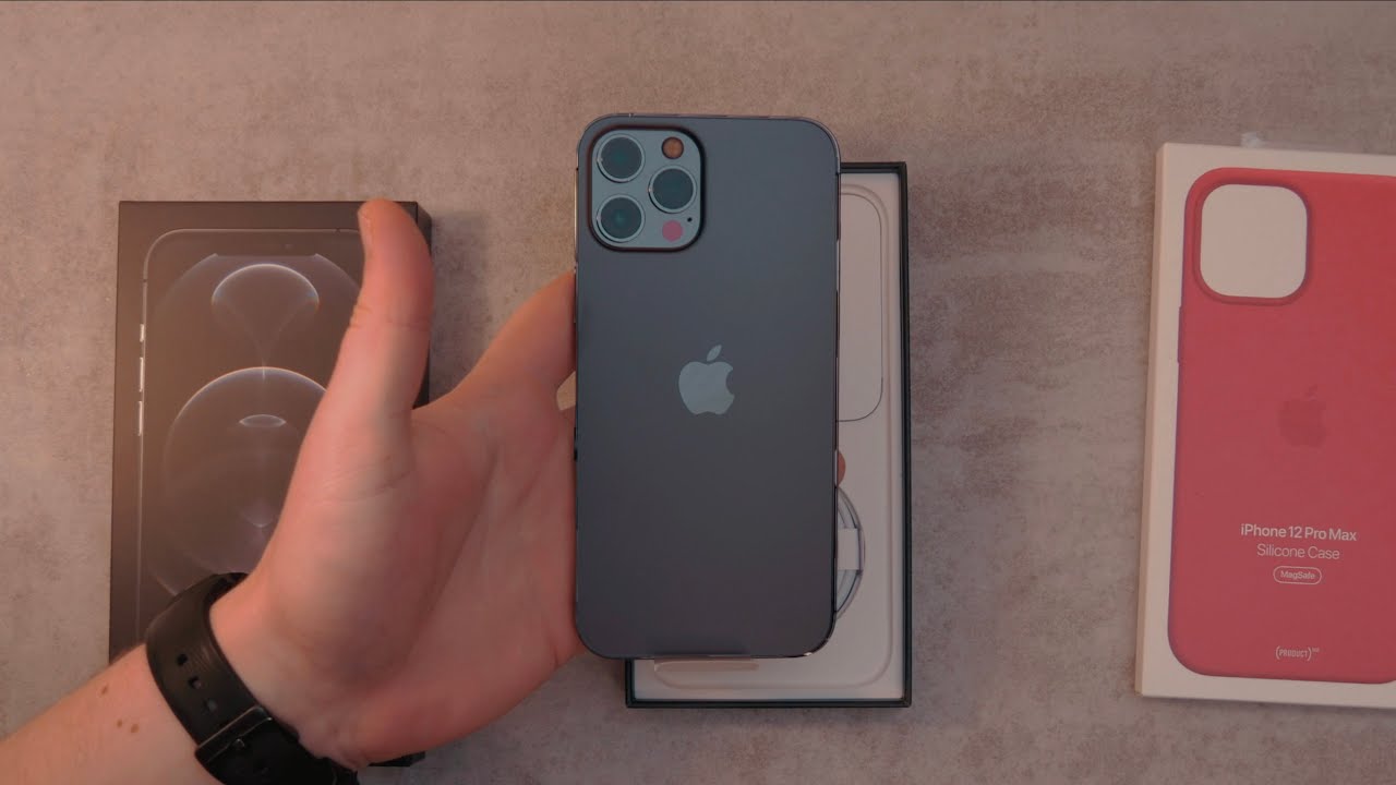
I have to buy this with my own money, and it's really not cheap, so yeah anyway.50K is pretty close as well. So if you could subscribe, that would help me out, let's dive straight into it. Okay, so right here we have the apple product red silicon case for the iPhone 12 Pro max, and we obviously have the phone itself. So we're just going to take off this cellophane. What I really like about the packaging this year- and I think the other year did this as well- is they have all these pulley tabs? So you don't actually need to like cut anything open, but, as you can see, there's the device sitting there.
We have it screened facing down and yeah. It looks pretty stunning. I got the space gray. One pretty much was the hardest decision I've ever made in terms of just choosing something because I didn't know whether to go for the blue or the space gray, but I kind of just decided on this because I, like the combination of red and black and overall, I just thought blue- wouldn't really go with many accessories and colors that I have in my life. So I ended up just going for the space gray.
I thought that was kind of like a neutral color now to peel off the screen. Protector. Oh, still gives me the chills that is so satisfying, but yeah. This thing looks really, really nice super premium, and you know something I really do like. Is this sort of old iPhone, 5s style? Look with the flat edges: now they are sort of glossy which I'm not a big fan of because it does kind of pickup fingerprints.
But anyway, now it's actually booted up we're just going to have a look in the box no charger this year, no earbuds! You just have a sim ejector tool and this lightning to USB, cable. So take it. How you will, they don't have a charger? They say it's for environmental reasons, but I still think it should probably be included, or they should do a little more of a price cut, but yeah now we're just going to go through and set this thing up pretty much just log into everything set up the Wi-Fi, and I'm also going to transfer some stuff over from android. So first time using this app, which does transfer, so you enter a code, it connects via Wi-Fi, direct and then transfers everything accordingly. Apparently so, while that's going in the background, we're just going to unbox this product red case and take a closer look at it.
So, as you can see there, it is- and you know I really do like the soft touch feel of these product red cases and something about the iPhone 12 cases. Are they have the mag save so basically, it just makes the magnet a little stronger, and it helps it align up a little better once you have this case on, but something I really like is that when you go ahead and actually snap the case on it gives you some feedback, and it also goes ahead and changes the screen color to match the case, which is just kind of snazzy, and you know it doesn't really do much, but it's just kind of a nice touch that they did that because I really didn't need to but yeah this is it pretty much set up. I'm obviously running the latest iOS there was a software update and I don't really have many apps on here. Yet this is just pretty much how it came out the box, but right off the bat I can say the screen is really, really crispy. Obviously it's only 60 hertz, not 120.
I was thinking, it'd be a bit more choppy, especially after coming from the s20. But, to be honest, I think apple are pretty good with the animations. It's a bit slower than android, and so you don't notice it quite as much and scrolling tends to be a bit slower as well. But something I'm super hyped to try out is the new camera system on the pro max, because you obviously have the optical image stabilized sensor rather than the lens in the previous year. So that will be fascinating to try out.
Apparently it's better in low light, so we'll have to experiment around with that. But it also has the new Dolby video mode as well, which I'm super hyped to try out, and obviously you have the new widgets they're kind of cool. They look nice they're, not quite as customizable as on android, which is a bit disappointing, but I'm sure there'll be room for improvement and things will change in the future. But it's definitely nice to see a next step from apple, just kind of snapping up the home screen a little more and just making it a bit more customizable, and obviously you still have that standard grid of icons, but that's just iOS, but pretty much. I've had good experience in the past, I'm not really expecting any glitches or hiccups, or anything like that.
So I will be looking out for that, because I've heard the new iOS isn't the most stable thing and then on the back. You have the three cameras as well as the LIDAR sensor. The pro max is actually quite big, it's quite wide to hold, and can be sharp in your hands. So I do advise picking up a case now. I have been playing around with this thing for quite a while, and I can say the video is really great on this, and you know cameras side-by-side just in terms of pictures.
It's roughly the same. I'd say the wide angle is a little better on the s20 ultra surprisingly, but obviously the zoom is better on the s20 ultra as well. So, realistically I can say the main sensor is definitely better than the s20 ultra. In my experience, low light is about the same. It really just depends on personal preference, but video is definitely better, but yeah.
I've just been trying to fit into the whole iOS thing. I do have a lot of iOS devices, so I've signed up for three months of Apple Music, which is an experience. Definitely battery life is mind-blowing. I have nine percent left. I've been using it for 12 hours, 20 minutes screen on time, which is just crazy, and this screen is unbelievably bright, like it.
Just gets super bright and in your face, and I really do like how it has the flat screen, because you don't get any accidental touches or anything like that. Obviously you still have that big ugly notch at the top, but you know the actual screen itself is good if it was 120 hertz. I could definitely say this is probably be one of the best screens out there now just to discuss some possibilities of LIDAR pro take is an app in the store for free, and it does allow you to go ahead and blur the background using the LIDAR, which is pretty cool, but there's also apps out there to allow you to see purely through the LIDAR sensor. So you can see just the depth of objects, but yeah there's some really cool things to play around with I'll, be doing a full review of this, but honestly, first impressions, it's a great device. If you like iPhones, you.
Source : Matt Robb
