iPad Pro 2018 UPDATE to iPadOS 14: Is the 2018 iPad pro better with these Features?? By Big Phil TV
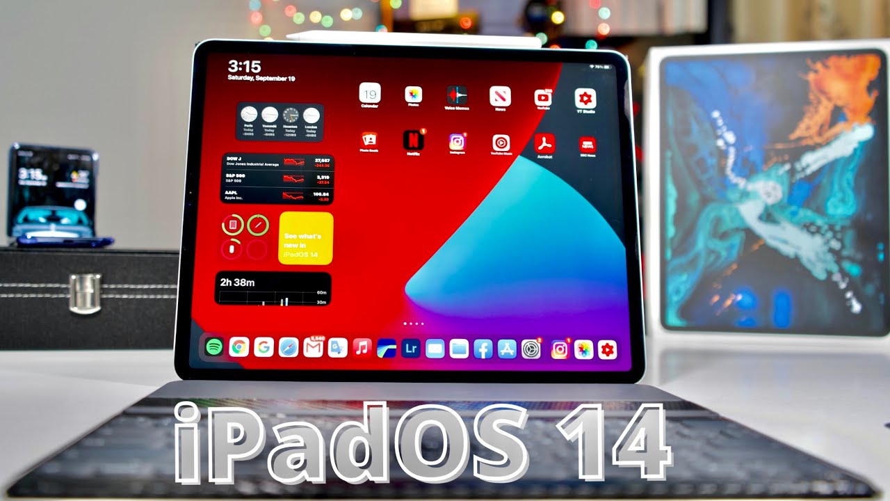
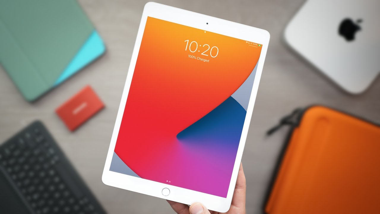
The official iPod was 14 is here, and it's now available for the 2018 iPad Pro, which is the one I'm having right here, the 2020 iPad Pro or any iPad in this video we're going to find out what are some new features, as I mentioned earlier, this is the 2018 iPad. Pro I've been using this thing since 2018, and I didn't buy the 2020 because they look alike, and this 2018 is still great. It's still one of my favorite device. It's amazing! I do everything on this iPad Pro right here, edit my videos photos. It has replaced my laptop. This is my laptop right here, so the iPadOS 14 on this 2018 iPad Pro is going to make this device much better with a lot of great features.
Now the iPadOS update is 2.5 gigabyte. That is more than that of the iPhone, because that of my iPhone is 2.332 gigabyte, but this is 2.5, so this is more than we are back in after the update and right now my 2018 iPad Pro is running, the iPad was 14 and there are a lot of great features in this video we're just going to concentrate on the most important features, the one that I think you really got to know about a lot of features. But I don't want to talk about so many of them, because it's going to take this video to like 50 minutes, and we don't have time to be doing 15 minutes, and nobody has time out that we're watching 15-minute videos, so I'm going to concentrate on the most important features. Let's start with the first one which is widget, but before we get into the Ouija. Let's talk about this wallpaper because it looks beautiful right.
The color is nice. Get into the settings scroll down to wallpaper, then choose a new wallpaper, then get into steels. There are three new wallpapers right now this one, which I think I like this one, the most much more beautiful than the others, red and blue. There is also blue and green and gray and silver, so those are the three new wallpapers, but I think I like this one. Let me know down in the comment section which one do you like best or which one do you think looks cooler yeah.
So that's it now. Let's talk about the widgets, the widgets are perfect. I mean it's much better than the previous one. It looks much better, and it's much more customizable than the previous version, because you can take it and put it wherever you want to put if it's easy like time. If I want to put time in the second layer right there, I can put a stock on the third layer.
You can do a lot of things with the widget right now and to get access to other widgets you tap and hold on the home screen. They tap on this little plus button right here get into it. Then, as you can see, these are all the widgets. For example, the clock there's small, there is medium and there is large, and also it's the same thing- stock, smart, large, medium and yeah. Then, if we screw right down to the bottom, there are a lot of the widget of all these different apps.
For example, if I want the widget of files type on it got medium, got smart and large, or just medium and large uh. It's the same thing. If I want Apple TV, I can get smart medium and large, so you can get a lot of widgets from any app. Any application can provide a widget which you can use on your home screen and make it looks beautiful, and also you can stack widget together. If, for example, I want the clock to be on with uh and stock to be together, just simply stack it right there.
As you can see, you can swipe up or down to move the widget because they are stacked together, you can stack even four five ten widgets. You can stack them all together, and you simply swipe to move them around. If you don't want too much widget on your home screen, then this is the best thing to do. Uh example like this one right here, as you can see, I got like almost 10 widgets all stacked together, simply move them just like this yeah. That is really cool, but one thing that I wish I could do is move this widget and put them wherever I want to put them on the screen.
This is possible on an iPhone on your iPhone. You can put the widget wherever you want to put it on the screen, but for the iPad Pro you just got to put it right here on this corner. That's the only place where you can put the widget on this corner right here. One of the biggest update with the iPadOS 14 is with Siri. Siri has gained so much improvement.
With this update it's much better than the previous version. It takes less space just a little bubble in the bottom right corner. It doesn't take the full screen like on the previous version, like it's much better. Let's check it out, hey Siri, as you can see right here. It's just this little bubble on this corner right here and that's all on the previous version.
When you say hey Siri, or you say the magic word, it takes the full screen, and you can't do anything when you, but right now I can still be doing whatever I want to do, and it's still on the little corner right down there. It looks better, really cool. I like it. The control center also have some new icons like accessibility shortcut. When you tap on this.
It takes you directly into the shortcut right here where you can customize some setting things like assistive touch: classy invent color filter. All these things for keyboard access, yeah, which is cool, because sometimes you don't have to go through all the settings. And now, if you want to access the accessibility, just simply tap on the icon on the control center, that's nice with the iPad was 14. There is now the picture in picture mode, which is something that I had a long time ago on netflix had it long time ago. That means you can be watching video, and you go back to the home screen.
The video keep playing, but now you have it even on YouTube, but not on the regular YouTube app you have to use it on safari, so you get into safari browser, let's say you're playing a video right here. You have to first put the video on the full screen. Then you go back to the home screen. As you can see the videos to keep playing right here, you can move the little windows anywhere. You want to put it on the top on the bottom.
On the left corner on the top left, you can put it anywhere. You want to put it on each four corners right here on these four corners. You can put the windows anywhere, you want to put it there and the video keeps playing so right now I can be doing whatever I want to be doing on my iPad Pro and still watching the video or listening music. It can be playing right there, but the only thing is that this picture in picture works with safari browser. Now, let's check out the photo gallery, there are some.
I mean not a little a lot of improvement on the photo gallery like check it out wow. This looks completely different from the previous version like right here you see everything is right now on the corner before, unlike on the previous version, you got to scroll right down to the bottom, to find all these different options, but now it's right on the corner. If you want to take it out, you simply click on this little icon. Right here, click on it. It's gone, that's nice! I love it.
It looks clean now. If you want to get back to all those different options, you click on it and there you are, so you got things like in pot. So these are the photos that I imported from a SD card or from a camera. It's right here you can access it. Your videos, that's nice.
Unlike on the previous version, everything was just in one video. Photos was all in one options, one setting, but now you have the settings for video you have setting for screenshots right on the corner here um, then we scroll down to the bottom. You have the album where you can access the different things like Lightroom like express Instagram photos. This is really cool. This is way better.
This is much better than on the previous version. Let's get into the note app and check out some improvement, especially for the Apple Pencil, because there are a lot of improvement for the Apple Pencil. First, let's tap on this three dot right here we got things like scan, pin lock, so you can lock a note if there's a lot of privacy or a lot of important things, you can lock it by putting a password delete, share note, semi copy, find in node move note line and grid, and my most favorite use light background. This is cool like right now. My iPad Pro is in the dark mode, but I can change that of the node app by simply tap right here.
As you can see, it goes to light mode if I want to use light mode to write on or if I want to use that mode to write on top right there very nice very simple, also another improvement for the Apple Pencil. Are you can now draw something, let's say like a square, and you make it to be perfect? As you can see, wow, that's nice, it doesn't matter how you do it, but the pencil can recognize the drawing and make it perfect. So let's say I'm drawing a circle. First, you got to draw the seeker. Then you hold it down for a few seconds.
That's over right there. Let's do second hold it down and that's it. Let's do triangle and hold it down. That's cool! Let's do this rectangle! Let's do triangle, and that's it! That's nice! So when you draw anything, it doesn't matter how you draw it. It automatically changes into a perfect shapes, that's really cool! Also, when you get into the Apple Pencil, you now have a pen this one right here.
It wasn't there before on the previous version, but now you have if it's just reading the a and with this one, if you're writing, let's say you're writing something. It's for letters all right! H! You see, you recognize it. So you can write this like a scribble. Who does it are you see right there? It recognizes your writing and transform it to be perfect. It looks nice.
I love this here in the apple pencils toolbar. There is now a ruler which you can use to draw a line. Just like this, as you can see, and you can move the ruler any way you want to move it, you can put it straight, you can put it horizontal, you can move it the way you want to move it so right now. Let's put it right here and still with the Apple Pencil, you can now do scribble using the Apple Pencil on the 2018 iPad Pro, and it's really nice. You can use it to ride anywhere on any website on any browser on any app.
It's so good. Let me show you, for example, let's say we get into safari browser, and I'm trying to search for YouTube. I use the Apple Pencil right with it YouTube and there we go very easy or let's say I'm trying to search for something in google and there we go really nice. It works on all different apps. Also, let's say we tried on the Google uh the YouTube app, so I want to get into big field TV and there we go big field TV, very simple.
We can also use it on Facebook, let's say I'm trying to search for big field TV on Facebook, big field TV, and there we go very simple, so it works everywhere on every app and it's so easy. It makes navigating this iPad Pro so good, because if, for example, I want to type on something on the browser- and I don't want to use the keyboard- I use the Apple Pencil right on it, and I'll get it. Oh, let's say we're trying to search an app I'm looking for BBC. That's it! You see. This is cool.
I love this thing, man. This is amazing and on the bottom it gives you a little windows right here where you can tap on either go to get into the BBC website or search to search on anything. So it looks amazing. This is the one of the best app for the Apple Pencil really cool. I love it.
The file management app has also been improved. It looks better and different from the previous version, like the folders now looks much smaller, and it takes less space on the screen. So I prefer this one. It looks much better smaller. On the previous version, it was much bigger and takes more space on the screen, but now they're much smaller, and also you got the different options right here to have more folder or to change the layout right here or select, and if you select all this on the bottom.
Yes still, the same still got share duplicate, move, delete and more yeah, but I like the way, the app the file management app now looks. It looks much like a Windows computer, much better. I'm going to end this video by saying the 2018 iPad Pro is still a great device, even in 2020 and with the iPadOS 14. It makes this device looks amazing. It feels amazing, it's still very fast, very smooth, no lag at all, it's amazing device.
Furthermore, it has replaced my laptop for over two years now. I use this iPad Pro for everything, editing, photos, videos and I love the fact that apple is keep doing great improvement. The iPad was now looks better. It feels better a lot of people out. There are now using the iPad Pro as their computer because of these updates, and this one it's still great.
I love the iPad awards.14 comes with a lot of great features, but this video we just speak out the most important ones, the ones that you really gotta know about. So thank you guys for watching this video. If you like it, please give it a thumbs up. If you're new to the channel please hit the subscribe button turn on notification for more videos, more great videos coming up on big field TV. Until then see you into the next one.
Peace.
Source : Big Phil TV
