HTC U11 Hands On By MrMobile [Michael Fisher]
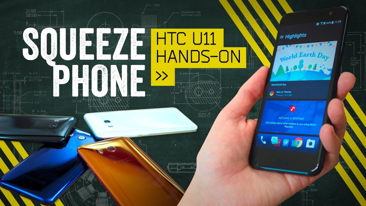
- One thing you've got to give HTC, it's not afraid to try new things. So, when it needed to follow up its solid 2016 smartphone with something better suited to mirror plated 2017, it blended the branding, doubled down on ditching the headphone jack, and traded a dedicated function button for a little squeeze. From Google IO in Mountain View, California, I'm Mr. Mobile, and this is the HTC U11 Hands On. U11 is a blend of last year's brand with this one. And the hardware follows that trend with slightly more success.
The U11 is about as easy to manage in the hand as the 10 was, but instead of the matte metallic finish, it's brought over the coating from the ultra reflective U Ultra. Whether you consider this an upgrade or not will depend on how you treat your phone. If you're a grab-and-go user and abuser, it's likely you'll miss the more robust metal. If instead you're the type who never goes without a case, and you love a phone that catches the eye, you'll appreciate the new shimmering paint jobs, which appear to change color based on how you hold the phone. This is Gorilla Glass 5 on both sides, by the way.
Just as stunning in person as it looks on film. And in a nice treat, we finally got IP67 dust and water resistance. Welcome to the club, HTC. Flip it around to the front side and the U11 looks an awful lot like every other HTC phone. And by extension, most other modern smartphones in general.
Now I say most because we've seen Samsung and LG do something different with the slab form factor this year, so it's tougher to give HTC a pass based on the old, "Well, how many ways are there to make a rectangle?" excuse. To me, the U11's aesthetics seem, if not dull, then at least unexceptional. Maybe that's part of what drove HTC to build in a feature you can't find anywhere else, with the exception of a Windows phone that never saw the light of day. You see, rather than building in a convenience key that you can program for particular functions like Blackberry did, the U11 lets you trigger custom actions with a squeeze. This is done via pressure sensors on the side rails.
It's not capacitive, so yes, it works through gloves or a case as long as the case is flexible. You've got a lot of options here. You can set a short squeeze for one shortcut and a long squeeze for another, and you can customize the amount of force necessary for a squeeze to register. Left or right doesn't matter, by the way, it's the inward pressure that activates it. It also gives you a little animation on the sides and a haptic buzz to let you know you "squoze" right.
If this sounds a little awkward, yeah, it can be. And there's an argument to be made that you could accomplish the same end by just putting another button on the thumb. When I asked about that, HTC countered by saying that the squeeze doesn't require you to shift your grip on the phone to use it, unlike a button. I guess that's true. But the main reason I'm willing to give it a chance is because I really like to see companies experimenting with new ideas in user interface.
I just wish that you could use the squeeze to do something you do a million times a day, like drop the notification shade. As it is, the squeezing into Google Assistant or Alexa (yes, Alexa will be here too) or the camera app is pretty cool, but I feel like squeezing to take a photo is going to result in a lot of blurry pictures despite the optical stabilization on the main camera. There's no such stabilization on this selfie shooter, sadly, one of the HTC 10's most distinguishing characteristics. Here's some footage from the 11's 16 megapixel front facer I snapped in a hurry here at Google IO. And here's some from the 12 megapixel primary.
If you're wondering about the specs on these cameras, they'll be called out on the spec sheet at the end of the video. I'm not going to comment on overall quality until I get my own review device, hopefully soon. This one, by the way, is on loan from Android Central whom I thank, as always. Elsewhere, the U11 mainly reheats stuff we've seen from HTC before. The software is essentially the same as the past three years, now starting to feel quite stale.
The buttons don't have the same travel or chunky feedback as on the 10, and there's no headphone jack despite there being ample room for it in the chassis. One place the U11 does deliver, though, is in the soundscape. Even though it uses the same split speaker arrangement as the HTC 10, this phone is much louder than its predecessor. And it ships with earbuds that now work together with the software to provide acoustic noise canceling. Very nice.
The HTC U11 is up for presale now in both unlocked and Sprint flavors, with devices starting to ship in June. The suggested retail price, a few clams short of $700. But if you pre-order through Sprint, you get two Echo Dots in the bargain, so there's that. Does the combo of a mirror finish, boom sound, and a squeeze powered interface make the U11 worth that kind of outlay? We'll find out in the full review coming soon. Subscribe to Mr.
Mobile on YouTube for that and for more from Google IO, follow me and the folks at Android Central in the links in the description below. Until next time, thanks for watching and stay mobile, my friends.
Source : MrMobile [Michael Fisher]
