HTC Desire retro review: 2010 phone vs 2020! By Android Central
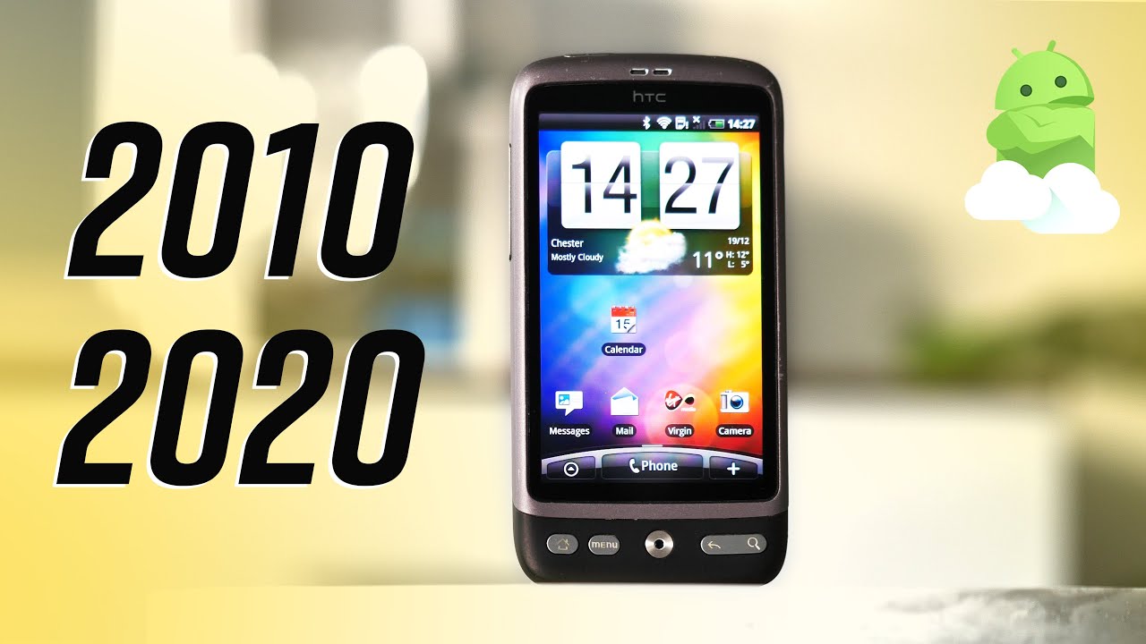
Think back, if you can a decade ago to the end of 2010. , the world was a very different place, to put it mildly, but for the purposes of this video, let's skip over politics and health and zero in on mobile tech. Android was, of course around in the early 2010s, but a very different beast. Compared to what we have today. HTC was at the height of its power as the de facto android alternative in many countries and in Europe. The android phone that everyone wanted was the HTC desire seriously ads for this thing were everywhere here in the UK running android 2.1 ?clair out of the box, with a 3.7 inch, VGA display and a camera capable of real actual 720p HD video. This thing was state of the art and for me, at the time, just over 10 years ago, the desire represented a more interesting, more customizable alternative to the iPhone 3g I just moved out of it was more open to tinkering, had a bigger screen and was just a hell of a lot cheaper than apple's, much hyped iPhone 4.
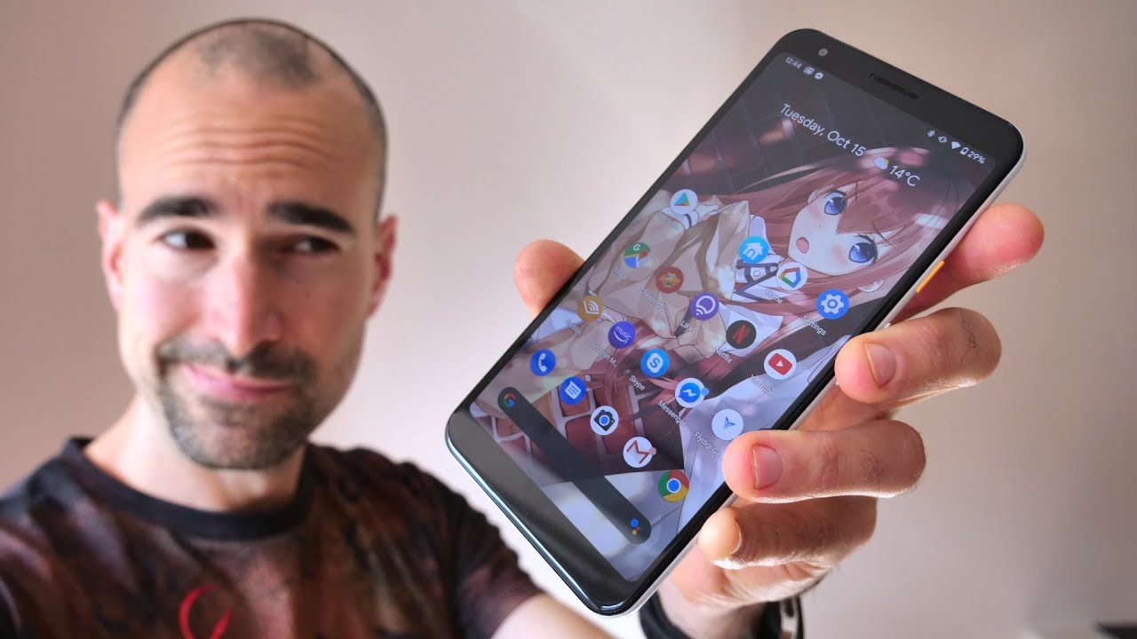
So I was on board, and this was what I was using as a daily driver a decade ago and yeah. This really was a big screen phone by the standards of 2010. , it's kind of hilarious to look back at it now compared to something like the pixel 5 here, which is considered small by 2020 standards, and that large display was something of a centerpiece for the HTC desire. It was among the first big name: phones to use an AMOLED panel, giving the same advantages in terms of color saturation and contrast ratios as modern OLED screens. Today, only you know pretty primitive compared to what's out there right now, the lowest resolution, combined with the structure of the screen, the gentile matrix pattern made it really easy to make out individual red, green and blue sub pixels with a decent macro camera or just your human eyeballs.
If you looked at it closely enough jagged edges on text and menu bars were a common trait of these early sleds. Despite this, the desire actually proved so popular that HTC ran out of ammo-led screens for its 2010 flagship and had to produce a second variant with LCD to keep up with demand. It was pretty much the luck of the draw as to which screen you got when you bought this phone OLED had better colors, but the LCD enjoyed sharper text. The design of this thing was also pretty sharp for 2010. A mix of soft touch plastic and brushed aluminum made for a smart, but understated look in keeping with HTC's company slogan of the time and although this second hand model has definitely seen better days unboxing one of these a decade ago, it was clear you were dealing with the pinnacle of mobile tech.
The internal specs are pretty typical for a high-end phone of this era: a single core one gigahertz snapdragon, s1 processor, 576, megabytes of ram and 512 megabytes of internal storage. That's right! This phone had more ram than it did internal flash and that's because android phones of this time ran on micros seriously. The designer won't even take photos without a SD card inside, and it was later updated to support moving certain apps to the SD card to keep that precious internal flash freed up. The software experience here is HTC sense. It's one of the very earliest versions of sense for android, which completely overhauled the look and feel compared to the very different aesthetic of stock android.
Back then, the desire shipped on android 2.1 and got an update to 2.2 in the fall of 2010 and eventually android 2.3 was supported with some finagling to re-partition the phone's internal storage. So it actually had enough room inside for 2.3 gingerbread seriously. This was the official HTC sanctioned way to update the desire to 2.3 in response to a public outcry that this less than year old phone was going to be left on an old version of android, so sense back then, was pretty goofy. Looking skeuomorphism was all the rage in software design, and so we have very non-abstract icons and buttons designed to look like cartoon versions of physical things in the real world. Big embossed controls and lots of clunky borders.
Inspired by the iPhone. Could be found here and in a lot of other android skins of this era. What's really striking is just how many of the core apps here are baked into the ROM updating built-in apps by the play, store or android market, as it was back, then just wasn't a thing yet. So, if you wanted a new version of say, google talk or even the HTC browser then sucks to be. You have fun waiting for that.
One firmware update you might get every year if you're, lucky, google services and just the internet in general has moved on so much over the past decade. That doing anything online on the desire in 2020 is a pretty broken experience. Certificate issues cause annoying pop-ups on most HTTPS sites, which is most of the web. These days and things like YouTube, just straight up fail maps does kinda work, which is surprising, though it's a pretty fantastic experience in terms of zooming and scrolling. If you click past those certificate warnings in the browser, a lot of responsive mobile sites of the early 2020s do actually work on the built-in HTC browser of late 2010 and things like scrolling performance and tabbing weren't a lot worse than what I remember from using this phone a decade ago.
Of course, a lot of the fundamentals of android. As we know it today, just weren't around back, then no biometrics, so your phone's either completely unlocked or you have to enter the same pattern or pin every single time. You do unlock no quick settings like at all, and we are still a year away from software navigation keys being a thing. So physical buttons are all the rage here. You've got home back the old menu key that hit a lot of extra functions in older android apps, a physical search key too, which is unused in most apps.
So just pops up the Google web search bar most the time and then something I still hear. Android notes fondly remembering from time to time with the optical trackball. You can kinda use this as a miniature mouse nub to hop through links on a webpage scroll through letters in a text field or home screen pages in the launcher. It was pretty useful back when android as a whole. Just wasn't designed for larger form factors in point.
This iPhone style power key on the top edge of the phone here. If this design that trackball and these buttons seem oddly familiar to you, it might be because the design shares a ton of hardware DNA with the nexus one, which was also made by HTC and arguably the first real google branded smartphone. The trackball was a physical ball on the nexus one, but otherwise these were pretty much the same phone on the inside and that led to the desire being a favorite for hackers, molders and custom firmware creators. Because of how open the nexus software was. There were a ton of great ROMs for the design back in the day, many of which focused on bringing that nexus style, experience and performance to this phone, which was a lot easier to buy in most countries and because android 2.3 was a lot simpler. With fewer things to break a lot of those ROMs worked really well right.
Now, the most recent custom ROM option for the desire is android, 4.4 Kitkat, which is a couple of years more recent, but still not appreciably less broken compared to 2.2 for everyday use in 2020. Once again, it wasn't necessarily that this phone was under powered, but you very quickly ran into that 512 megabyte wall for internal storage, so you had to resort to tricks like repartitioning and using SD cards to store part of the OS which just made performance even worse, but still kudos to the community members who are still hacking away at this phone more than five years after its launch other things to mention before we wrap up well, this was 2010 and this was an android phone, so everything was removable and hidden behind a snap-off plastic back panel here, you've got the mini sim slot, removable storage and the 1500 William hour battery, which, even by the standards of the time I remember as being far from outstanding and that camera it's a five megapixel unit same one used in the nexus.1, though, with the addition of 720p video, thanks to some software magic from HTC, but even in the early 2010s HTC's cameras didn't have a great reputation. So no surprise that, 10 years on it is a total potato. I could run through all the things that are bad compared to even a bargain bin phone camera from this year, but it would be basically everything the saving grace was HD, video recording, which was still relatively rare at the time, but even in good lighting. This often dropped to below 30 frames per second making for blurry judder footage.
So like a lot of android phones, pre-2014 using the HTC desire today is basically a feature phone experience, basic things, work, but you'll run into compatibility issues or broken apps time and again, and if you want third-party apps you'll be trawling through the likes of APK mirror to find ancient APK files to run on this ancient version of android still playing with this old big screen, android phone from 2010 makes you appreciate just how far we've come since then hit the comments and share your memories of the desire. If you owned one hit subscribe, so you don't miss future videos of both new and old android phones. Thanks for watching, and I'll see you next time, you.
Source : Android Central
