Google Pixel & Pixel XL Review: One Month Later By Erica Griffin
Hey everybody- this is Erica the technology nerd likes to film stuff in it is time for the full review of the pixel and the pixel XL. Now I have spent a lot of time with this phone this past month. I really wanted to understand the in and outs of this device and what it's all about now I realize that both of these don't have a lot of bells and whistles, like some flagships, do, and also they're, not water resistant, sadly, but what they do offer really feels to be really special, there's just something about these devices. So there's a lot of things that I want to talk about, and hopefully I can help you decide if one of these is for you, so let's go ahead and check them out. So the first thing that I want to do in this review is to take a look around these phones talk about the build. The design also take a look at these size differences as well.
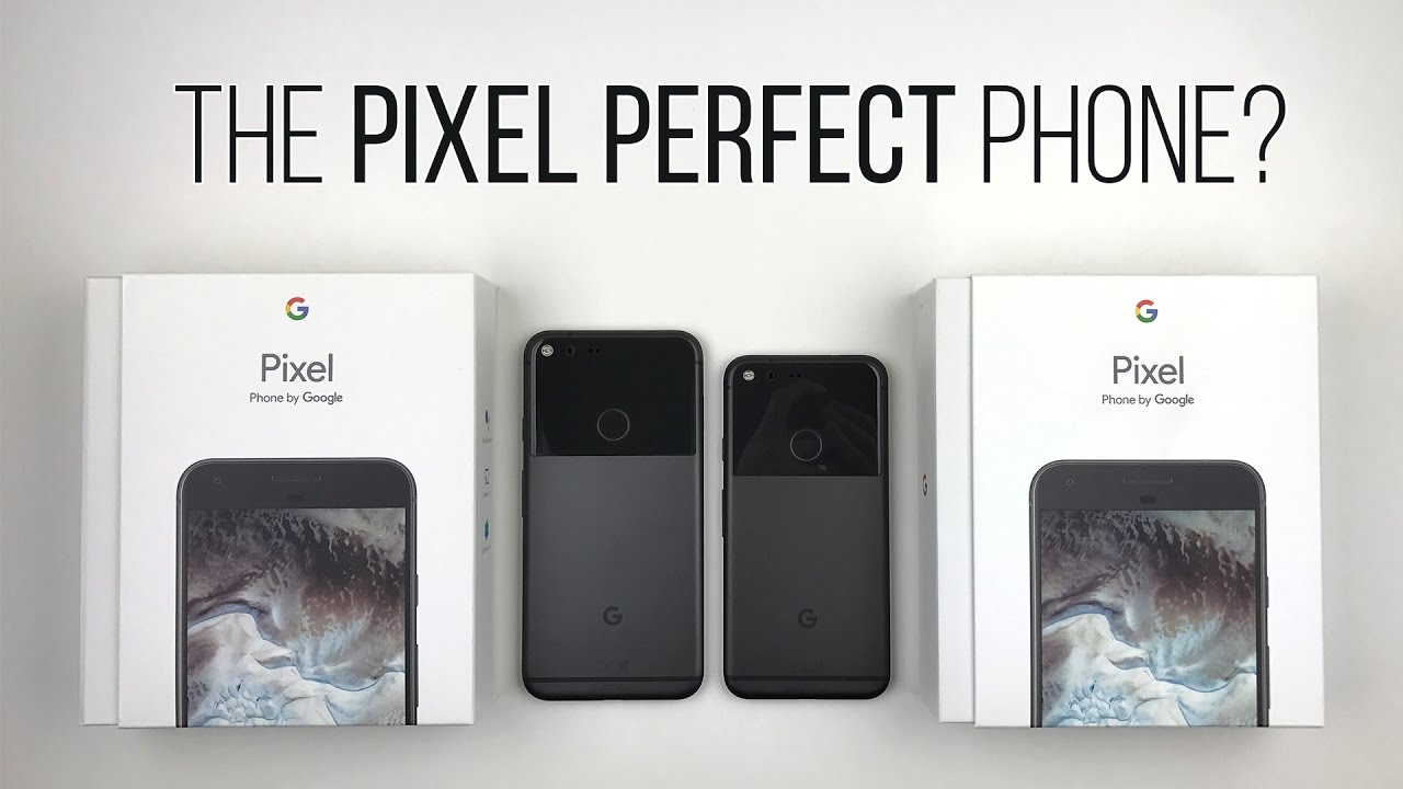
So here we have the pixel XL and the pixel. They look so, so similar. Although you can see that there is a marked size difference between them. The pixel is quite a bit smaller, although without the bias of seeing the pixel when I touch this for the very first time, this did not seem to be a very big or overwhelmingly large fun, it's actually a pretty good size and for most people who have normal-sized hands not like me, this is going to be a really good-sized phone for those who have small hands like I do. This is actually perfect.
I've been so incredibly happy with this phone. Finally, I have a phone, that's powerful! That fits my hand, that's not an iPhone. The important thing is to be able to reach the fingerprint sensor or their imprint sensor comfortably and I. Just really can't do that so well on the XL. So if I want to swipe it, I'm kind of stressing my finger there, where this is perfect, so size does matter here, and my favorite has been the smaller one.
Now you probably noticed that between now and my unboxing, that I had the silver phone, and now this is the black one, and I actually traded it in for this one, the black one looks a lot cleaner and a lot nicer to me. Also, this chin here at the bottom, isn't as obvious on both of these, as it is on the white model of the phone, although I think that Google did a pretty good job, even with the white one, not making the front look so busy with sense. So speaking of this chin here at the bottom, let's get this out of the way in the very, very beginning, I, don't have any trouble with this chin whatsoever and here's why phone displays are getting larger and larger. Embezzles are getting slimmer and slimmer to where there's nothing to hold on to anymore, to where you're not touching the display. If there isn't good palm rejection, then you accidentally touch parts on the display, so with this phone I feel like there's actually a part to grab onto, and that actually really helps when watching media, for example, because I'm not blocking the speaker.
So I can hold this listen to media no speaker, blockage, plus the most obvious thing that appealed to me when I was out taking pictures was that I actually have something to grip when I am framing my shots, so this works quite nicely. A lot of people make fun of this chin, but for me, it's kind of oh hello, I'm, happy to see you again. This may not be a design for everybody because it looks like there's just a lot of dead space, but it's practical for some people. Now, let's move on to taking a look at the back here before we give a nice tour of the phone, you can see that there is this glass window. This is here for a reason.
It's supposed to help with reception. Also, it looks like it's kind of an art statement designing piece in a way, but from what I am seeing. This glass may not be as strong as the glass on the front. It seems to scratch pretty easily that's what I've noticed. I have quite a few scratches, and it's really hard to tell in this environment but in direct sunlight.
For example, I've got scratches everywhere, littered entirely where the body doesn't seem to have any scratches at all. So get yourself a case if you hate cases which I mostly do get yourself a skin or something it'll also protect it from cracking. That's another thing: I'm saying that people are cracking this pretty easily even Tehran. He was just trying to take a picture of his phone or whatever it fell down, and immediately it cracked. So this can crack fairly easily so protect this.
Keep this in mind also, the camera is right. Underneath this glass and I have a scratch, that's passing just barely missing where the lenses, and I'm worried that over time, I might see the scratches if their deep enough, maybe there'll, be weird reflections. So this has me paranoid a little. I have been using this entirely careless, though, and just as long as I put it down the table nice and slowly, and I'm gentle with it and not raking it across the table. It's generally been okay, expect scratches, but I really am going to look into getting myself a skin.
So now I like to take a second to thank my sponsors at Braintree. So much for making content creation possible. Braintree is code for easy mobile payments, and they're, basically a major reason that you can press one button and pay for something, maybe you're working on the next over Airbnb or GitHub. Then why not use this same simple payment solution that helped them become what they are today brain trees, full stack payment platform is easily adaptable to whatever the future holds, so that you can adapt easily to accept nearly any type of payment from Apple paid, Bitcoin, Venmo credit cards or whatever types of payment that comes next with just a few lines of code. This all means that the platform is stress-free, simple and adaptable for mobile app developers, and they offer a single integration across all platforms with superior fraud, protection, customer service and fast payouts, see if you were abandoned carts and more sales with brain freeze, best-in-class mobile checkout experience that way, you'll always be ready, whether you're earning your first dollar or your billionth check it out at Braintree payments, comm, slash, Erika, to learn more now for the grand tour around the phone.
Both of these are exactly the same, just a size, difference 5-inch display versus 5.5 inches. Although there is a difference in resolution- and we are going to talk about that in the display section so starting off with the front, we have an 8 megapixel camera, you have the receiver. You also have the ambient light sensor and proximity sensor right here. An interesting thing is that a lot of people are saying that there is no notification, LED anywhere to be found. Actually, yes, there is its underneath the speaker, grille just go underneath settings.
Then notifications then hit this little non-obvious wheel here, and you're presented with pulse notification, light and voil?. We now have a notification. Led I find it strange, though, that even when I have it plugged in that's not showing me a little red light to indicate it's charging. Maybe it's just for notifications. Let me know your experience.
You guys I bet you. This is not enabled by default because of ambient display, which will wake your screen. When you receive notifications, maybe that seemed redundant less clean to them, but it definitely is there hidden for your consideration so moving on, we have the chins here at the bottom that don't seem to have any function, except for they're in good grip. Then, on the left-hand side you have the SIM card. Tray takes a NATO SIM, no SD card slot on this phone, although you do have 128 gigabyte and 32 gigabyte storage options, I'm really thrilled that there is 128 gigabytes, but these things are expensive.
Talking about iPhone, expensive, even matching the price, then, on the right hand, side we have the power button. You've also got your volume rocker. You can see that we've got these antenna ban lines here and here which also helps with reception with the glass here. So on the back. You can see that we have this glass and on this glass section we have the imprint fingerprint sensor.
Both of these in the same place, you've got a dual LED flash. We have a twelve point, three megapixel camera. We've also got a microphone and laser assist autofocus. You can see that's what this is for here and if C is under here, and you've got this really nice matte feeling aluminum on both of these. There was a slight difference in feel to me between the silver and the black.
One actually prefer the black one better. It's a little rougher, maybe less slippery to me now. I have seen the very blue one, and it looks really, really nice. It's just I'm, not a fan of that I'd probably be a bigger fan if there was a 128 gigabyte option, but it's a special edition capped at 32 gigabytes. That's really unfortunate! Here's another band here at the bottom, for reception G to indicate Google phone, although this has been manufactured by HTC designed by Google, though then at the bottom we have a speaker.
You've got the microphone and the USB-C charging port. Now no, this does not have stereo speakers, but I am seeing some mods on DA done where you have a speaker here and just like with the iPhone 7s they've been able to get the receiver to function as a speaker, ?, maybe not as powerful as the bottom, but that's interesting. So if you are somebody who likes to mod, you can go and play around with that I'll put a link down in the description, so you can check that out. Finally, at the top we've got the headphone jack, so for those of you who really value having a headphone jack that is there otherwise taking a look around the rest of the phone, you can see this tapered looking design thinner here at the bottom thicker here at the top, so that they could fit the camera supposedly without having it. Protrude I do like the design of this, though it is nothing remarkable I like how it's flat, and then it's rounded I think it feels really nice in the hand to me.
So what is my overall outstanding statement on the design? Well, the pixel, the smaller one is just a pixel, XL, miniaturized, very, very smudgy ?, but ultimately Jewish looking, but also very, very familiar because of the iPhones and people may or may not like this glass window, but seriously just cover it with the skin, and you'll. Never have to see it again. Now, let's move on to talking about the user experience of this phone and just how it feels to use this I know, a lot of people came from the Galaxy Note 7 and that phone had so many features that was really neat, those probably my favorite phone of the year. It is no more, so people now are trying to find what to do now. What phones to get now and on paper.
A lot of people are not so pleased with this phone because it looks like it's kind of ho-hum, there's not too much to it. But let me tell you the experience on this phone is phenomenal, a lot better than what I expected I didn't care for this phone on paper at all, but now that I've been using this for several weeks, it has started to fill that hole in my heart that the Galaxy Note 7 left. So this is like that nice, quick little sports car, where the Galaxy Note 7 was the Mac truck it's hard to say, which one is better: they each had their own special things. This is just an awesome, quick no-nonsense experience. It does what it does very well, so I love the user experience, I love the interface I didn't think.
I was going to care for the pixel launcher, because I played with it on the Nexus 6p and just didn't like this pull tab thing until I learned that actually you can swipe for anywhere doesn't have to be right from the side or anything, although it wasn't like that before anyways and I really adore the new app tray I like being able to pull up from pretty much anywhere around the bottom, then I can just simply swipe back down again, so I think that this lens really nicely ? one-handed use to me. This has been just excellent when looking at the user interface. I think that the one thing that's missing is a dark mode. You see when you pull upward. This is white when you pull downward from the notification shade in the toggle shade.
This is a dark gray, but there is no option to change the whole user interface to being black, and black would really complement the UI with those nice inky blacks. So that's something I really think would be a boon for this phone I think it would really look quite nice with the dark model of the phone ? I can hope. So simple uncomplicated- and this is a very, very snappy user interface, the pixel launcher. Oh my goodness, it just flies. Let's go down here to developer options and let's find profile, GPU, rendering and on-screen as bars.
So let's scroll up from right here and just scroll through the app menu and these little Peaks here whenever they go over. This green bar indicate a drop frame or several drop frames depending on how high it is. You can just see how smooth it is. Sometimes you'll get some drop frames, but mostly when scrolling through the interface. This thing is so nice and smooth.
It just feels so super responsive and that really helps the experience. It's not incredibly Jacky, like some phones, that you're used to I went into an 18 t store. The manager had a chance to play with my pixel and was just like whoa when seeing the difference between something like the Galaxy S7 and the pixel a lot. Smoother, so Google has done a perfect job. Looking at the meat of the launcher, a little more you've got this pull bar here, which is going to bring you to Google now, but also, if you tap on this, it's going to bring you into search.
So now, that's very discreet. I, like that, gives the illusion that there's more room I hoped I could get an extra icon here at the top. But it looks like this here is fixed in place, so you can't get rid of this, and if you do want to go back to the old launcher, if you go underneath the Play Store, that's really not going to help you it's going to tell you. Your device isn't compatible with this version, but really no matter just go online and find yourself an older APK. Download that install it, and it works, see there it is I was able to install it.
No trouble, it's just not going to be something that's compatible from the Play Store I prefer the pixel one, though now after using this I, just love this app tray from the bottom. So just like from before, if you hold down word, it's going to bring up some options: you've got wallpapers widgets and your settings going underneath settings. You have options for app suggestions, show google app, which is Google now and allow home screen rotation I keep that off. That gets quite annoying after a while, but it allows you essentially to rotate the interface, no matter where you are I, suppose that could be good for the bigger phone. This is something I find more beneficial on a tablet, though widgets is the same as usual.
Then you have wallpapers, and this is pretty cool. I use my own wallpaper. This is paper. Land, Pro I recommend this seriously. It's really, really neat but live earth.
Wallpapers have been really pretty nice. I'm sure you guys have seen these all by now, but it just gives a live feeling to the wallpapers. This is us emit, National Park. Let's go ahead and set the wallpaper and unless you've got a lot of tabs, there really isn't a lot of movement. This really nice 3d looking movement, but as soon as you unlock it, it does give you that nice smooth movement.
So whenever I have this Live Earth wallpaper thing on I'm constantly turning off my phone and turning it back on just to watch that really neat animation. Let's do it again, oh yeah, which is one more time that never gets old now they've only got several here. I really hope that they continue to release more because I get bored after a while and that's where I end up going back to my paper, land Pro, because it's very dynamic right now matches with season seriously try this out. This is not NAD. Also, what's really nice is just being able to touch down for a moment.
It's going to give you some shortcuts. This is so iPhone like and just like, with force touch on the iPhone or 3d touch or whatever the heck you call it I, don't really use this I haven't used it really at all, but on some things it looks like it would be quite useful. Maybe I'll have more interest when there's more support for third-party apps. You can see that all this did was just pulled this over as a shortcut, and I'll wait now, of course like before you can double press on that power button to execute the camera. Although it's been kind of finicky I've noticed it doesn't always want to work.
For me, something else. That's been kind of finicky is the Google Assistant when I say: okay, google, half the time, it'll execute and turn on and actually unlock, but other times it just completely ignores me: I, don't know what the problem is, or maybe it'll wake the phone, but it won't actually unlock it. Okay, Google like right now. Why is it doing that? Ok, Google, ok, Google darn, you Google! Why are you ignoring me? She has a mind of her own, ok, Google, and then it tells me something like couldn't recognize your voice unlock without ok, Google I'm infuriated I've had to reprogram my voice a couple of times. I, try saying things a similar way, but it's just not so reliable right now, I'm hoping it's just a bug, I'm sure Google can fix it.
But let me know your experience. Some people say it works all the time 99% and then there's other people in the camp. Like me, we're very infuriated with this function. Ok, Google, ok, Google, no screw you Google I'm, tired of you. So the neat thing here with Google Assistant is that it's able to do a lot of things, one of which is being able to understand context, specific questions.
So I asked in what is Wow it was. It gave me some quick info, and then I was able to carry on the conversation. How big are they, and here you have the height, then how much do they weigh, and you have the weight then I said: can you show me some animal shelters to get one, and I gave me the top search results, so it can work quite well, but on other things it can be a little unintelligent, but the more you use it and the more people use it in general, it's supposed to get more intelligent. So it's new right now, just hang in there don't insult the phone I already tried doing that. Just now and she said, I'm still learning what can I help you with that kind of broke, my heart kind of being a bully too.
The phone I'm actually feeling a little bad, so she's, actually quite witty too okay Google make me a sandwich: poof you're, a sandwich, Thanks Google! That's hilarious. Tell me a joke, ha ha ha ha ha. She can also play games with you. So I don't know if this is supposed to be endearing or just a little sad that if you don't have human interaction during the day, Google can sit and have a conversation with you, I'm feeling sad, yes, now cute very cute, so moving right, along with other features of the phone on the back you've got the pixel imprint sensor, so on top of it being able to unlock your phone, and it's pretty accurate as long as you keep it clean I've noticed sometimes when it gets a little grimy with fingerprints, it tells me that it can't recognize so keep that in mind, but otherwise I find it really nice. So you can swipe your finger downward, and it's going to allow you to view the notification shade and I use this all the time.
All the time constantly, it's so important to me that I want the smaller version of the phone so that it's easier for me to do this. Otherwise, it's not such a joy I am a little sad, though, that it doesn't do more than just simply showing your notifications I, wish that if you held down on it that it dismiss your notifications, so it doesn't do that. That's something I've seen with Huawei phones, also it'd be nice if I could scroll through the interface. So if I wanted to scroll downward once underneath a list or something or once underneath the Chrome browser, it would be really nice to use that like I've seen before. So that's just a wish of mine, it's really nice to see this, but I would like more features.
So that's kind of wall way like another thing that seems similar to other phones, I've seen, is the flick of the camera to bring to the front-facing camera, though that's like Motorola type phones, you've. Also got double touch to switch between your two recent applications. I'm hearing, that's like Cyanogen, then, last but not least, you've got the multi window type function or if you go underneath an app that's supported, if you hold down, you can see that it's giving you options of what you can use. So, let's just say, eBay and there you are, so you can move around the window. You can change its size if you move all the way down.
Word, it's going to make this full size if you've got to open, and you exit out of it, it's going to remember it and to keep it here for you. So when you press again there you are and when not in split-screen mode, you can hold down an app, that's capable of it drag it upward, and it's going to execute this split-screen mode as well looks very much like Samsung. Doesn't it also, let's not forget, unlimited backup for pictures that are on the phone, so you have unlimited full resolution, photos and videos uploaded from the pixel now this does not count for Google Drive. It doesn't apply to anything else, but photos and videos that are on the phone that you're uploading from what I'm seeing. This also applies to my other folders such as my download folders and my screenshot folders.
If I'm wrong, please correct me, but it looks like none of that is counting towards my limited space. If this is true, I'm sure people catch on eventually and start abusing the system, which makes me wonder how long Google is going to support this unlimited upload from the phone now, a neat thing that I found when going through these settings is free up device storage. So this comes in 32 gigabytes in 128 gigabytes and if you have a 32 gigabyte configuration you're taking a lot of 4k videos, for example, you've got a lot of pictures. You'll, probably be ok with a 32 gigabyte version of the phone as long as you're using free up device storage. So when you click on this, it's going to find all those photos and everything that I have and the ones that are backed up already.
If I hit remove, it will remove them off the storage of the phone, but they'll still be backed up onto the cloud, so you have all that room still for all of your applications. It clears up room for more videos and pictures, but these are backed up in their original quality. So that's a really nice thing, and it's really nice to help free up some space. So that's brilliant that that's made right there for you and the last thing that it can do. If you go underneath settings here, you see that there is a tab for support.
They've a whole tab dedicated to this. We're here for you 24/7, so you're able to call them or chat with them and have support right away. I actually use this the other day, because the phone I told you that I returned in order to get this one USPS lost it. We don't know where it is, but Google's going to give me a refund anyway. I tell you: I have so many problems with shipping, and it's not my fault ever so.
This works right now, I'm hoping that it always works, because this is the most seamless and easy experience I've had with customer service on a phone ever now. Moving on to talking about specs and performance, we have the Snapdragon 820 1 SOC inside this. Now this is not the higher clocked 821 SOC. This one is actually at the same frequency as the SI 20 right now, 2.15 gigahertz for the two higher powered cores. We've got the adrenal 530 GPU, four gigabytes of RAM.
The internal specs of these phones are exactly the same, except for battery size and, of course, the display resolution now I want to remark that I don't have my normal suite of benchmarks, because a lot of the benchmarks actually do not work yet for this version of nougat, but I can tell you what I have observed with this phone, and this is a great phone. It's not a Genii piece of crap, like I've, seen with a lot of Android phones day to day performance is absolutely awesome. We've got geek bench for right here and really in general, with CPU, it's very, very similar to other flagship, Android phones with the s 820. Really there isn't a performance difference with this 821 SOC, because that frequency is still the same, but it is more power efficient. So both the pixel and the pixel Excel CPU wise look the same here we have the LG V 20.
It's also they're, all very similar I find GPU performance to be similar to other top-rated, Android phones as well, but actually do see a difference between the smaller phone and the larger phone. Simply because there's a difference in resolution, you have a lower resolution phone, meaning there are less pixels that have to be pushed around. So for the on screen tests for car-chase. You can see that it says 20 frames per second versus 11 frames per second looking at Manhattan. You have 33 frames per second versus 16, so on and so forth.
Yet by the time you get down to the bottom, you've got 58 frames per second versus 53, so, as the intensity of the test goes down, there's somewhat similar. So, of course, I say that there's a slight leap in performance with a lower resolution version, but in general everyday tasks and in non-intensive games both of them should perform about the same on. Both of these I have been pretty impressed with their sustained performance, so just performance over time. I, don't see really any throttling to really speak of so throttling. You really haven't been too much of an issue.
I see the same thing on the CPU side, these phones sustained performance, pretty darn. Well, if you're really taxing the heck out of this thing, it can get really quite warm expect that with these metal phones, but this is a great performer, it really is sustained or just doing small bursts tasks. So this is all needless to say that I've been playing games without a hitch. I really haven't had any complaints about performance whatsoever. But if you have, let me know what those complaints have been in.
The comment section below I've been a happy camper now for app launching speed and app switching speed. I normally use disco mark, but, like I was saying, with my normal suite of benchmarks. I, haven't really been able to use those, because not everything works right now, but this launches apps, very nice and quickly. The app switching feature you can see here is so smooth and so fast, there's really no hiccups, and it doesn't miss a beat so whether you are switching between your applications or you're executing and getting into an application. This thing is great, so this phone, maybe fasted, opening, apps and also switching between apps, but in terms of keeping them open.
How does it perform I would normally use disco mark, but that's not working properly, but I've got 12 different applications open here that I would practically use and actually more than I would practically use several which are games, and it's able to keep all of them in RAM without any problem whatsoever that Riptide gp2. That's pretty intensive. Just a couple of games: I love, Eve explorers, that's a great one! Nothing has been shutting down. I haven't had any issues whatsoever. You should.
Let me know your experience with this. For me, the RAM management has been just fine, quick to open, apps, quick to switch between them and also keeps them open to me. That is a perfect ratio of performance. So, let's move on to talking about these displays at first glance, these are beautiful displays. These are AMOLED displays the resolution of the five-inch one is 1080p.
Then you've got quad HD on the 5.5 inch display. So if you're somebody who's going to be getting all into Google daydream get the pixel XL, it's really not that much bigger than the regular size pixel, but the pixel density is far greater. It's over 500 pixels per inch. Think it's about 515 or so, where this is about.441 I will correct myself if I am wrong, but when holding this up close to your face when doing Google daydream, it's going to look a lot less pixelated to you. Otherwise, 441 pixels per inch has been a perfect pixel density and in everyday use.
Holding it at a decent distance. From my face, I have not had any objections whatsoever to this resolution. I think that 1080p at the size is a good compromise, so no complaints there, but if you're somebody who really wants the best of the best then get the pixel excel. For me, it's just been a matter of size now I'm going to measure both of these two Blaze and talk about them, but I do want to talk about display quality at first with AMOLED displays so much of the time it is a lottery. You don't know if you're going to get a nice uniform display oftentimes when looking at Gray's or whites you'll have a two-toned, KISS or part of the display will be a neutral looking tone and another part will be kind of pinkish or greenish, or something, and I'm noticing that, with both of these phones as well, I've actually seen several displays now of the pixel, and all of them seem to have some type of uniformity issue, although the best that I have right now is this one? So if you have a display, that's not very uniform to your liking, just go and exchange it, but realize that there's a very good chance that you'll find another one that has a uniformity issue.
That just seems to be something with AMOLED very difficult to fabricate these and get them to be nice and uniform. I have had several people complain to me, though, that there are other things they're, seeing with the pixel display. Not all of them are like this. Okay, so keep that in mind just go and exchange your display, if you don't like it, but I've been seeing weird grayish lines and other interesting anomalies on my pixel excel display they're, not all going to be like this, but I've heard more than one person tell me that they've seen it, so it seems that maybe this isn't Samsung's top quality display. As far as I know, these are being manufactured by Samsung.
So with my pixel XL I have hit the jackpot, with uniformity, issues, weird greens and places and weird lines, and just doesn't look so nice just go and exchange it. Don't settle for less but realize AMOLED is a lottery now. My biggest concern with AMOLED displays when they're using this on screen touch bar is image retention, but worse burning. So when this bar here is shown a little of time, I do see that the image is retained. It tends to fade a bit over time, but also I notice.
What doesn't fade over time? Is there pretty much indefinitely, so I'm already seeing its having just a tiny teeny bit of burning and, of course, that nice bit of ghosting / image retention? It should fade in a little. So if you're, not wanting to compromise with having to deal with burning, then probably don't get this phone get something like a Samsung Galaxy phone where, even though it's an AMOLED display, there are hardware buttons or even the 1+3, where you can change between on display keys and hardware buttons, so Google I really wish. You would have done that. You've got all this room down here at the bottom, and it's nice to hold on to, but at the very least you could have put some type of hardware key or at least capacitive keys. So far, though, when watching videos or playing games whenever I look at this side in the corner, I'm not seeing those on-screen buttons, they're not showing up just yet, but I expect that, probably over time, if they have a chance to burn in enough I will see a little circle and square and triangle.
If you're planning on keeping this phone and using it heavily for a year or two, then that might end up being a problem. So this is just something: I want to call attention to. Currently, I only really see it against dark Gray's, and that's only because I've been really looking for it, but just preparing you all. If you want to salvage your display, you do have some options. You can use GMD immersive mode, so that's essentially going to hide all the software buttons and those software buttons to really only appear here when you swipe up and try to get to them.
But otherwise you can see that they hide now as for display calibration between these two they're fairly similar. Although the white points are a little different or how the whites look, you do have two separate modes underneath developer options. You can see that we have in s RGB mode, so that's going to make colors not look saturated where you've got the standard mode which is going to make everything. Look nice and punchy I'm sure that most people are going to be using this mode in comparison, the RGB mode is going to look pretty lifeless. Another reason that I think that the RGB mode is not looking so nice is grayscale issues and also white point issues.
If you don't have a nice balance between red, green and blue, it's going to make a weird color cast on all the colors, so that applies for both of these actually the white point, and even the grayscale ends up looking a bit nicer on just the over saturated mode, so I end up using the over saturated mode more just because I can't stand the way. The colors look because of that weird color cast on the RGB modes. Mostly people aren't going to notice anything, and it's going to look really nice, beautiful and saturated. But if you don't like over saturated colors, you can choose the RGB mode. It just looks a little weird, so my overall conclusion with these displays is that they are beautiful.
They both look quite nice. They are very, very similar, but expect to have a lottery with these displays. I, don't think that these are Samsung's top-of-the-line displays, they probably reserve those for their own phones, but I do believe that these are current generation. AMOLED displays and they are pretty darn good. They don't even have an issue with turning pinkish when you turn down the brightness all the way, so that is a definite plus okay.
So now, let's move on to talking about the battery life of both of these devices, we have the pixel XL with a 3450 William hour battery, not a bad-size battery, and then we have the much smaller pixel with the two thousand seven hundred and seventy million-hour battery. That's quite a bit smaller. Now. Keep in mind that we do have a smaller 5 inch display and also a 1080p display versus the larger 5.5 inch display of the pixel XL, and also we've got quite HD resolution. So considering that and then also in my actual usage I've been pretty happy to see that I'm able to get at least four point five to five hours of on-screen time and mostly on Wi-Fi during the day, I keep my brightness at about half I.
Do a lot of mobile office. Things such as checking my email, composing things. Then I do get my YouTube videos in there I like to watch some Netflix I will play a game or two I also like to take pictures here and there. So this is getting quite a bit of usage during the day, and I'm, getting four point: five to five hours of average on screen time, I'm, pretty darn, happy, so I'm, seeing that people are saying that they're getting an average of five to seven hours of on-screen time for the XL. So, if you're, someone who needs to have a little more battery during the day, a little more leeway get the XL.
But for me that has actually been just fine. Now talking a bit about they're charging speeds, we have USB type-c at the bottom. Both should charge pretty quickly the pixel XL ports up to 18 watts and the pixel supports only 15. Previously there was a mistake on Google's documentation on their website, and it said that the pixel also charged at peak of 18 watts, but no it's 15. But if you take into consideration that that is the peak charging speed, that means it's only going to be charging at 18 watts for a small amount of time, and that only happens in the beginning, and that starts to slow down towards the end Plus.
This has a smaller battery. So when you take 18 versus 15 into consideration, that's not too huge, and honestly they're, probably going to charge up at about the same rate, so I'm not so upset about that. Supposedly they had to do with thermal constraints. This is a smaller phone. So let me know if that is something that has upset you or not.
For me, I, don't care! This does charge it pretty quickly, and it has pretty darn good battery life for being such a tiny phone now a bit about connectivity, the thing that makes a phone of phone- it's been just fine for me, Wi-Fi Bluetooth, GPS, all that this even supports Wi-Fi calling. So if you are on T-Mobile, for example, you can use that feature as well. No issues if you have had any issues. Let me know, though I'm always curious. So, lastly, what I want to talk about in this review.
Are these twelve point three megapixel cameras that we have on the back? Both of them are the same. This is the highest-scoring DXO mark camera. That Google is calling the best camera on any smartphone. Now I, don't know about that, but I have played around with this quite a bit and I do have some things to say so, looking a little at the specs, this is a twelve point. Three megapixel camera F, 2.0 aperture lens, there's laser assist autofocus as well and large. One point: five, five micron pixels, but no optical image, stabilization, which is something that we've really come to expect.
So in my time, with playing with this I find that the camera is definitely a point-and-shoot compared to a true photography tool to point that further home, the onboard app is very simple: there are no pro features. All you've got four options here: are the timer, the HDR plus option, here's the option for the grid. You've got a little of white balance options and then also flash off auto end on you can around and mess with the exposure compensation, but that's it of course, you're free to load a third-party application. Should you, like, so I feel that this camera is a testament to what can be done with decent optics and post-processing with their HDR+ algorithm. It doesn't have optical image.
Stabilization like I was talking about or a really wide aperture like we've come to expect like F 1.8 F 1.7, though it does have very large pixels to help pull in light, but Google doesn't want you to care or focus on those factors. They don't want you to care how they are achieving their results, but just that the results are good, and they definitely are good, but I don't know if I would call them the best. First, an issue that I have seen is that we do get some weird lens flaring going on. They won't fix this hardware issue this time around, but they will try to take care of it with software and looking at what they can do with HDR plus I definitely believe that they can succeed at least minimizing, that look of the lens flare. I do see a lot of potential, though I like the color processing.
For the most part, it really pops. So it doesn't look quite natural, but it does look really nice I've really enjoyed the results. I think that there are plenty of details in the images, even though there are only twelve point, three megapixels and what's really nice- is that Google doesn't over process the images and make fine details. Look really smudgy I see that all the time they also don't over sharpen their images either. Thank goodness so in lower light environments.
Instead of going crazy with their noise reduction, they allow a fine grain to show through, and I love that I will probably use this camera a lot, because I really can't stand over processing and I. Think Google has done that right here now. Looking at how the camera deals with exposure, it can be often frustrating because touching on a different spot can totally change the exposure of the image. So sometimes I want certain parts of the image to be exposed properly, and it will either blow them out or under expose them. So I've had to get to know this camera very well, so I know what to focus on, so the scene will be exposed properly.
I recommend keeping HDR+ on as much as possible to get a more stylized image. I find that it makes images. Look nicer in general, though, especially when the high dynamic range aspect is needed, so that's a definite plus, definitely keep it on in low light. I can't stress this enough. It seems that Google counts on the size of the pixels on the sensor and cranking up the ISO then post-processing it later to make it look good, so definitely keep HDR+ on for taking photos in low light.
It actually does quite well in low light, even without optical image. Stabilization that surprised me. It does a pretty great job, so Google is able to show that you really don't need to have optical image. Stabilization, not if you've got their crazy algorithms going on what's nice about software, algorithms is that they can change it and adapt it over time. So it's not stuck like hardware, so moving on to macro focus, it has been okay.
I can't get as close to my subjects as some other smartphone cameras, and we don't get as a shallow depth-of-field, but you can use Google software to add some both and I think that it works. Alright I've gotten some decent results, it's not as cool as what's on the iPhone portrait mode, though now when looking at video. Unfortunately, it requests the audio in mono. Why do this google seriously, but I have been pretty astounded by the electronic image stabilization google has tied it to the gyroscope to make the images look, less shaky and holy cow? Does it work it feels like I have the phone on a gimbals. It is that smooth.
Also, it's awesome that we have the same stabilization on 4k footage too. So you can use the EIS on the 4k I think that the quality of the images looks detailed and sharp to me. I, like the colors I, think that it's a very capable video camera and also to drive home the abilities here. It also seems that their autofocus is just the best in class, it's just so fast and so accurate. So overall, I love the camera as a simple point-and-shoot camera thanks to Google's algorithms, but outside those software abilities, is just an OK camera.
The images look okay without HDR plus, but again Google doesn't want you to worry about those details, just the results so to wrap things up. Both of these are great Android phones, maybe even the best Android phone. That's out right now. This is Google's own phone. This is Google.
This is Android, it's very snappy, very responsive, great performance, really no-nonsense, but what it does. Fantastically nice, accurate, fingerprint sensor great battery life. In my experience, the cameras are a really nice surprise. They may not have the hardware that some people expect, but Google really knows what they're doing on the software side. These displays are definitely beautiful, although the technology can be a bit finicky.
So I really can't blame that on Google, you've got the 128 gigabyte option, which is really nice even without an SD card. I've been ok with a 32 gigabyte version, because most of what takes at my storage anyway is pictures, and video, and I've got a limited storage for those. Some may not like having to store images off onto the cloud, but if it's such a problem for you just download it and put it on to a flash drive or something otherwise, 32 gigabytes has been more than enough for my apps I. Don't put a lot of crazy games on here, and I'm sure a lot of other people don't do that either. If you are somebody who's in the development community- and you really like to mod your phone, nothing has been more developer-friendly than the Nexus line, but this is the next evolution of the Nexus.
This is the pixel, so I'm, pleasantly surprised with these phones. I definitely recommend them after spending all this time, I think they're still pricey, but it's starting to feel worth it to me just what you're getting with the feeling of the quick performance. So you guys have to. Let me know what you think and if you think these are well worth it. So this has been Erica the technology nerd likes to film stuff.
Please rate comment and subscribe. I definitely give these phones in a that hole in my heart, caused by the Galaxy Note. Seven that I miss so terribly still is starting to slowly fill up thanks to these guys, I didn't think I could say it, but I am now. So let me know what you think and good night.
Source : Erica Griffin
