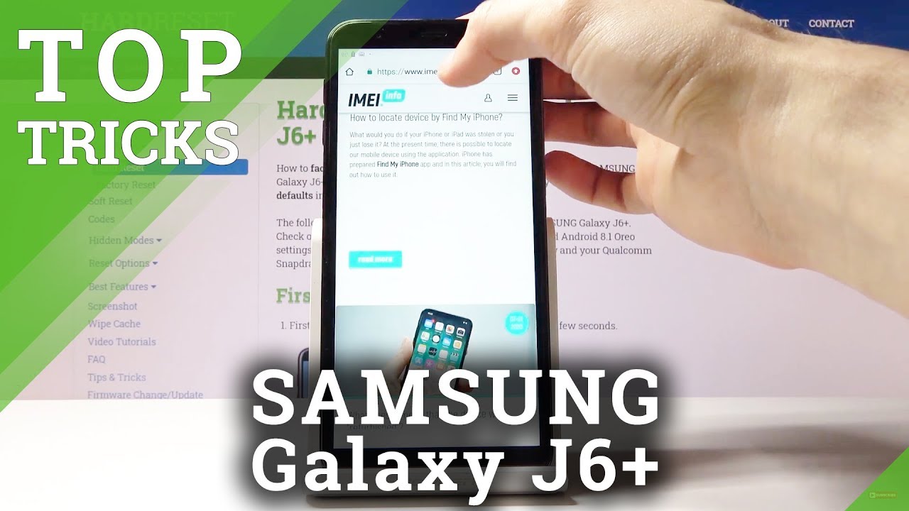
Best Features for Samsung Galaxy J6+ | Top Samsung Tricks By HardReset.Info
And from is a Samsung Galaxy, j6 + and today I will show you a couple tweaks and tricks that can do on this device. So we're going to begin with the Historian obligations, which allows you to remove the pesky buttons on the bottom and substitute them for something a little more elegant and minimalistic. So to get started, go into your settings and from there we're gonna, go into display right here and see it's going to be navigation bar right here and from here you can see that there is a full screen gesture, so you can check that on, and I'm not sure how well is visible, but they're still a little like tiny little pills. You can kind of see them more on the image right here. They basically indicate where the buttons used to be and there's basically the same. So, for instance, when you have a recent button on the left and on the right, you have the back button.
If you change into gestures that still stay so go back swipe up or go to recent swipe up here. So keep that in mind now you can also remove these tiny little indications right there completely by just taking this one suggest your hands and now there's nothing. So you can see anything, but if you're used to how Android buttons used to work instead of pressing on the screen right there, you just swipe up from the bottom, and they work almost the exact same, not the best way. You could do it just to navigation, but hopefully maybe with Android 10, when all the companies are actually forced to implement them better. It will improve it with a little more of a gesture navigation that is more friendly.
So that's the first one now I'm moving on I'm going to go into the animation speed. Now this is not particularly the fastest device. So I would say that changing the animation speed and this advice might help it a bit in terms of how well it looks or how quickly I can access apps, but to enable it you go into the settings again, but this time I'm out of here this time you go all the way down into about phone disregard the fact that I already have developer options on and that's where we going to go, but first we need to enable it, and by default they are disabled, so go into about phone. Then software information and find those number right here tap on that seven times. For me, it says no need.
Developer mode has been enabled. So, as you see, I already have it. But in your case you tap on it seven times and after the seven stop it will either confront you with some kind of pattern. If you have set the protection, if you don't, it will just automatically enable and from there you can go back once more into the main page of settings you can see and right at the bottom, the last option. You should see nu a pop up there, which is the developer options, and from here you can scroll down a little past halfway.
What we're looking for is animation, speeds and transition speeds. So there we go ya window animation, scale, transition, animation, scale, animation, duration, scale, so each one of them corresponds to a different animation. For instance, the first one, the window animation window. Is this pop-up right here? So if I change it two times ten, you can get a brief idea of how it will look, so I can set it to off I want to close this. You can see that now it's instant there is basically no animation there so kind, some kind of shadow effect behind that that's supposed to cooperate with the animation speed of the window, but the window is instant, and you can set all of them to off.
You can also set them to half speed if you want to drastically well increase the speed of it, but still actually have some kind of animation. Otherwise, if you close something, it's going to be instant, it doesn't slide down when you go in to reset it doesn't. Do some kind of like tile sliding when you open an app it doesn't go into full view by just extending it just pops in there, so that might be a little too harsh for you. You can always set it to half speed, and it's going to be better than any kind of other settings for speed increase on any device that you normally have. Some devices actually come with increased speed of animations, but they basically mean nothing when you're, comparing it to the developer options right here, so we can now see without speed.
It's way quicker, basically twice as quick as it normally was, so it's preference. If you want it off, you can turn it off. If you want to set it to half speed, you can do that too. Now, I want to show there's the split screen now. A normal circumstances.
Split screen allows you to just these two different apps at the same time, so you can multitask copy information from one play from one up to another without actually switching the apps and the way you would enable this is by, for instance, let me open up something like Chrome as an example and where I was going to open. That is, let's see anything interesting here: I! Guess: let's go with settings so now, if I go into recent, you see this little button over to bars. This will allow me to enable the split screen now, whenever you end up going split screen. The first tab that you enable this on is the one that is going to go on top. So if I use Chrome, it will open up Chrome and up upper part, and then it gives you a tile view of all the other apps that are open right now, which you can just tap to add to this part.
If your app isn't open, you can always just close this. It minimizes it and just disregard. Is it minimizes it? You can still see that it's open, and you have access to home screen from where you can open the app that you want. So, for instance, I can tap on the settings, and you can see that you can use two different apps at the same time, they're fully usable. There also can precise it there we go now once the keyboard actually pops up, it does roll back there we go so once the keyboard pops up, it shifts it, so it can fit.
As you can see again, everything is usable here. Let's go back once more to actual settings. There we go. So this is the first one. Now there's no use for it.
That I find very useful and another way you can enable it also to the recent. If you pull up you have this other button right here is the farthest one to the left. So when you tap on it, it gives you a resize window and what it does is just you place it wherever you want and whatever size you wish. So, for instance, it can just set it like this and tap on done and that section will go right at the top, and it's still interactive, although this is super, tiny and really abstract anything, but also kind of prevents you from accessing it easily ledge is cleared and show what this is better for, in my opinion, so when you open up YouTube as you'll know, when you do that, and you try to quit YouTube, so you can do other stuff, like everybody else does. When listening to music, you don't want to have it straight on your screen.
Take all the real estate of it. You would want to probably close it and listen and listen to music while doing other stuff, but you don't feel like paying a subscription for no apparent reason in my opinion. So what you can do is just enable this. So let's go into recent once you open up YouTube tap on the button right here, and you have again this adjustable window, so you probably want to set it up straight at the top. So you have access to the search bar there's a few, for instance, go ahead and go lower.
You will only see the content from here. It basically crops it and puts it in the size of the window that you choose, so you want to make sure that you're caching, the search bar, so you can actually search, and then you can make it away smaller to whatever feels well reasonable, I guess, I think this will be on the verge of unreasonable and then top one and done and from there you have other ups. So let's just go to other apps, for instance like Chrome, and add that no, thanks and there we go, so you can see that you still have access to search. So you can search for videos here. It opens up the search bar just actually minimize this.
Let's click on the buck, and you can also as long as you don't close it, which I just did by a mistake. So that's what I mean by unreasonable now when you grab the line, you can actually slide it up to close that up, which I just did by mistake. So, let's try that again like this and make it a little smaller. Okay, I'm going to go done, and now, let's open up chrome again and from here as you can see, you can scroll through it now I'm going to mute the sound, so I'll. Actually so there is no sound coming, and I'll just open up whatever I go.
You can see videos playing right now or well, in this case it's an ad, and you can continue to use your device like Chrome. As you can see right now. You can also in a way leave this up, so you can see, and the video is still playing can see, there's little eggs over there, but the video is still playing it's not being stopped by anything. So it just allows you to listen to music or anything else without actually needing to have it open and take up all your screen and not be able to do anything else. So I consider this a very handy.
Okay, now moving on just close, this we're going to go into the quick open notification panel, which, for a bigger device, in my opinion, is just a must, and now this device also has access to one UI which, although At this moment it's not updated there, it is software update. I could update it to one UI, which would be way better for the device also changes. The word this layout is located, which is more suitable for one you sent. So all these toggles would actually be at the bottom, so just a little better, but the setting stays the same on any version and what it allows you to do is just pull down. Instead of the up tray that I, just pull hold it down, you'll be able to pull down the notification panel, and you wouldn't have to reach all the way to the top to actually open it.
So to do it, it was located and was it I think it was somewhere and home screen settings? Let's see yep there. It is so quick, open notification panel, so I'm going to actually go there once more. I, basically pinch the screen and give the options here and then go Home, screen settings and from here just enable this, and if you leave now, you can instead of opening up- and you know the up tray like we did previously, you will pull down the notification panel and just allows you to pull it down. Basically from there straight from the bottom of the screen. You don't have to reach all the way to the top to pull it down.
Right, in my opinion, is very handy and just simplifies the use of the device. Ok. So the last thing that I want to show is the option for the big screen now I'm, not very fun a bit. It annoys me especially that it's here and I most certainly don't want to update it. So I just leave this, so you can actually disable it so doesn't sit on my mistake.
Go to it because, at least in my opinion, it's useless when you can use something like Google and to disable it. When you go again into the screen and slide to the page of fix, because it gets you big to be home right here, you have to struggle, I need to do is just toggle it off and now, when you go back to the home screen, there is no more Bigamy. This is that, for this page you can go to so just removes simply Bigamy, but this would conclude all the tweaks and seems that on the shrimp and if you find any of them helpful, don't forget to hit like subscribe, and thanks for watching.
Source : HardReset.Info

![Four Lenses on the Back!! Samsung Galaxy A9 (2018) Unboxing [4K]](https://img.youtube.com/vi/sgTlhOhnDVU/maxresdefault.jpg )
