Apple Watch Series 6 Unboxing + First Impressions! By Matt Robb
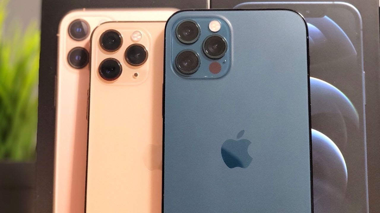
Hey guys welcome back it's mat there, and today we're going to be taking a look at the Apple Watch Series 6. I have the aluminum version, we're going to be doing an unboxing and first impressions, but just want to say if you haven't already definitely do check out my video for the iPhone 12 Pro max. I recently just unboxed this and also gave my first impressions on that. So link will be down below to that, but if you could also help me reach 50 000 subscribers before summer 2021, that would be just crazy. So definitely do hit subscribe bell icon. If you want to see notifications for my videos, that would also be appreciated, but without further ado, let's just jump straight into it.
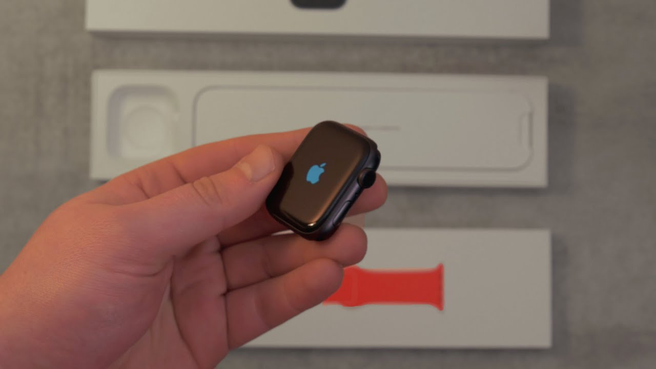
Okay, so here we actually have the Apple Watch as well as the product red strap. Now something I thought was a little strange was the strap come separately, so I actually went in the store and specifically asked for the red strap with a black aluminum Apple Watch. So I really wasn't sure how it comes in the past. I believe they came together in the same box, but whatever that's just how it works. So now we're just going to open it.
There's a couple of tabs underneath I really do like the style of this box. It's just kind of unique, like I've, never really seen this done before, but these tabs just pull out if you can actually get it right and then it sort of folds out now like a present, which is kind of cool now. Obviously, I've screwed it up a little here, um and there's also a filler for where the strap would usually be, but this is how it would normally open just opens like that with some decorations about all the different apple watches, and then you have your actual watch as well as the strap inside, so just lifting off the top of the box. This is the Apple Watch box, so in here we simply get some instructions. We also get the charging cable as well, which is that magnetic charging cable- and we also get the Apple Watch itself.
Now, there's no charging brick included, so you will have to use an existing one or just some other USB device, but popping the Apple Watch out of this sleeve actually goes ahead and turns it on. So, as we can see, there's an Apple logo there and there's also this small screen protector applied. So we're just going to remove that, and this thing looks really nice and stealthy. I went for the black because I thought it really does go with just pretty much any strap. You can think of any color.
It will pretty much go. It could go with leather straps, rubber, whatever it might be, even the metal link ones. I feel they all go really well with the black one anyway, just putting it next to it. It comes out with this little pop-up to connect, and then it will just go ahead and allow you to set up the Apple Watch. You can also set it up for your kids as well, but you just simply need to go ahead and scan the screen and that will go into the pairing process, and it will start to set everything up.
It also asks you which wrist you're wearing on, so you can wear it on the left or the right. Obviously I wear it on my left. Just that's pretty standard, I think, okay. So while that goes ahead and sets up we're, going to take a look at the strap. So this is the product red silicon strap by apple.
I selected this as my custom strap to come with the watch um, but opening up, as you can see, there's the strap it comes with a standard version as well as a smaller version. In case you have a very small wrist I'll, be sticking to the larger version. But, to be honest, this is part of red, but whenever I look at it, I can't see red like every time I look at it. I just see orange. Let me know what you think down below, but I just feel like a really dark orange, and it doesn't really quite match the product red which I got for the silicon phone case, which is kind of annoying apple, tend to change up their colors a lot so yeah, but I still really do like the look of this strap.
It has a really nice contrast with the black watch, and it just goes ahead and slides in if you're unfamiliar with Apple Watch straps, but something that's new about this is you have an ECG built in which is quite cool, so you can put your finger on the digital crown, and it will go ahead and actually tell you your heartbeat, and it will map it out in a PDF. You can go ahead and show your doctor and everything like that. But this thing looks very, very sleek. I'm charging it right now because it did come fairly low with only about 10 percent right off the bat. I can say the series 6 has some great watch faces included, and I'm running watch OS 7.
Furthermore, I believe, but there's just so much functionality on this watch. Furthermore, I've only been using a few minutes. Furthermore, I can see all my apps started to port over onto the watch, and I've been a big fan of android wear in the past, but honestly there isn't much functionality there and a lot of apps aren't supported. So it's really nice to see a full-fledged Spotify app Flipboard, an app for tile, as well as even a domino's, app, there's just so many types of apps that will be ported over onto your watch that you really don't have on android wear. So this is really nice for functionality.
Obviously, I still kind of like the round look of android wear watches, but the Apple Watch is fairly sleek, and it just has so much more functionality and that's why I think I'm going to be sticking with the Apple Watch over some other android wear competitors that's until in the future, maybe when android wear picks up. But honestly, I kind of doubt that swiping out brings this control center up. You can see your battery life, your walkie-talkie mode. You can expel water turn on your flashlight they're, just sort of quick toggles, which you might want to enable when you're out and about you, don't want to be fiddling through loads of menus, so it's nice just to have them all there, but obviously the main purpose you get. This is for notifications.
It does that great. I love the haptics. It has this sort of tap response whenever you get a message, and obviously you can use the crown to scroll through them all the main interface is interesting with all this sort of bubbles at first. I wasn't really into it that much, but I think it's growing on me and honestly, it's very easy to use because you can see all your apps in the one place, whereas on android, wear you'd have to scroll through the entire list, but you can do basic things like make phone calls, there's a speaker in here, and you can go ahead and monitor your fitness, which is absolutely amazing on the Apple Watch. It monitors your heart rate, and you can select from various different activities.
You also have the ECG, which I mentioned before. So you just simply place your finger on the digital crown that will go ahead and monitor your heart rate, and it will export to a PDF on your phone and then there's talkie, talkie mode, which basically means you can just click and hold down a button and speak out of your friend's Apple Watch wherever they are, and it's kind of creepy at times, but it's also really cool and then, like I mentioned, there's a tile app. So if I lose my keys or my wallet, I can go on my Apple Watch and actually see where they are, or I can go ahead and ring them. But there's so many things you have reminders. You have your calculator there are loads of basic things on here, but the fact that there's so many third-party apps supported is just really great.
So that's my first impressions hope you enjoyed the video, don't forget to comment rate and subscribe peace out guys. You.
Source : Matt Robb
