Apple Watch Series 4: Unboxing & Review By DetroitBORG
What's up guys this is Mike the Detroit pork with the brand-new series for Apple Watch. This is the first complete redesign of the Apple Watch since it launched in 2015. The big news here are obviously bigger screens, so we go from a 38 and 42 millimeter size to a 40 and 44 millimeter size, but the existing watch bands still work with a new design. Although the screens are bigger, the new design is thinner. We get louder speakers better, microphones, a new electrical heart rate sensor, along with a digital CROM, with haptic feedback, and of course we get a new processor which boosts performance up to twice the speed of the series 3 watch. Once again, the watches are available in the aluminum or stainless steel.
Aluminum is the cheapest starting at 399. For the smallest size, we still get three aluminum colors the same colors we had from last year, but stainless steel finally adds a third color. This time, gold which matches the new iPhone, 10s and 10s max. So in this video we'll take a look at three versions of the Apple Watch: the cheapest aluminum 40 millimeter design in space gray and the most expensive discounting terms 44 millimeters stainless steel with a Milanese loop in both gold and space black. So when it comes to unboxing, the Apple Watch Series for this is one of the other big design changes and that's because they've unified the packaging design for all versions of the Apple Watch.
There used to be many versions depending on the type of watch. You got, whether you got stainless steel, a lute band and that sort of thing and one of the reasons they were able to do. This is because they're packaging. The watch separate from the watch bands. So when you open up the boxes, you'll see this wrapper that sort of keeps both boxes together.
So you'll see the box for the Apple Watch on top and the watch band just below it. You'll see some information for what version of the Apple Watch. You have along the side and, of course you get that embossed version of the watch on the top of the box. So when you lift the lid, the first thing you'll see here are all the familiar accessories. So once again we get a 5 watt, USB a wall adapter just like you get with the iPhone, but we also get that Wireless inductive charging puck.
Now, just like the original Apple Watch, we get a stainless steel version for the stainless steel watch and a white plastic version for the aluminum watch. Now this is the same design. We've always had so existing accessories will still work with the new watches. The paperwork included is very basic. It shows you how to install the watchbands, how to set it up for the first time and if you're looking for Apple stickers, unfortunately they don't come with the Apple watches.
So perhaps the smallest component in this entire box is the Apple Watch on the left side, which is protected in these microfiber pouches, which are color matched to the Apple lunch. They also tell you the size on the back. The slots for the watch. Bands are the same design we've had since the beginning. So if you look at the inside edge, you'll see things like the model number or your serial number information, and we'll find the latches which you can release by pushing the button on the underside.
So when you install the watch, bands just slide, it left and right to make sure that they've latched on so next up getting to the watch bands. First up, we have the 40 millimeter sport band. Now this is the same design we've had since the original. So it's the same flora, elastomer material, that's really soft and comfortable to wear, especially if you're working out we get some installation instructions, and you'll see that we get two bands. We get one, that's large one, that's small! So you really just have to use the band that fits you best.
The thing to keep in mind is that the sport bands that come with the Apple watches have a color matching rivet. That may not be the case for the ones you buy off the shelf so getting to the Milanese loop space. Black is not a new color, but go certainly is now. The design is pretty much the same as the original, except for one important exception. The big news here is that you can now open up the Milanese loop, meaning you can actually pass the loop through the watch band, lug I'm, actually, a huge fan of the Milanese loop, it's a little more formal than the other bands, and it's also more expensive.
But for me, it's the most comfortable because it's highly adjustable it breathes normally, and I'm, not allergic to it, like I can be with one of the polymer bands or even the leather bands. In terms of the setup process. It's extremely simple. You do need an iPhone to set this up, but they've made it very simple. I have to do.
Is boot up, the Apple Watch hold it near your iPhone, and this will trigger the setup process. The setup process involves using the iPhones camera to scan a code on the Apple Watch face and the rest of the set of process happens on the iPhone. So you can transfer your settings. You can enter a passcode for security. This also gives you an idea of some new features, including a heart rate, monitor which can warn you if you're suffering from a low heart rate or a high heart rate.
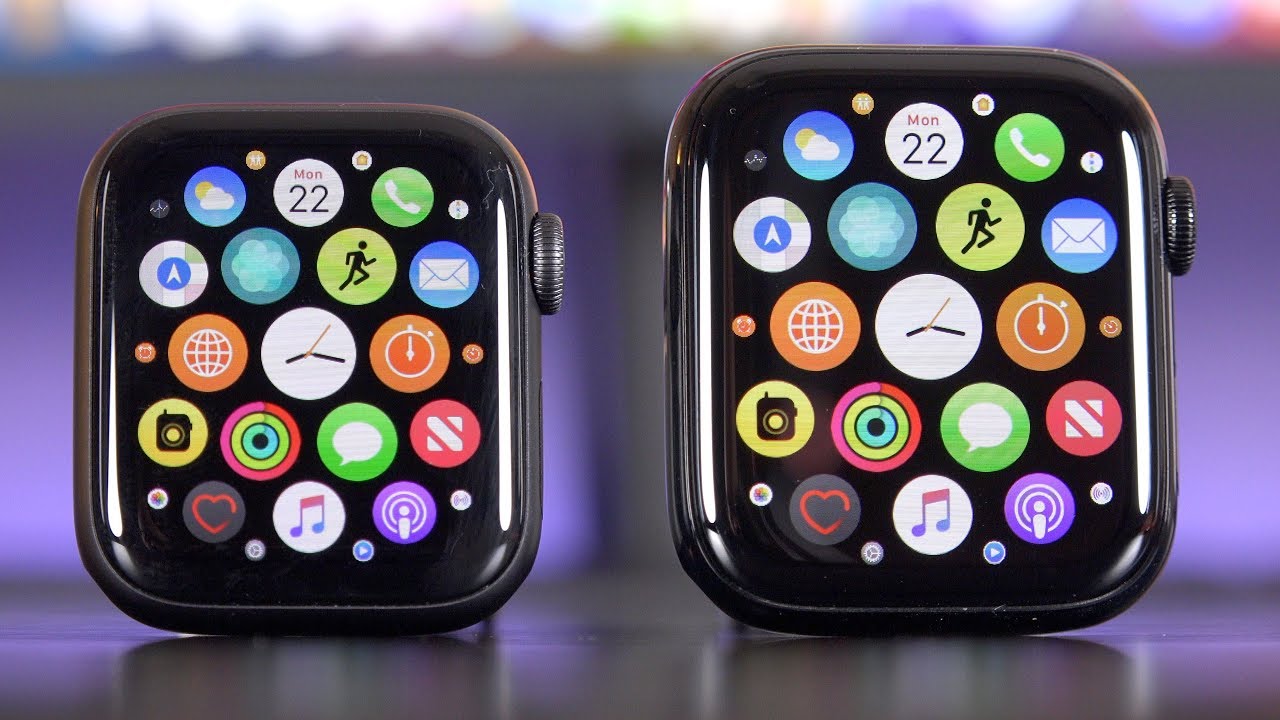
You can also set up app pay and if you have a version with cellular connectivity, you can also set up that service, as well as before the aluminum watches are using I next glass for the face plate. So it's less reflective, but it should be a little less Chandler prone while sapphire crystal on these stainless steel is more reflective and more jewel-like, but it's also much more scratch resistant, but might be a little more brittle. The first thing that jumps out right away about the series for watch is not only that the display is larger, but that it's more rounded, so the old Apple Watch feels quite a bit of box here compared to this. A lot of that has to do with the display, which again has been pushed toward the edges and rounded off, but the display is also closer to the glass, so it almost looks like the display is sort of floating on top, which gives it that sort of rounded illusion. In fact, it almost looks like the display is curved, but that's really just the optics of the glass series.
Four also gets a new display technology called LAP ON, also known as low-temperature poly crystalline oxide. This is Apple's first application of this technology, and it's really designed to improve battery efficiency. It's still an extremely bright OLED display gets up to 1000 nits of maximum brightness indirect lighting, so this watch is extremely visible in bright, daylight conditions. Although bigger these are still tiny displays, 1.57, inches or 1.78 inches with a resolution of 394 by 324 or 448 by three sixty-three and still built into this watch is pressure sensitivity which Apple calls force touch side by side. You can see that the footprint of the Apple watches have increased slightly, but really the biggest increase is in the utilization of that footprint.
For the display, so much more of the device is display, not just the bezel surrounding it. It's also quite a bit more rounded at the corners. That's something you don't really appreciate. Until you see that side by side, the back of series 4 also gets a major redesign, so we have a much larger ceramic back panel on both the aluminum and stainless steel. Now this improves the radio transparency of Wi-Fi, Bluetooth, GPS and cellular on the Apple Watch, but also incorporates a lot more sensors.
So, in addition to a much more compact optical heart rate sensor, we now get electrodes surrounding that optical sensor. That's actually used to measure your heart rhythm. In addition to your pulse, this actually works combination with a new electrode within the redesigned digital crown. So you hold one finger to your digital crown while it measures your heart rhythm through your wrist. So this will allow the series for watch to act as an EKG monitor, so it can actually detect whether you have a rapid or irregular heart rate.
Unfortunately, for now that feature is not yet activated in software H into that ceramic back panel are all of these specs for the Apple Watch, so we'll find things like LTE specs, 50 meters of water resistance, whether we have the aluminum or stainless steel and, of course, reference to either IN Xor sapphire crystal glass side by side. There's a few visual tweaks to take a look at. Obviously, it's thinner. In fact, it's a one, millimeter thinner, which is quite a bit for the Apple Watch. We see that digital crown no longer has that prominent red dot again.
This indicates whether you have the cellular version. So now it's a more subtle red ring, also reposition for series. Four is the microphone alongside a smaller side button. On the other side, we get a much larger speaker which dominates the entire side of the device, so we get much better audio for two-way communication and for Siri feedback degrees and, once again the speaker is waterproof. In fact just like before there is a control in the control center that allows you to eject water by sounding a tone.
The digital crown has also been redesigned, so they've reduced the footprint of the crown, but they've also increased its complexity, so there are more parts going into it. So, of course, we have the new electrode for measuring your heart rate, but it also gives us a haptic feedback as we scroll through the interface. Now you get an audio feedback, and you get a sensation like clicking through detects. It's a little more subtle than I expected, but the interesting thing about it is that it changes in intensity depending on what you're doing so. For example, when you scroll to the bottom of a list, you get a sharper click that lets.
You know when you've hit the bottom, but this completely turns off when you're not scrolling through the interface. So it's entirely synthetic in terms of new hardware specs we have the new s4 CPU, which is a 64-bit dual-core processor. The delivers up to twice the performance of the s3. We also get 16 gigs of on-board storage, and although the batteries are smaller in both sides, watches are about 30 percent. Smaller.
We actually get the same, bury life around 18 hours. So most days, I end with about 60 percent left on the battery series.4 also gets new gyroscopes and GeForce sensors. In fact, it can detect up to 32 G's. So this is part of the new fault detection feature, there's actually quite a bit of science behind it. So it's difficult to get false fall detection readings, but in the event that the watch detects a fall, you can set this up to send an emergency call to one of your emergency contacts, but you can imagine this being useful for elderly or people working on dangerous job sites.
Once again, cellular connectivity is available for the Apple Watch, which means the Apple Watch can run independently of your iPhone. So you have full access to the internet over cellular if you prefer. This also includes phone calls and standard text messaging. Now this actually uses the phone number from the iPhone that it's paired to. So you basically have to sign up your watch to the service on your iPhone, but once you do that you could just leave your iPhone at home and use your Apple Watch for your phone number and text messaging.
In addition to a bunch of new features and a faster UI, we also get a new animation with Siri. So previously we used to get a standard waveform. Then we get a waveform that ex responds to your voice in terms of picking sizes. I have to say that the 40 millimeter is a lot more serviceable for more people than I. Think the 38 millimeter was nice thanks, partly to the fact that the overall footprint isn't that much bigger, but the display is larger.
In fact, the display is almost the same size as the 42 millimeter from last year, but I'm definitely sticking with the larger display of the 44 millimeter size. It's really hard to be a very important thing to keep in mind when choosing one of the stainless steel colors is how they wear over time. There's a big difference between raw stainless and one of the coated stainless steel finishes so space black has a DLC, coating or diamond like carbon coating, which is very scratch resistant, especially when you compare the original Apple Watch I wore for about a year compared to the space black version I also wore for about a year now, I'm, not sure how gold will hold up, but after about a month of use, have had no noticeable scratches in terms of aluminum that 7000 series is extremely strong and that anodized finish is very forgiving. So you shouldn't have any issues with scratching on that design in terms of the glass of really only worn a version with the sapphire crystal glass and that glass has been extremely durable, I've, never scratched one yet and I wear my Apple watches all day long every day of the year, so basically I, never taken off for working out swimming working in the yard or any home projects. Now take a look at the interface for watch, OS 5 on series 4.
The big news here, obviously, is the extra screen real estate. So things are more spacious. So, for example, the amp screen has a lot more room to work with, so it's actually easier to pick the apps, and it was before so. If I want to open up the weather app, you can see, it opens up really quickly. I can scroll through it get that mechanical feedback as I do so or I can move around here and zoom in on an app.
So I can open up my messaging app I can even open up the podcasting app and with the podcasting app I can see all of my podcasts synced from my iCloud account and open them up directly on the Apple Watch without having to sync them from my phone just like on iOS. You can also rearrange these apps, so you can drag and drop them around like so now. All of that screen real estate really comes in handy with a new standard watch face, so this is called info graph, which is packed full of complications, which you can edit. So, in my case, I have the weather convocation in the upper right corner, which indicates the low and high temperature my battery status when the Sun will set arise, the UV index, and then I have convocations within the watch face, so I have the wind condition, so the direction of the wind and the speed calendar and my events toward the top I even have the earth complication, which tells me where the Sun is right now on the planet. So right now it's set across North America now to customize this just force touch and select Customize, and from here you can choose your complications, which are formatted differently for the spot they occupy.
So obviously we have this crescent design for the corner, complications, but they're different for the circular complication. So, for example, if I choose the weather complication, you can see it's circular instead of crescent-shaped. Now there are countless complications you can pick from so, for example, I have the earth complication the calendar shortcuts again to your apps air quality index activity level, or you can just turn them off. If you want and again there's quite a few more, you can pick from, you can even choose your favorite content or the moon phases and getting shortcuts to some of your amps like the music app. You even have these solar complication, which I also like solar system, so it tells you where the planets are in relation to each other.
So again, there's just lots of cool things in here. These complications are also shortcuts to the apps that are providing that information. So, for example, if I tap on the weather complication, it takes me directly to then app another one of the watch faces is called info graph, modular, which again takes advantage of that screen real estate and the resources for pushing all of these convocations on the screen. Now what really stands out about this specific complication is the size, so you can get quite a bit more information in this little window. Compared to these smaller complications, so I can see my heart rate, weather, charts and more vapor is another series for a watch face formatted for the screen.
This is also available with watch OS 5, but of course it takes advantage of this larger screen. You can customize this as well. So if you go to customize, you can choose between three different colors, so we have blue, green black and white or pink and orange. You also choose all colors and if you choose all colors, you can cycle between the different vapor colors just by tapping on the screen now what's interesting here is that these are actually practical effects, so they're, not digital effects, they've actually been captured in real life and then formatted for the screen. Now, the only problem with the full screen watch faces that you can't add complications, so there's actually a circular version which you can customize as well.
So if you choose circular, that animation is only within a certain part of that screen, and then you can swipe to add complications now. What's interesting is that these complications are color-coordinated, so they actually match the watch face vapor, so blue for blue-green, pink for pink and orange, and then of course, you have white and gray. Another new watch face is fire and water very similar to the vapor effect. This is also a practical effect, and you can choose whether you want full screen or circular I can tap on the screen to select, go between them and there are different variations of them. So there's about two variations for fire and there's also two variations for water.
So if I tap here, you'll should see them, so they splash around the edges or from the center kind of neat watch face. So if I'm going to customize it I can choose whether I want fire and water or both of them and I can cycle between them, and then I can choose full screen or sir, and if I choose circular I can add complications. Another cool watch face is liquid metal. So you can see gold matches the gold of this watch, but you can customize this and select silver or black if you prefer. So of course, you might want to choose the one that fits your color best.
You can also choose whatever you want full screen or circular, and you can add complications now to check out your notifications. Just swipe down, and you can scroll through them with your digital crown or use your finger to do the same thing just like with iOS 12e notifications are now stacked on top of each other. So I can see with this nest. App I have 51 notifications, so I can tap on it to expand them out and see the individual notifications and tap on them to get more details. Now, one of my favorite aspects of watch, OS 5, is that I can open up websites on the Apple Watch.
That's especially useful for email. So, for example, emails formatted in HTML I can actually read the entire email right on the watch in terms of the buttons along the side. We have these side buttons. So if you press it once this will take you to all of your recent apps now, just like with iOS 12, you can swipe to dismiss apps like so now. If you double press, this will activate Apple Pay.
If you long press. This is where you can shut down your Apple Watch now, if you tap and hold the crown and side key at the same time, this will take a screen grab in terms of these buttons along the side. If you long press on the digital crown, this will take you to Siri now something new with Siri. This time is that it actually has a waveform that responds to your voice. That wasn't the case with series 3.
What's the weather tomorrow, ok, so again, I get voice feedback, which is even clearer with that louder, speaker and visual feedback as well. Another trick to know about is if we double tap the digital crown. This will take you to your most recent app now. If you swipe up from the watch face you get to your control center, so your control center has things like your connectivity status. So right now, I'm connected to my phone, but if I turn my phone off I can connect to Wi-Fi or, if I have cellular setup.
I could connect to my cellular plan, but right now, I don't have that set up. I can also enter in airplane mode. So again, just like an iOS 12. These are toggles, you can switch on and off. I can also enter in power reserve mode, but this also is a quick way of checking out the battery status.
One of my favorite features something I use quite often is the phone locator, so they'll actually ring my phone, so I can look for it if I've misplaced it. We also get the flashlight. So this allows you to use your watch as a flashlight, and you have several options. You can pick from a red screen, a flashing screen or just white. Now it's dim it first, and then it gets brighter.
So it gives you a chance to look away and use the launch as a flashlight. Instead of blinding you directly in your eyes, we also get enhanced do-not-disturb options, so you can turn it on say that for just one hour or only until tomorrow morning or until I leave this location. So, for example, if you go to a theater you can enter, do not disturb, and then once you leave the theater, this will automatically turn off, which I think is useful. We also get theater mode which will prevent the display from waking up or sounding notifications, and it will also turn off the walkie-talkie feature until you wake up the screen with the digital crown over by tapping it, we can also enter water lock mode. This is useful if you go swimming with your Apple Watch, so this will prevent the screen from accidentally being triggered while you're in the water.
Now I can wake up the screen and take a look at my time or notifications, but I can't tap anything on the screen. So in order to exit this mode, you swipe on the digital crown. So you hear that tone. That's actually ejecting the water from the speaker as you exit the mode. We also have airplay on the Apple Watch, so you can change the airplay output from the Apple Watch to your air, pods or other compatible devices, and if you want, you can select edit and move these around, so I can go ahead and drag them around if I want series.
Four really is an amazing piece of micro engineering and design. There's a lot packed into such a small device and for the first time, I really feel like series 4 delivers on the promises of its software, so we finally have hardware that can keep up with the features and features have been further refined, so they're much more useful, and they're much clearer in terms of how you use them. So, although it took a while, the series for watch definitely has the polish and performance you expect from an Apple device all right. Ok, so that's going to do for me with this video. If you guys enjoyed it.
Please. Let me know with a like, and I'll see you again in my next one.
Source : DetroitBORG
