Apple iPhone 11 Pro vs 11 Pro Max: Unboxing & Review By DetroitBORG
What's up guys, Mike here, the Detroit Borg, with the brand new iPhone 11 Pro and the pro Macs. We also get the new iPhone 11, which I'll take a look at in a separate video, but the pros are the flagship iPhones for 2019 2020. These look like speck bumps of the 10s and the 10s max, but these are significant redesigns. So the headlining new features include a new triple camera system that adds an ultra-wide camera. We also get a brighter OLED display, that's more efficient and one of the biggest new features here is the battery life they've added four to five hours over the 10s, which is the biggest improvement I've seen for any iPhone. But there's a lot more to talk about here.
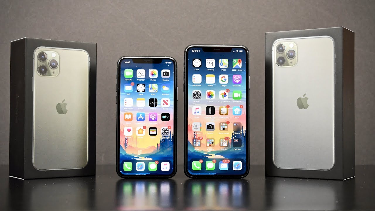
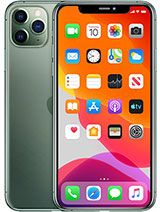
Basically, every feature on this phone has been improved or redesigned just like last year. They start at $9.99 or 1099 for the two sizes, and that gets you 64 gigs of storage standard, which is a little tight, but it is doable if you store most of your files or stream most of your music from the cloud. So every iPhone usually debuts with a signature new color and this year its midnight green and that's what we're going to take a look at here. It's sort of a dark green sort of closely related to space gray. It's a really nice color, although at first glance it wasn't something they liked or the way now it's been a while since I've seen black used on an iPhone box, but that's the color they're using for the iPhone pro.
If you get an iPhone 11, those boxes are white, but you can see the color of the iPhone depicted on the top of the box, so lifting lid. The first thing we see here is that stunning midnight green with a frosted glass back panel. Typically, there's some paperwork on the top when you open up these boxes, but this time we get the phone right away, so that's kind of nice lifting that up. You also see that there is no plastic on the back panel just on the front glass, but before we get to that, there's a lot new to talk about in terms of accessories. First up we have our standard paperwork packet.
That includes a sim ejection tool, a very brief Quick-start guide and a set of white Apple stickers. Incidentally, these stickers for the Macs are a bit larger, not just on a bigger sheet like they were previously, but the big news is the included 18 watts power adapter, which is able to charge the battery up to 50% in only 30 minutes. That's a big improvement over the small 5 watt adapters. We used to get. We also get a USB, C, 2, lightning, cable, to support that faster charging, and we get a set of Lightning connected ear pods.
So, once again, those wireless air pods are sold separately in terms of design the big innovation with the eye phone 11. Is this three-dimensional machined glass back panel, which has been strengthened to what Apple says, is the strongest glass on any smart film? Well, of course, I'm going to leave that to other people to test, but this design that gives you this much more integrated. Look to the camera bump out on the back. You also get this contrasting texture between the mat on the back and the glossy surfaces around the camera module and within the camera bump out. You'll find those three cameras with matching metal rings around the lenses.
It's a really nice look. It almost looks like jewelry, it's a really well crafted design they've, also simplified the look on the back panel by mounting the Apple logo at the center and removing the iPhone branding. We still have wireless charging up to 7.5 watts, I believe the iPhone pro is still the only iPhone that gets a stainless steel frame. So you have this. Nice polished finish all around the edges to accommodate the larger battery.
These phones did get a bit thicker and heavier, so they're up to 8.1 millimeters thick instead of 7.7, and we gained about 11 grams on the pro and the 11pro Mac's gained about 18 grams. Although the displays are the same dimension, these phones are slightly taller and wider than before as well, and this is where an apple cart comes in handy, to show you the slight difference. For the most part, this is largely imperceptible, but the weight gain is slightly noticeable, so this one does feel a little heavier than the 10 s. The buttons on these sides of the phones also get a slight tweak here. The design is the same, so we still have our sleep/wake power button along the right side, the volume controls and the mute switch along the left side, along with the SIM tray, but all of these have been slid down just a little with a new generation visually.
Not much has changed at the bottom of the phone. We still have a speaker on one side: the microphone on the other side, a USB, lightning connector at the center and color matching components right down to the grille inserts and the screws around the lightning connector. Once again, we have a set of steered speakers with the earpiece and the polished speaker working together, and they are acoustically matched, so they sound, nice and uniform in terms of sound quality I'm, actually a little surprised by how much louder these speakers sound compared to the iPhone 10s Apple really only talks about the 3d audio processing for 5.17 point one or Dolby Atmos sources. It's able too much better separate the channels with only two speakers. It's pretty impressive and definitely a welcome improvement.
These phones do pick up some new OLED displays, although at first glance they look like they're the same because of its same size, five point eight inches or six point five inches with the same resolution in pixel Tennessee of four hundred and fifty-eight PPI. Now these displays are fifteen percent, more energy efficient, but they're also brighter at the same time. So, instead of 600 nits of maximum brightness, we can now achieve up to 800 minutes of maximum brightness or 1200 nits. Now 800 nits is what you'll achieve. If you expose the ambient light sensor to direct light, you can't manually dial it up to 800 nits 1200 nits is for HDR content such as Dolby Vision or HDR 10, so that allows these this place to better represent the dynamic range with brighter highlights to match the deep blacks of OLED.
So because of this more vivid and brighter panel Apple is calling this the super Retina DR display now. For me, the differences in the displays don't really show up that often so, for example, it is slightly more visible outdoors when exposed to direct sunlight, but the indoors you're, not gonna, really notice much of a difference in terms of HDR content. It's kind of hard to find the right situation where it's really noticeable, especially for the camera, but for the most part, I do notice that some highlights tend to get brighter and the colors tend to have more depth and separation than before. Now, what I think is really helping this display day today is the auto brightness, because this display is more efficient. It's much less aggressive in terms of dimming.
The screen, like the previous iPhone, no LEDs in terms of the bezel, nothing has really changed here. We still have this nice uniform design top to balance of each corner as the exact same dimensions. Although the bezel looks kind of thick compared to some other phones which have razor-thin bezels, even if they may not have these same symmetry, the notch at the top of the phone is unchanged from the previous generation, although face ID is a little quicker and works from greater angles than before. Face ID still is the most secure and effective facial recognition technology on any smartphone, so I definitely think it's worth having the notch. One of the other changes is that the iPhone 11 Pro gives up on 3d touch in favor of haptic touch the same technology that debuted with the iPhone 10 our last year.
So instead of the pressure sensitivity, we now use long presses to achieve the same action, but if you're used to the 3d touch, you'll find haptic touch to be a little slow just because it requires a long press to work properly.3D touch was a little more instant, but it is something you get used to and at least acquires a lighter touch to work, as opposed to mashing the screen, and you still get the haptic feedback, just like you did with 3d touch. This year's new chip is called the a13 Bionic CPU. This is a 2nd generation, 7 nanometer chips which really focuses on energy efficiency, so we're seeing about a 20% improvement in terms of CPU and GPU performance, but a 30% to 40% improvement in terms of energy efficiency. Although that's not a significant difference, it maintains a significant lead over its next rivals. So when it comes to bare life with that larger battery, the more efficient display and the more efficient CPU I'm seeing better life I have never seen on an iPhone over 9 hours of screen on time in a 24-hour period, that is remarkable, usually I get about 6 hours.
This is a huge leap over that, although we don't get 5g, the iPhone does pick up some revised radios, including support for Wi-Fi 6, but one of the most interesting new components is the u1 chip. This is an apple design chip which uses ultra-wideband technology for a much more precise spatial awareness. So Apple wants you to think of it as GPS at the scale of your living room, they've also improved the water resistance rating, so it's still IP 68 rated, but now they've doubled the depth to 4 meters. So by far, the most important piece of hardware here is the all new camera system on the back, so we get three cameras, all 12 megapixels and each one of these cameras is all new. So in terms of the wide-angle camera in the upper left, we still get an F 1.8 aperture with a 6 element lens an optical image stabilization, but we now get 100% focused pixels, which improves auto, focusing and low-light conditions up to 40%. The telephoto camera is also new, with a larger F 2.0 aperture that lets 40% more light into the camera. This is also optically stabilized, with a 6 element lens with 2 X optical zoom, but new is the ultra-wide camera.
This is the first iPhone together, but certainly not the first Android phone together. I've always wanted one of these cameras, and we finally get it for iPhone, so this gets a much wider, 120 degree fields of view for four times more scene than the standard wide-angle camera, and this is the only camera without optical image. Stabilization, so Apple is done a perfect job. With this camera, it's able to reduce barrel distortion within the optics of the camera, instead of resorting to suffer to minimize it. But you get this really impressive effect when you use that wide-angle camera and of course it allows you to get a much larger scene in close quarters.
So really this is nothing new, but I think this is potentially more useful than a telephoto lens. At least with this lens, you can get a shot that you simply couldn't achieve from the wide-angle camera. In terms of these cameras, performance in ideal lighting conditions, there's not a huge difference between the 10s and the 11th, but there's a few things that are consistently better with the iPhone 11 Pro, specifically, the performance of smart HDR, so smart and HDR is doing a much better job. Preserving the dynamic range of a photograph images, look more vibrant because things are brighter, and the colors are more vivid. So in comparison, I, Phone, 10s images look a little hazy and flat compared to the more vibrant images produced by the 11pro.
Some of these improvements seem to come down to semantic, rendering that's something new. With this new, a 13 ISP or image signal processor so effectively, this camera can identify the different surfaces and subject your photograph and customize the rendering for every area of the photograph instead of just applying a blanket algorithm. Now, because we have three cameras working together, that means these cameras can easily switch between each other virtually seamlessly. Each camera is able to tell the other camera what to do before they switch between each other. So that means you're not jumping between different exposures and focuses abruptly.
There's another really neat trick with this ultra-wide camera. So if you're using the standard wide-angle camera, the ultra-wide camera can be running at the same time to capture additional information around the standard wide-angle frame. So that means, when you take a standard, wide-angle photograph, you have additional information around that photograph which you can crop in and out of, so that allows you to recompose your scene. If you need to, and then information is wiped out after 30 days by far the biggest new improvement with this camera system is night mode. This is something that turns on automatically if the scene needs it.
Now, this only works with a telephoto and the wide-angle. It does not work with the ultra wine. Essentially, this takes a bunch of images, combines them together, activates the optical image, stabilization of the camera. Then you use the software to align images to correct for movement, discards, the sections with too much blur infuses sharper ones together. It adjusts for contrast, so everything stays in balance: fine-Tunes, the color, so they look natural.
Then it D noises and enhances detail to produce the final image and the overall effect is really impressive. This is something you can turn off with the screened dial. If you prefer, it can also change the intensity if you want, but for the most part, automatic mode works perfectly. So if you compare the images of the 10s max next to the iPhone 11 Pro Max, you can see there's a pretty substantial improvement in terms of detail, color, vibrancy and, of course, exposure. Now.
This is not a new feature for a lot of smartphones, but Apple has done a perfect job in terms of preserving detail without excessive noise and maintaining consistency, especially in terms of color and the end results aren't quite as cartoonish as they can be with other smartphones. Now this is not a magic night-vision camera. This is best used when you have some light sources in your image, you just need some enhancement through the software. Otherwise, if you have very little light, you're still going to see plenty of noise in terms of video, all four of these cameras can do it at 4k resolution. Only two of them, the wide angle and the telephoto can do it.60 frames per second, but the ultra-wide is limited to 30 frames per second now. For me, the most impressive improvement with this camera is stabilization.
I've, never seen anything quite like it on a smartphone. So it's a huge improvement over the 10s max, and it's virtually infallible. So most of the stabilization is electronic, not optical, so it makes for very smooth video and again one of the best video cameras you can use on the smartphone not to be forgotten is the new 12 megapixel front-facing camera with a wider angle lens. So now it's able to record 4k video up to 60 frames per second, it's also able to take wider angle images. So when you're taking a portrait photograph, you get a standard 7 megapixel photo, but if you rotate to landscape mode, this will expand it out to 12 megapixels.
You can also toggle the icon on the screen to change between these different views. Also, new and unique to the new phones is a new portrait lighting mode, specifically high key light mono and for some reason this camera gained a slow-motion feature. So if you want a slow fee as Apple calls it, you now have that option. But unfortunately, if you don't have hair, this really is a useless feature. Alrighty, so testing out the front-facing camera I have the 10s max here.11 Pro max here big difference here. So obviously one of the things you notice right away is that the lens is why, so you have to hold the cameras far away to get a wide shot.
That helps a lot of course, 4k at 6 frames per second versus 1080p at 60 frames per second definitely, a huge improvement overall I can see the color I think it looks better. Now, I guess not a huge difference here in terms of exposure. It does a perfect job. You can see in terms of HDR. You can see through the windows.
Furthermore, you can see the light pictures behind me not too bad. Definitely a welcome improvement on the camera that Apple is neglected for too long. In terms of the camera app, there is quite a bit: that's new with the iPhone Pro, that's worth exploring here. A lot of people may not be aware of how some of this works. So at first glance nothing really looks terribly different.
Here you can switch between the different camera lenses. That's all pretty familiar. You can also tap and hold to switch between the cameras using this little dial, again very similar to what we're used to you, get these little detects in terms of haptic feedback that let you know that you're jumping between the different cameras, and you can see a slight transition as it does so. What's not obvious here is, if you long press on the shutter release, you can start recording video, so this will start recording video until you release your thumb or your finger, so the video is done, recording, so that's kind of a nice quick way of getting to the video mode without having to swipe away from the camera. You can also lock the video mode by swiping to right, so it continues recording, and you can tap this icon to take photographs of log recording video.
Now, if you swipe over to the left, you can take a burst shot. So that's how you get to that feature in terms of some other more interesting features. If you swipe on the mode you can get to some of your settings, unfortunately, not all of your settings, you still have to dig into the phone settings to change some of these things, but one of the things I want to point out here is that, right now you can see that around the main frame I have this extra information provided by the ultra-wide camera. So you can see when I take a photograph. I can go to that photograph like so go to edit go to crop and when I crop you can see that I have this blurred edge around here.
That tells me I have additional photograph I have access to so basically, I can zoom in zoom out or change my rotation without losing any photograph. So you don't have to crop in to rotate. That's all very useful this for thirty days, so that extra information is pitched after 30 days. So if you want to edit your photo, do it within those 30 days now. This feature really only works with enough light, so it's only good for certain situations.
So if I tilt the phone down here toward a darker shot, you can see it fades out, so it turns off. But what does wake up? Is my control for night mode, now night mode, there's mostly automatic, so it turns on only when it's needed, but you can manually adjust the feature as well. So, besides the three cameras, we also have a microphone and our new and improved quad led true tone flash now we have stereo audio pickup with video on the iPhone, but it does pick up a new feature called audio zooming, so with audio zooming and some computational magic thanks to the a13 Bionic CPU, it's actually able to enhance and reduce sound, depending on where you're, pointing in the camera and the depth of the zoom. It's a really neat feature. So, as I zoom in on my air conditioner, you can hear it gets loud or even though I'm not moving as soon as I move away from the air, conditioner and zoom farther away from it.
You can hear the audio died down in the background. It's pretty amazing. Next up, let's take a quick look at the interface. It does change a little with haptic touch. We do have live wallpapers available if you want to add them through the wallpaper or section under settings.
So this is the green live wallpaper, and it works just like it did with 3d touch. You just use a long press, and it's a little more static this time. So you can't change the intensity of the effect by increasing or decreasing pressure, but you can long press on these icons to get to some of your shortcuts here, such as the flashlight or the camera. So again, long press to get to the flashlight turns on turns off. We have our notification here.
So if we long press on that, it expands out just a little slower this time, swipe up to get to your other notifications and swipe up to unlock and take you home so from the home screen you swipe to get to your widget panel. If you swipe down from the top you get to your notification, then again you can expand them out, like so swipe from the upper right corner to get to your control center and again, we just use long press to interact with some of these controls. So we have true tone night shift and dark mode which you can turn on and off swipe up and hold to get to all of your recent apps, and you can swipe to dismiss them like so swipe down from the center of the home screen to get to search now, if you're used to an iPhone with a home button, these side buttons do mostly the same thing tap and hold to get to Siri, to take a screenshot tap the volume up, key and side key at the same time and to power off or restart tap and hold the side key and the volume down key. At the same time until you get to the interface. Haptic touch also works with quick actions, so you can long press apps to get to these quick actions.
But this is also how you rearrange apps. So they don't start wiggling automatically. You have to activate rearrange apps in order to start that mode and if you want to exit the mode just swipe to dismiss in terms of haptic touch with the keyboard, you no longer 3d press anywhere on the keyboard to activate the cursor. You long press on the space bar to achieve the same thing in terms of choosing between these two sizes. It really comes down to three things: price, there's $100 that separates them battery life.
There's a big difference there, because you're going to get quite a bit more with the Macs and, of course, screen size does mean that we get a few slight software tweaks for the Mac's compared to the standard Pro. Essentially that means some part, so the user interface and many of the Apple apps have been formatted for a landscape orientation to take advantage of that larger screen. Otherwise, the camera specs performance and even the four gigs of RAM are shared across both devices. The max is a substantially larger phone than the 11pro. So if you don't like peering around a larger and heavier device and prefer the more one-handed nature of the iPhone 11 Pro, you definitely have a fantastic option without compromise.
But for me the max is the way to go with that larger battery in the larger screen. That makes it extremely versatile and the one device that can do it all. So, in the end, we have a few big new features and lots of small updated features overall. That makes for an all new phone top-to-bottom, even if it doesn't really look like one, but generally speaking, you probably don't need to upgrade from the 10 s if you already have those, but this will certainly be an upgrade from anything earlier. Of course, there's always room for improvement.
It would have been nice if we had bilateral charging, so we could charge our air pods or Apple Watch with our iPhone. It would also be nice to have a 90, Hertz or 120 Hertz refresh rate for the display. Apple has promotion on the iPad. It would be really nice if that could make it to the iPhone and, of course, a smaller or no notch design would be nice and USB would be welcome, but that's going to do for me in this video I hope you guys enjoyed it. If you did, please leave a like to.
Let me know, and I'll see you again in my next video.
Source : DetroitBORG
